Scoring genre clarity...
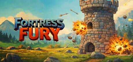
Fortress Fury is a survivor multiplayer tower defense roguelite. Endless hordes of enemies want to crush your tower! Buy weapons and upgrades to craft an array of overpowering builds. Will you be able to survive all waves and be the last tower?
Free to PlayMixed(107)
StrategyActionTower Defense
KervadoJan 21, 2026