Scoring genre clarity...

Moorhuhn Kart 4 capsule

Moorhuhn Kart 4

The world's craziest chicken is heading back to the racetrack! Wacky characters, cool tracks and karts, and zany items await in a worldwide online battle for first place!

HK$ 25.00Very Positive(79)
RacingFunnyMultiplayer
Korion Interactive13 Mar, 2025

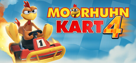
Moorhuhn Kart 4 scores 78/100 — better than 74% of Racing capsules (n=772).

Very Positive (79 reviews) · HK$ 25.00 · Released 13 Mar, 2025 · By Korion Interactive

Quick text summary

Moorhuhn Kart 4 scored 78/100 on Steam Analyzer — Good for a Racing capsule. Top priority fix: [contrast_color] Add a subtle dark vignette or gradient edge to the background so the capsule separates more cleanly from Steam's #1b2838 dark UI at all browse sizes.

Capsule scores by dimension

  • Genre Clarity: 9/10 — Kart racing genre instantly clear. The center-dominant kart vehicle with a chicken character gripping the steering wheel, combined with the word 'KART' in the title and flame/speed lines in the background, communicates kart racing immediately. Even at tiny size, the red kart silhouette and racing posture are unmistakable. No genre ambiguity whatsoever — this reads as Mario Kart-style arcade racer on first glance.
  • Title Readability: 8/10 — Bold title reads well at small sizes. The yellow outlined bold 'MOORHUHN' and red 'KART 4' text use strong contrasting letterforms with dark outlines that separate well from the light blue-white background. At small size the title remains readable due to the high-contrast yellow and red palette. At tiny size 'MOORHUHN' may compress slightly but 'KART 4' remains legible due to its larger relative weight and simpler letterforms.
  • Contrast & Color: 7/10 — Warm palette pops but light background risks blending. The warm red, yellow, and orange tones of the kart, character, and title create a vibrant, energetic composition. However, the light blue-to-white sky background means the capsule does not contrast maximally against Steam's dark #1b2838 background — the top edge bleeds lightly. In grayscale, the kart and character still maintain reasonable silhouette separation from the background due to the darker underside shading of the kart.
  • Uniqueness & Polish: 7/10 — Polished cartoon style, familiar formula. The 3D rendered chicken character with an expressive angry face and the clean kart design show good production polish and a fun, accessible tone. The composition follows a very standard kart-racing capsule formula — character in kart, centered, logo above — which is competent but not distinctive compared to top performers like Disney Speedstorm or HOT WHEELS UNLEASHED 2. The Moorhuhn IP itself is the main differentiator, but without prior IP knowledge the capsule feels genre-typical.
  • Brand Consistency: 8/10 — Strong mascot identity, cohesive style. The Moorhuhn chicken mascot is an established European gaming icon and its angry-expressive face is a recognizable identity cue for fans. The yellow-red brand palette used in the title matches the kart and character colors, creating strong internal cohesion. The cartoon 3D rendering style feels consistent with what would be expected across store screenshots for this type of casual kart racer.
  • Composition: 8/10 — Clear focal hierarchy, well-balanced layout. The chicken-in-kart serves as a strong central focal point occupying the lower-center of the frame, with the title text filling the upper-right area and fire trail extending left to balance the composition. The layering of background speed lines, mid-ground kart, and foreground tire provides some depth. At small and tiny sizes, the kart character remains the dominant visual element and the title stays in a clean reading zone without fighting for attention against the subject.

What works

  • Instant genre recognition. The red kart, steering wheel grip pose, and 'KART 4' title make the genre unmistakable even at 120x45 pixels.
  • High-contrast bold typography. Yellow and red outlined lettering with dark strokes ensures the title does not dissolve against either light or dark viewing contexts.
  • Expressive mascot personality. The angry-determined chicken face communicates a fun, wacky tone immediately and gives the game a memorable identity anchor.
  • Warm energetic color palette. The red, orange, and yellow tones convey speed and excitement appropriate to the kart racing genre.

What hurts the capsule

  • Light background reduces Steam contrast. The pale blue-white sky background does not create strong separation against Steam's dark #1b2838 UI, potentially causing the capsule to feel washed out in browse mode.
  • Generic composition formula. Character-in-vehicle centered with title above is the most common kart racing capsule layout and does nothing to differentiate from competitors like Disney Speedstorm.
  • No secondary gameplay hook visible. The capsule shows only the mascot in a kart with no track, item, or multiplayer hint that communicates the 'wacky items' or online battle angle from the game description.
  • Title can compress at tiny size. At 120x45, 'MOORHUHN' is a long word that may become difficult to parse fully, relying on 'KART 4' to carry readability.

Priority fixes

  1. [contrast_color] Add a subtle dark vignette or gradient edge to the background so the capsule separates more cleanly from Steam's #1b2838 dark UI at all browse sizes.
  2. [uniqueness_polish] Introduce a secondary visual element — such as an item projectile, rival kart, or track environment detail — to hint at the wacky multiplayer gameplay and differentiate from generic kart capsules.
  3. [title_readability] Slightly increase the font weight or outline thickness on 'MOORHUHN' to ensure it remains fully legible when compressed to tiny 120x45 thumbnail size.
  4. [composition] Consider adding a subtle foreground element or motion blur streak to reinforce speed and depth layering beyond the current flat sky background.

Store copy priority fixes

  1. [uniqueness] Replace 'improved driving physics' with a specific mechanic or track feature that differentiates this from other kart racers (e.g., 'dynamic track hazards that change per lap' or 'vehicle deformation affects handling')
  2. [hook_strength] Rewrite the short description opening to lead with the core hook for new players: replace 'The world's craziest chicken' with something that explains the core experience, e.g., 'Race up to 8 players online or 4 locally in this chaotic cartoon kart battler with physics-based combat items'
  3. [feature_communication] Clarify the item system by naming 1-2 examples beyond the '16 ton weight' to show variety; explain how items interact with physics or track elements
  4. [audience_targeting] Add a single sentence after the first paragraph explicitly positioning the game (e.g., 'Perfect for local party racing or online competitive play' or 'Whether you're a speedrunner or casual couch co-op player')

Related guides

Steam app ID: 3012980 · Tags: Racing, Funny, Multiplayer, 4 Player Local, Split Screen