Scoring genre clarity...
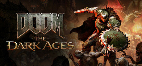
DOOM: The Dark Ages capsule

DOOM: The Dark Ages

DOOM: The Dark Ages is the prequel to the critically acclaimed DOOM (2016) and DOOM Eternal that tells an epic cinematic story worthy of the DOOM Slayer’s legend. Players will step into the blood-stained boots of the DOOM Slayer, in this never-before-seen dark and sinister medieval war against Hell.

$49.99Very Positive(600)
ActionFPSDemons
id SoftwareMay 14, 2025

DOOM: The Dark Ages scores 88/100 — better than 99% of Action capsules (n=10,298).

Very Positive (600 reviews) · $49.99 · Released May 14, 2025 · By id Software

Quick text summary

DOOM: The Dark Ages scored 88/100 on Steam Analyzer — Excellent for a Action capsule. Top priority fix: [uniqueness_polish] Consider adding a medieval-specific visual motif (knight silhouette, period armor, or mystical runic element) to differentiate this prequel's story angle beyond standard DOOM branding

Capsule scores by dimension

  • Genre Clarity: 9/10 — Iconic dark action, medieval hellscape. The DOOM logo, charred medieval aesthetic, demonic weapon fragments, and blood-stained earth immediately communicate a dark action-fantasy hybrid with horror elements. At tiny size, the distinctive DOOM logotype and burning orange/red earth tones remain unmistakably recognizable as a high-intensity action game set in a hellish medieval setting.
  • Title Readability: 9/10 — Bold embossed logo, clear hierarchy. The DOOM wordmark uses a thick, metallic embossed treatment with strong orange-gold highlights that stand out sharply against the dark burnt earth background. The subtitle 'THE DARK AGES' reads clearly in a supporting serif font positioned below, and both elements maintain legibility at small and tiny sizes due to high contrast and bold letterforms.
  • Contrast & Color: 9/10 — Strong warm orange against dark ground. The warm orange-gold metallic logo pops dramatically against the dark charred earth and shadowy background, creating excellent value separation in both color and grayscale. The glowing edges and hot highlights on the embossed letters ensure the title remains visible even at tiny thumbnail size when quick-scrolling.
  • Uniqueness & Polish: 8/10 — Premium metallic craft, cinematic mood. The embossed metal treatment, scorched earth detail work, and strategic placement of demonic weapon fragments create a premium, handcrafted feel distinct from generic action capsules. The medieval-meets-hellish aesthetic and cinematic lighting treatment communicate the unique story premise, though the overall composition relies on established DOOM visual language rather than introducing entirely novel visual hooks.
  • Brand Consistency: 9/10 — Iconic DOOM branding, recognizable style. The signature DOOM logotype treatment, warm metallic gold palette, and dark hellish aesthetic align perfectly with the franchise's established visual identity seen across DOOM 2016, Eternal, and related media. The embossed metal style and fiery color scheme are instantly recognizable as DOOM brand markers and would stand out as such in a row of store thumbnails.
  • Composition: 9/10 — Centered hierarchy, balanced focal depth. The DOOM logo dominates the center with clear visual weight, supported by the subtitle below and environmental detail scattered across foreground and background in a balanced, non-competing arrangement. The composition remains effective at all three sizes due to centered placement, with sufficient margins and no critical elements vulnerable to Steam's typical edge cropping.

What works

  • Unmistakable brand identity. The embossed DOOM logotype and metallic gold treatment create instant franchise recognition that persists at tiny thumbnail sizes.
  • Atmospheric cinematic tone. Charred earth, weapon fragments, and hellish lighting establish the dark medieval premise immediately without text dependency.
  • Excellent contrast longevity. Warm orange-gold logo maintains crisp silhouette and readability against dark background in grayscale and color across all viewing sizes.
  • Clear visual hierarchy. Primary title and subtitle are properly weighted and positioned with supporting environmental details that enhance rather than distract.

What hurts the capsule

  • Minimal unique visual hook. The design executes the DOOM franchise style exceptionally but does not introduce novel visual elements that differentiate this prequel's medieval angle at first glance.
  • Subtitle contrast secondary. The 'THE DARK AGES' subtitle, while readable, does not receive the same visual emphasis as the main logo and becomes slightly harder to parse at tiny size despite adequate contrast.

Priority fixes

  1. [uniqueness_polish] Consider adding a medieval-specific visual motif (knight silhouette, period armor, or mystical runic element) to differentiate this prequel's story angle beyond standard DOOM branding
  2. [composition] Ensure the subtitle maintains equal visual weight by increasing its scale or metallic treatment to strengthen the two-tier hierarchy at tiny sizes

Store copy priority fixes

  1. [hook_strength] Rewrite the short description to lead with the medieval + Hell mashup as a unique setting hook ('Fight through a medieval kingdom consumed by Hell') rather than leading with franchise pedigree, and add a specific gameplay verb ('battle,' 'survive,' 'conquer') in the opening sentence.
  2. [feature_communication] Add a dedicated 'Core Features' or 'Gameplay' bullet-point section listing: new weapons (Shield Saw mechanics/use), level exploration, combat types, and difficulty/accessibility options; this would consolidate scattered information into a skimmable format.
  3. [uniqueness] Clarify what the medieval setting brings mechanically or narratively (e.g., 'wield medieval weapons alongside futuristic arms,' 'explore demon-corrupted castles and kingdoms,' 'forge a new legend as Hell invades an ancient world') to differentiate from prior DOOM entries beyond atmosphere alone.
  4. [audience_targeting] Add a sentence signaling to newcomers (e.g., 'New to DOOM? This prequel is your entry point—no prior knowledge needed. Adjustable difficulty lets you play at your pace') to broaden appeal beyond series veterans.

Related guides

Steam app ID: 3017860 · Tags: Action, FPS, Demons, Dark Fantasy, Singleplayer