Scoring genre clarity...

Rotten Sails capsule

Rotten Sails

Co-op pirate horror for 1–4 players. You're already dead.. Now loot cursed islands, keep your haunted ship afloat, and pay the Black Armada's price. Or rot forever.

Early AccessPiratesHorror
DaBomb GamesQ3 2026

Rotten Sails scores 77/100 — better than 77% of Early Access capsules (n=3,143).

Released Q3 2026 · By DaBomb Games

Quick text summary

Rotten Sails scored 77/100 on Steam Analyzer — Good for a Early Access capsule. Top priority fix: [uniqueness_polish] Add a distinctive visual element or character silhouette pose that signals the co-op pirate gameplay loop and differentiates from generic horror adventure titles at small size.

Capsule scores by dimension

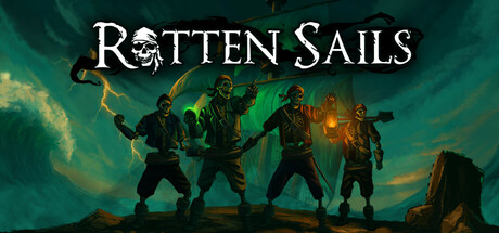
  • Genre Clarity: 8/10 — Strong pirate horror action read. The silhouettes of four armed figures in a ship setting against a supernatural green-yellow sky immediately communicate action-adventure with horror elements. The skull motif in the title and eerie atmospheric lighting reinforce the supernatural pirate theme effectively. At tiny size, the grouped character silhouettes and glowing sky still communicate danger and horror genre despite loss of fine detail.
  • Title Readability: 8/10 — Clear, well-positioned title. ROTTEN SAILS uses a clean serif font with strong white contrast against the dark upper portion of the image, placed in a controlled sky region away from busy character silhouettes. The title remains legible at small size with good letter spacing and weight. At tiny size, the text is still distinguishable though fine serifs blur slightly, but the overall word shape remains clear.
  • Contrast & Color: 8/10 — Strong value separation and saturation. The white title pops decisively against the dark teal-green background, and the character silhouettes are well-separated by bright orange-yellow fire and supernatural green lighting. The warm fire tones against cool blue-green water and sky create strong directional contrast. In grayscale, silhouettes maintain clear edges and the overall composition reads clearly at small and tiny sizes.
  • Uniqueness & Polish: 7/10 — Solid craft with strong thematic hook. The capsule effectively communicates the core pirate-horror premise through deliberate visual choices: cursed crew figures, haunted ship setting, supernatural lighting, and the skull-marked title font. The color palette and atmospheric effects feel intentional and cohesive. However, the composition is relatively straightforward for an action game—strong execution but not immediately distinctive compared to DREDGE or Lies of P's visual storytelling depth.
  • Brand Consistency: 7/10 — Coherent pirate horror identity. The capsule establishes a clear visual identity through consistent use of supernatural green lighting, nautical silhouettes, fire accents, and gothic title treatment that should carry through to store screenshots. The palette and eerie atmosphere feel branded and recognizable. The identity is memorable but relies on familiar pirate-horror tropes rather than a unique visual signature that would stand out immediately in a crowded store.
  • Composition: 8/10 — Clear hierarchy, balanced staging. The four-figure group creates a strong focal point in the center-right third of the frame, with the title anchoring the upper portion and atmospheric sky filling the upper background effectively. The composition uses depth layering with foreground characters, midground fire, and background sky. Characters remain well-positioned away from edges and the title sits safely within bounds; at small size, the grouped silhouettes and title remain the clear primary elements without distraction.

What works

  • Strong atmospheric lighting contrast. Warm orange fire and supernatural green glow create distinct value separation against the cool teal sky and dark water, maintaining silhouette clarity at all sizes.
  • Title placement and legibility. ROTTEN SAILS uses clean serif lettering with white-on-dark placement in a controlled sky region, remaining readable at tiny size without competing with character silhouettes.
  • Clear genre communication through staging. Four armed figures, ship setting, fire, and supernatural elements immediately convey action-adventure horror, with the skull motif reinforcing the pirate-cursed theme.
  • Balanced focal point hierarchy. The grouped character silhouettes create a strong visual anchor that guides attention without scattering focus across the composition.

What hurts the capsule

  • Limited unique visual hook. While well-executed, the composition relies on familiar pirate-horror visual tropes without a signature element that distinguishes it from similar adventure-horror titles in quick scroll.
  • Minimal storytelling depth. The capsule shows the premise clearly but doesn't visually communicate the co-op, loot, or progression elements that differentiate the core gameplay loop from standard action games.
  • Character detail loss at tiny size. Individual character details and equipment become indistinct silhouettes at thumbnail size, relying entirely on group pose and lighting to communicate tone rather than character distinction.

Priority fixes

  1. [uniqueness_polish] Add a distinctive visual element or character silhouette pose that signals the co-op pirate gameplay loop and differentiates from generic horror adventure titles at small size.
  2. [composition] Consider introducing a focal gameplay element (cursed treasure, supernatural ship detail, or unique crew gear) that telegraphs core mechanics rather than relying solely on atmospheric staging.
  3. [brand_consistency] Ensure the green-yellow supernatural lighting palette and skull motif are consistently applied across all store screenshots to reinforce brand identity recognition.

Store copy priority fixes

  1. [feature_communication] Replace vague atmospheric phrases with specific mechanic verbs: instead of 'Lurking Horrors: Every creak could be your last warning,' write 'Face creature encounters in procedurally cursed areas—manage resources, defend your crew, and survive the return voyage.'
  2. [uniqueness] Add a sentence that articulates the core game loop or unique hook, e.g., 'Combine ship management, resource gathering, and horror survival in a way [specific game X] does not—what sets this apart?'
  3. [audience_targeting] Clarify the tone balance between horror and humor by adding one sentence early in the detailed description that explains how 'Funny' elements fit alongside the dark atmosphere, e.g., 'Dark humor and absurdist moments punctuate the tension.'
  4. [feature_communication] Add a short bulleted feature on progression or unlocks: 'Unlock new cursed zones, ship upgrades, and crew abilities as you survive and return with treasure.'

Related guides

Steam app ID: 3022470 · Tags: Early Access, Pirates, Horror, Sailing, Co-op