NebuLeet scores 73/100 — better than 56% of Tactical capsules (n=1,380).

Quick text summary

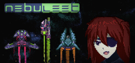
NebuLeet scored 73/100 on Steam Analyzer — Good for a Tactical capsule. Top priority fix: [genre_clarity] Replace the generic unit lineup with a scene that visually communicates the 'programming your units' mechanic—such as a UI overlay, code snippets, or visual feedback showing player input to unit output to telegraph the hybrid RPG-strategy gameplay loop.

Capsule scores by dimension

  • Genre Clarity: 7/10 — Sci-fi strategy with clear visual hierarchy. Pixel art aesthetic immediately signals indie game, and the arrangement of stylized units (left to right: symmetrical robot, tall staff-wielder, pyramid-shaped ship, character portrait) communicates tactical/strategy gameplay. At tiny size, the unit silhouettes remain distinct enough to suggest turn-based combat mechanics, though the specific RPG-strategy hybrid nature requires prior knowledge. The neon color palette reinforces sci-fi setting effectively.
  • Title Readability: 8/10 — Clean neon logo, solid readability. The 'nebuLeet' logo at top uses consistent neon green/cyan letterforms with a sleek, futuristic font that maintains clarity from full size down to small. At tiny size the text remains legible due to even stroke weight and spacing. The stylized lowercase 'L' replacement is a nice touch but doesn't compromise parsing. No competing taglines or clutter around the title area.
  • Contrast & Color: 8/10 — Strong neon pop against dark background. The neon green logo, bright magenta/pink unit, cyan accents, and red-haired character portrait create excellent value separation against the dark space background (#1b2838 equivalent). Grayscale squint test shows distinct silhouette for the character and unit shapes. The saturated color choices avoid muddy mid-tones and maintain visual pop even at tiny thumbnail size.
  • Uniqueness & Polish: 7/10 — Retro pixel art with stylish execution. The pixel art style is well-executed with intentional neon coloring that signals premium indie polish rather than cheap asset store work. The character design (reddish hair, purple eye covering) and abstract unit forms show deliberate art direction. However, pixel art is common in indie games, and the composition feels like a lineup rather than storytelling that communicates a unique mechanic or hook. The capsule is polished but not groundbreaking in concept.
  • Brand Consistency: 7/10 — Coherent neon retro aesthetic throughout. The neon green logo, consistent pixel art rendering, dark sci-fi background, and cyberpunk color palette create a recognizable internal identity. The character portrait and unit designs suggest a specific visual language that could be identified across marketing materials. No clashing art styles or tonal inconsistencies. Strong enough to feel branded without being iconic enough to be instantly memorable across the genre.
  • Composition: 7/10 — Balanced lineup with clear focal points. The composition arranges four distinct elements (three units on left, character portrait on right) creating a natural left-to-right read. The character portrait anchors the right side effectively and the units provide visual interest without cluttering. At small size, the arrangement remains readable with good distribution. Safe margins appear adequate, though the portrait sits slightly close to the right edge—acceptable but not ideal for Steam cropping resilience.

What works

  • Distinctive neon sci-fi aesthetic. The green and cyan neon palette combined with pixel art creates immediate visual identity that stands out in scrolling and avoids generic space game templates.
  • Clear unit and character silhouettes. Each visual element (abstract robots, character portrait) maintains distinct shapes that read well even at tiny thumbnail size due to strong outlines and contrasting colors.
  • Legible logo placement and execution. The neon green title at top uses consistent letterforms that preserve readability from full to tiny size without decorative degradation.

What hurts the capsule

  • Limited visual storytelling. The capsule shows a lineup of assets rather than communicating a core mechanic or narrative hook—genre is clear but the unique selling point (paramilitary force, cult threat, programming mechanics) is not visually suggested.
  • Generic composition structure. The left-to-right unit display is functional but common in strategy games and doesn't convey the game's programming or tactical depth differentiators.
  • Portrait placement risk. The character portrait sits near the right edge and risks being cropped or obscured depending on Steam's display context across different store pages.

Priority fixes

  1. [genre_clarity] Replace the generic unit lineup with a scene that visually communicates the 'programming your units' mechanic—such as a UI overlay, code snippets, or visual feedback showing player input to unit output to telegraph the hybrid RPG-strategy gameplay loop.
  2. [uniqueness_polish] Add a subtle visual element (glow effects, layered background, UI framing) that hints at the cult threat or narrative context rather than a detached asset showcase, giving the capsule narrative weight.
  3. [composition] Adjust character portrait margin to create clear safe zone from right edge, allowing for flexible cropping across Steam catalog displays without cutting off the visual anchor.

Store copy priority fixes

  1. [hook_strength] Rewrite the short description opening to lead with the core differentiator: 'Program your android fleet with visual code and watch tactical combat unfold—or take manual control. Face a growing space Cult in this RPG-strategy hybrid with infinite ship customization.'
  2. [feature_communication] Add one paragraph in the detailed description that explicitly explains what visual programming looks like and how it changes gameplay, since it's the game's most unique mechanic but lacks concrete examples.
  3. [audience_targeting] Strengthen the narrative hook by adding 2–3 sentences about faction choices, the Cult threat escalation, and how pilot management ties into story progression, to signal appeal to RPG-focused players alongside programmers.
  4. [tone_match] Replace casual insertions ('The coolest part,' 'death machine') with voice that mirrors the game's identity—either systematically precise throughout, or deliberately dry/futuristic in a way that feels intentional rather than marketing-speak.

Related guides

Steam app ID: 3024370 · Tags: Tactical, RPG, Open World, Sandbox, Simulation