Scoring genre clarity...
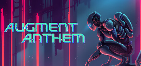
Combine four Augment types to transform your gun, movement, and traversal in a 2D sci-fi metroidvania. Explore interconnected environments from flooded ruins to abandoned bunkers, fight biomechanical threats, and rebuild the last human settlement.
$19.995 user reviews
ExplorationMetroidvania2D Platformer
Project EgoMay 15, 2026