Scoring genre clarity...

Bubsy in: The Purrfect Collection capsule

Bubsy in: The Purrfect Collection

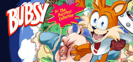
Is Bubsy a celebrated icon from the mascot wars of the early 90s or a platforming punchline? Bubsy in: The Purrfect Collection explores the franchise's troubled history and enduring popularity. A playable history that includes games, artifacts and interviews. What could possibly go wrong?

$19.99Very Positive(12)
Side Scroller2D Platformer3D Platformer
Limited Run GamesSep 9, 2025

Bubsy in: The Purrfect Collection scores 77/100 — better than 79% of Side Scroller capsules (n=1,065).

Very Positive (12 reviews) · $19.99 · Released Sep 9, 2025 · By Limited Run Games

Quick text summary

Bubsy in: The Purrfect Collection scored 77/100 on Steam Analyzer — Good for a Side Scroller capsule. Top priority fix: [title_readability] Increase tagline font weight or simplify the 'Purrfect Collection' text to ensure legibility at TINY size without losing the playful pun.

Capsule scores by dimension

  • Genre Clarity: 8/10 — Recognizable 90s platformer mascot. Bubsy's orange cat character, exaggerated expression, and playful pose immediately signal a retro platformer or action-adventure game from the 90s mascot era. The vibrant, chaotic background with colorful geometric shapes reinforces the arcade action vibe. At TINY size, the character silhouette and bright palette still read as lighthearted action platformer.
  • Title Readability: 7/10 — Strong title, readable tagline placement. The 'BUBSY' logo in bold white with red outline stands out clearly against the dark left side, maintaining legibility even at SMALL size. The red tagline 'In: The Purrfect Collection' is visible but becomes harder to parse at TINY size due to smaller letterform weight. At FULL size both elements read cleanly with good contrast separation.
  • Contrast & Color: 8/10 — High saturation, clear subject separation. Bubsy's orange fur, white accents, and blue clothing create strong value and hue separation against the dark background and busy mid-tones. The character pops clearly even at SMALL size due to warm orange against cool blues and dark tones. In grayscale, the white title and character maintain excellent silhouette clarity against the darker background elements.
  • Uniqueness & Polish: 7/10 — Nostalgic appeal with confident art direction. The capsule leans intentionally into 90s aesthetic with Bubsy's iconic exaggerated grin, chunky proportions, and retro styling that feels authentic rather than derivative. The colorful background pattern with geometric shapes and game references shows deliberate art direction tied to the collection concept. While not groundbreaking visually, the execution feels premium and purposeful for a retrospective compilation.
  • Brand Consistency: 8/10 — Strong character identity and era-specific branding. Bubsy's distinctive facial features, orange color, and 90s character design are immediately recognizable and consistent with the franchise's iconic look. The bright, chaotic composition with multiple visual references reinforces the 'collection' identity. The overall aesthetic coherently represents a 90s platformer retrospective without conflicting visual signals.
  • Composition: 8/10 — Clear focal point with balanced layering. Bubsy occupies the right-center to right side with strong eye contact and dynamic pose, creating a clear primary focal point that reads at all sizes. The title anchors the left side with breathing room, and the background pattern fills space without overwhelming the character. At TINY size, the composition remains readable with Bubsy as the undeniable hero and title clearly separated.

What works

  • Distinctive character focus. Bubsy's exaggerated expression and dynamic pose create immediate character recognition and personality that stands out from generic platformer covers.
  • Strong chromatic contrast. Orange, white, blue, and red elements create high saturation separation that reads clearly at SMALL and TINY sizes against the dark Steam background.
  • Coherent nostalgic branding. The entire composition reinforces authentic 90s mascot platformer identity without feeling like a poor pastiche or generic retro throwback.
  • Clear title hierarchy. The white 'BUBSY' logo with red outline occupies prime real estate on the left with excellent contrast and legibility at all viewing scales.

What hurts the capsule

  • Tagline legibility at tiny size. The 'In: The Purrfect Collection' red text becomes muddy and hard to parse at TINY thumbnail size despite acceptable SMALL size performance.
  • Busy background pattern. While thematically appropriate for a collection, the dense geometric and colorful background creates visual noise that competes slightly with Bubsy's silhouette at very small scales.
  • Limited visual storytelling. Beyond 'retro platformer collection,' the capsule does not strongly communicate gameplay mechanics or the unique retrospective/documentary angle mentioned in the game description.

Priority fixes

  1. [title_readability] Increase tagline font weight or simplify the 'Purrfect Collection' text to ensure legibility at TINY size without losing the playful pun.
  2. [genre_clarity] Add a subtle UI element or mechanical hint (e.g., a small level platform or game artifact icon) to reinforce the collection and retrospective nature beyond just character appearance.
  3. [composition] Consider darkening or slightly simplifying the background pattern intensity to let Bubsy's character read with even stronger separation at TINY scrolling speed.

Store copy priority fixes

  1. [feature_communication] Move or restructure the 'Included Titles' section to appear immediately after the introductory paragraph so players know exactly which four games are in the collection without scrolling.
  2. [hook_strength] In the short description, add a single sentence explicitly stating 'Play all four Bubsy games enhanced for modern platforms' to balance the retrospective framing with core gameplay appeal.
  3. [audience_targeting] Add a one-sentence clarifier such as 'Ideal for retro platformer fans and Bubsy legacy enthusiasts' to make the intended audience even more explicit and lower friction for uncertain buyers.

Related guides

Steam app ID: 3039890 · Tags: Side Scroller, 2D Platformer, 3D Platformer, Platformer, 2D