Scoring genre clarity...

Onimusha 2: Samurai's Destiny capsule

Onimusha 2: Samurai's Destiny

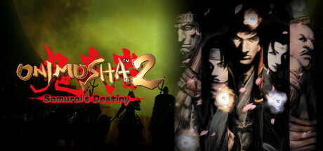
Reclaim your destiny. Onimusha 2: Samurai's Destiny returns with higher resolution graphics and modernised controls to perform issen critical counter attacks and intense swordplay. Experience this dramatic revenge story set in Feudal Japan.

$14.99Very Positive(16)
ActionDark FantasySurvival Horror
CAPCOM Co., Ltd.May 22, 2025

Onimusha 2: Samurai's Destiny scores 68/100 — better than 17% of Action capsules (n=8,534).

Very Positive (16 reviews) · $14.99 · Released May 22, 2025 · By CAPCOM Co., Ltd.

Quick text summary

Onimusha 2: Samurai's Destiny scored 68/100 on Steam Analyzer — Solid for a Action capsule. Top priority fix: [contrast_color] Increase overall saturation and reduce atmospheric fog density to sharpen silhouette edges and boost visual pop at small and tiny sizes, matching the vibrancy of top-tier action game capsules.

Capsule scores by dimension

  • Genre Clarity: 8/10 — Strong feudal action game signaling. The right side displays multiple characters in period-appropriate armor and clothing against a dark, atmospheric background, clearly communicating a samurai action setting. At tiny size, the silhouettes and armor details remain readable enough to suggest historical action gameplay, though the specific 'Onimusha' theme is less obvious without the logo. The composition avoids modern or sci-fi elements that would confuse genre expectations.
  • Title Readability: 7/10 — Logo readable at full, some decay at tiny. The 'ONIMUSHA 2' logo in the upper left uses orange and red styling with a distinctive red kanji character overlay, which reads clearly at full header size and remains distinguishable at small capsule size. However, at tiny thumbnail size (120x45), the tagline 'Samurai's Destiny' becomes illegible and the overall logo begins to blur slightly, reducing clarity. The logo placement on a controlled background helps, but fine details suffer at the smallest size.
  • Contrast & Color: 7/10 — Good value separation, minor midtone softness. The logo's warm orange and red tones create clear separation from the dark green-black background, and character silhouettes on the right benefit from rim lighting that separates them from the murky midground. In grayscale, the composition maintains reasonable contrast between the bright logo area and dark character section. Some atmospheric fog blending in the center creates softer transitions that reduce punch slightly at tiny sizes, but the overall read remains functional.
  • Uniqueness & Polish: 6/10 — Competent but familiar action game template. The capsule uses a standard action game layout: branded logo on left, character ensemble on right with moody lighting and period costume detail. While the samurai setting is appropriate and the character render quality is respectable, the overall composition mirrors many similar action-adventure releases (visible in comparison to Ghost of Tsushima and Lies of P benchmarks). There is no distinctive hook or visual storytelling element that communicates 'Onimusha' specifically—just a generic feudal action vibe.
  • Brand Consistency: 6/10 — Recognizable logo, generic character staging. The red kanji and orange 'ONIMUSHA 2' wordmark are internally consistent and would be recognizable to returning fans, establishing brand identity through the logo alone. The character ensemble and dark atmospheric treatment are competent but do not feature any series-specific motif, icon, or signature visual cue beyond the costume period. Internal cohesion is sound (lighting, color grading, rendering), but there are no memorable identity signals beyond the logo itself.
  • Composition: 7/10 — Clear two-zone layout, minor edge tension. The composition divides clearly into a logo-focused left zone (orange warmth) and a character-focused right zone (cool darkness), creating good visual hierarchy and balance. The focal point shifts appropriately from logo at full size to character silhouettes as the eye moves right, supporting quick recognition. At tiny size, the layout remains readable, though character faces on the far right edge risk minor cropping and some compositional 'weight' sits near the frame boundary, creating slight tension in the safe margin.

What works

  • Logo stands out against background. The orange and red 'ONIMUSHA 2' wordmark with red kanji overlay provides strong warm-color contrast against the dark green-black gradient and remains legible at small capsule sizes.
  • Character silhouettes communicate genre. The right side features well-lit samurai and period-costumed characters that immediately signal historical action gameplay and create visual intrigue despite atmospheric softness.
  • Clear compositional structure. The left-to-right logo-to-characters layout creates logical visual hierarchy and guides the eye in a natural scanning pattern without competing focal points.

What hurts the capsule

  • Generic action game template. The ensemble-on-dark-background composition closely mirrors many competing action-adventure titles without a distinctive visual hook unique to Onimusha's identity or mechanics.
  • Tagline becomes unreadable at tiny size. The 'Samurai's Destiny' subtitle loses legibility at 120x45 thumbnail resolution, reducing the completeness of the branded messaging at the most common browsing size.
  • Atmospheric fog softens contrast. The heavy greenish fog and midtone blending in the center reduces overall pop and crispness compared to top-performing competitors, making the capsule feel slightly diffuse rather than punchy.
  • No series-specific visual identity cues. Unlike the benchmark titles, this capsule relies entirely on the logo for brand recognition and lacks a memorable character, symbol, or color motif that signals 'Onimusha' beyond the wordmark.

Priority fixes

  1. [contrast_color] Increase overall saturation and reduce atmospheric fog density to sharpen silhouette edges and boost visual pop at small and tiny sizes, matching the vibrancy of top-tier action game capsules.
  2. [uniqueness_polish] Introduce a signature Onimusha visual element—such as a glowing demon orb, iconic weapon, or series-specific UI accent—into the composition to differentiate from generic samurai action templates.
  3. [title_readability] Enlarge and reposition the 'Samurai's Destiny' tagline into the safe-margin zone or integrate it more boldly into the logo lockup so it remains readable at thumbnail size.
  4. [composition] Tighten character positioning slightly away from the right edge to ensure no cropping occurs and to reinforce the compositional balance in Steam's standard crop zones.

Store copy priority fixes

  1. [feature_communication] Add a 1-2 sentence description of the issen counter-attack system—explain *how* it works and why it creates engaging moment-to-moment gameplay (e.g., 'Master the issen system: precisely timed counter-attacks that turn enemy strikes into devastating openings').
  2. [uniqueness] Insert a sentence differentiating this game from other samurai or action-RPGs, such as 'Wield supernatural Oni powers to turn feudal Japanese warfare on its head' or 'The only samurai game that merges historical settings with supernatural Oni mythology.'
  3. [audience_targeting] Add an explicit audience signal in the short description such as 'For fans of challenging action combat and revenge-driven narratives' or 'Ideal for players seeking story-rich samurai action with high replay value.'
  4. [feature_communication] Briefly describe the role of allies in gameplay (e.g., 'Fight alongside powerful allies who unlock new combat abilities' or 'Manage a team of warriors, each with unique Oni powers').

Related guides

Steam app ID: 3046600 · Tags: Action, Dark Fantasy, Survival Horror, Action RPG, Swordplay