Scoring genre clarity...

Dual Eclipse capsule

Dual Eclipse

Restore order to the cosmos by seeking out a Prismatic Dragon imprisoned in the stars. Delve into dungeons, evade traps, and discover secrets. Seek adventure as one of three classes in this trick-taking RPG.

$4.99Positive(25)
Card BattlerRPGDungeon Crawler
Curly Goblin GamesSep 12, 2025

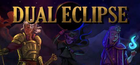
Dual Eclipse scores 73/100 — better than 58% of Card Battler capsules (n=660).

Positive (25 reviews) · $4.99 · Released Sep 12, 2025 · By Curly Goblin Games

Quick text summary

Dual Eclipse scored 73/100 on Steam Analyzer — Good for a Card Battler capsule. Top priority fix: [genre_clarity] Add a subtle visual cue (card motif, abstract trick pattern, or UI element) to signal the trick-taking card-game mechanic and differentiate from standard fantasy RPG

Capsule scores by dimension

  • Genre Clarity: 7/10 — Fantasy RPG with cosmic themes clear. Three distinct character classes (warrior, rogue, mage) are immediately recognizable via silhouette and color coding (gold armor, dark shadow form, purple arcane magic), signaling RPG or adventure gameplay. The central black circle with gradient rim evokes a celestial/cosmic setting tied to the Prismatic Dragon premise. At TINY size, character poses and magical effects read adequately as fantasy adventure, though the specific 'trick-taking RPG' mechanic is not visually communicated.
  • Title Readability: 8/10 — Bold gold serif type legible. DUAL ECLIPSE is rendered in a strong, high-contrast gold serif font positioned in the lower half against a dark background, maintaining excellent readability at both FULL and SMALL sizes. The letters have clean outlines and adequate spacing; the design holds up well at TINY size where the title remains distinguishable despite minor detail loss. No taglines or secondary text clutter the primary message.
  • Contrast & Color: 8/10 — Warm gold pops against dark space. The vibrant gold title and warm-toned character on the left (red, orange, yellow armor) create strong value separation against the deep purple-blue cosmic background (#1b2838 equivalent). Character silhouettes have clear edges enhanced by rim lighting and glowing magical effects (cyan, purple), ensuring visibility in grayscale. The composition avoids muddy mid-tones and maintains crisp separation between subject and background throughout all viewing sizes.
  • Uniqueness & Polish: 7/10 — Polished fantasy character art distinctive. The three stylized character designs show cohesive art direction and professional rendering with hand-crafted appearance rather than asset-store templating. The cosmic eclipse motif and character positioning suggest intentional visual storytelling. However, the core composition (three characters against starfield with central celestial object) is a relatively familiar fantasy game layout; while executed well, it lacks a truly distinctive mechanical or thematic hook that elevates it into premium tier.
  • Brand Consistency: 7/10 — Cohesive art style recognizable identity. The capsule exhibits consistent character rendering style, unified color palette (warm golds with cool purples and cyans), and a distinctive visual identity that matches a fantasy-RPG brand expectation. Character designs are memorable and appear to reflect the three-class system mentioned in the description. The warm/cool color contrast and hand-painted aesthetic create a recognizable internal identity, though without access to additional brand assets, deep consistency scoring is limited to visual cohesion alone.
  • Composition: 7/10 — Clear focal point with balanced trio. The three characters create a strong horizontal composition with the left-side warrior (gold armor) as the primary anchor, the central eclipse as the secondary focal point, and the right-side mage as supporting balance. The title sits cleanly in the lower third without competing for attention. At TINY size, the arrangement remains readable with good depth layering (foreground characters, midground eclipse, background stars). Safe margins appear adequate, though the left and right characters edge toward lateral boundaries—acceptable but slightly risky for Steam crop variance.

What works

  • Strong title contrast and legibility. Gold serif font maintains clarity at all sizes from FULL to TINY against dark background without outlines or decoration that would collapse at scale.
  • Three-character focal point composition. Character silhouettes are distinct, well-positioned, and immediately communicate RPG gameplay with diverse class visual identities (warrior, rogue, mage).
  • Cohesive warm-cool color palette. Gold, orange, and red character tones pop decisively against cool purple-blue cosmic background, maintaining strong silhouette separation in grayscale.
  • Professional hand-crafted art style. Character rendering and effects (rim lighting, glow) feel polished and intentional rather than generic or asset-store templated.

What hurts the capsule

  • Familiar composition lacks unique hook. Three-character lineup against starfield with central celestial object is a well-worn fantasy trope that doesn't immediately communicate what makes this game mechanically distinct.
  • Trick-taking mechanic not visually signaled. The unique 'trick-taking RPG' core mechanic has no visual cue or UI hint in the capsule; viewers see standard fantasy RPG iconography without understanding the card/trick-based gameplay.
  • Character edge positioning crop risk. Left warrior and right mage sit near lateral edges, creating minor risk of detail loss if Steam's cropping varies across resolutions or dynamic layouts.

Priority fixes

  1. [genre_clarity] Add a subtle visual cue (card motif, abstract trick pattern, or UI element) to signal the trick-taking card-game mechanic and differentiate from standard fantasy RPG
  2. [composition] Tighten lateral padding around left and right characters to ensure safe margin clearance and reduce crop vulnerability
  3. [uniqueness_polish] Consider an iconic symbol or motif (e.g., Prismatic Dragon silhouette, eclipse variant, or card suit integration) that could serve as a memorable brand identifier across store assets

Store copy priority fixes

  1. [audience_targeting] Add a line clarifying the intended experience: 'Perfect for solo strategy players seeking a relaxing deckbuilding adventure' or 'Built for hardcore optimization fans,' so players self-identify fit immediately.
  2. [hook_strength] Strengthen the short description opening with a more visceral verb: 'Duel your way through cursed dungeons in this trick-taking card RPG' leads with combat action rather than abstract restoration.
  3. [feature_communication] Expand the parry mechanic explanation: Add one sentence showing a tactical scenario, e.g., 'Parry to dodge damage and gain tempo, but fail and your opponent gains advantage'—this clarifies the risk/reward loop.
  4. [tone_match] Standardize voice to match indie enthusiasm: Either embrace the casual, punchy tone throughout (revise the opening) or elevate the combat language to match the poetic opening, so the voice feels cohesive.

Related guides

Steam app ID: 3048300 · Tags: Card Battler, RPG, Dungeon Crawler, Deckbuilding, PvE