Scoring genre clarity...

Luthier capsule

Luthier

Dive into dungeons, battle cursed souls, and craft powerful guitars in Luthier. Manage your guitar shop, upgrade your abilities, and become the ultimate guitar hero.

Action RoguelikeHack and SlashDungeon Crawler
Burak PişkinTo be announced

Luthier scores 70/100 — better than 25% of Action Roguelike capsules (n=1,730).

Released To be announced · By Burak Pişkin

Quick text summary

Luthier scored 70/100 on Steam Analyzer — Good for a Action Roguelike capsule. Top priority fix: [uniqueness_polish] Recompose the scene to prominently feature a character actively crafting or holding a glowing magical guitar to visually communicate the unique shop-management-plus-action hook, not just generic combat stance.

Capsule scores by dimension

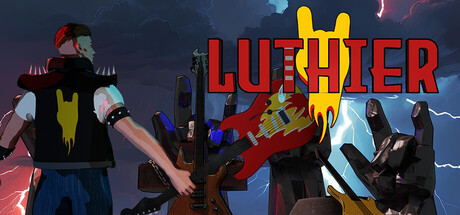
  • Genre Clarity: 7/10 — Action RPG with unique music twist. The capsule clearly communicates action through dynamic character poses, combat silhouettes, and glowing weapon effects against a dark fantasy backdrop. At TINY size, the red/yellow color scheme and aggressive stances read as action-RPG, and the guitar motif in the title provides the unique hook, though the guitar crafting mechanic is not immediately visually apparent from the artwork alone.
  • Title Readability: 8/10 — Clear bold red text with icon. The title 'LUTHIER' is rendered in large, bold red capital letters with strong contrast against the dark blue background and yellow guitar symbol above it. At SMALL size the text remains legible with good letterform separation; at TINY size it remains readable due to the large cap height and consistent stroke weight, though some fine details of the guitar icon become less distinct.
  • Contrast & Color: 8/10 — Strong red and yellow pop. The saturated red title and yellow guitar icon create excellent value separation against the cool dark blue-grey background, with warm tones pulling focus immediately. Character silhouettes on the right benefit from bright armor highlights and glowing effects that maintain clear edges even at tiny sizes; the overall palette avoids muddy mid-tones and sustains visual clarity in grayscale.
  • Uniqueness & Polish: 6/10 — Competent action-fantasy art. The character designs and combat poses are well-executed with clean linework and intentional color blocking, but the scene composition—multiple characters standing against a generic fantasy sky—reads as fairly standard for the genre without a distinctive narrative hook or unusual visual angle. The guitar symbol is a memorable unique selling point, but the artwork itself does not convey the shop management or crafting loop that differentiates this title, keeping it at baseline competence rather than premium polish.
  • Brand Consistency: 6/10 — Consistent style, limited icon memory. The art direction is internally coherent with a unified color palette (warm reds/yellows against cool blues), consistent character rendering style, and stable visual hierarchy across elements. However, without multiple reference materials visible here, the capsule lacks a strongly iconic character or motif that would create immediate brand recognition; the guitar symbol is the strongest identity cue but feels more like a thematic label than a signature brand mark.
  • Composition: 7/10 — Clear focal point, good balance. The title and yellow guitar symbol occupy the upper-right quadrant as a strong primary focal point, while the character group on the left provides visual weight and action context without overshadowing the title. The layout maintains safe margins and the title does not sit too close to edges; however, at TINY size the composition compresses slightly and the supporting characters on the right become secondary noise rather than reinforcing the central message, which is acceptable but not exemplary for discoverability.

What works

  • Bold readable title with icon. The large red 'LUTHIER' text and yellow guitar symbol remain legible at SMALL and TINY sizes due to high contrast, consistent stroke weight, and intentional spacing.
  • Strong color contrast against Steam dark background. The warm red and yellow palette creates immediate visual pop and clear silhouette separation in grayscale, making the capsule stand out during quick scroll.
  • Coherent internal art direction. Character designs, lighting, and color blocking are consistently rendered with clean execution and no tonal confusion or cheap asset feel.

What hurts the capsule

  • Generic fantasy combat scene without unique hook. While the characters and poses are well-drawn, the composition reads as a standard action-RPG group shot rather than communicating the distinctive guitar crafting or shop management gameplay loop.
  • Limited brand identity beyond title symbol. The capsule lacks a memorable character, mascot, or signature visual motif that would create lasting brand recognition across multiple viewings or comparisons with competitor titles.
  • Supporting characters become noise at tiny sizes. The figure group on the right compresses into secondary visual clutter at TINY size and does not clearly reinforce the core message beyond confirming it is an action game.

Priority fixes

  1. [uniqueness_polish] Recompose the scene to prominently feature a character actively crafting or holding a glowing magical guitar to visually communicate the unique shop-management-plus-action hook, not just generic combat stance.
  2. [brand_consistency] Introduce or emphasize an iconic character silhouette, distinctive color motif, or signature visual element that could be recognized across multiple marketing materials and in-game branding to build stronger recall.
  3. [composition] Simplify or consolidate the supporting character group on the right so one figure or element clearly guides the eye toward the title rather than competing for attention in the frame.

Store copy priority fixes

  1. [hook_strength] Replace 'become the ultimate guitar hero' with a verb-forward hook that emphasizes the core tension—e.g., 'Craft guitars to survive cursed dungeons and build a thriving music shop empire' to immediately clarify the dual gameplay loop.
  2. [tone_match] Remove theatrical phrases like 'The stage is set, and the spotlight is yours' and replace with dark, grounded language that matches the 'cursed souls' combat setting—e.g., 'forge legendary instruments to survive the depths.'
  3. [feature_communication] Add 2–3 concrete examples of how guitar properties affect combat strategy—e.g., 'Each guitar modifies your combat style: fast attacks, heavy damage, or magical effects' to explain what makes crafting meaningful.
  4. [audience_targeting] Clarify the intended player in the opening by specifying whether combat or crafting is primary—e.g., 'For roguelike fans who crave character progression' or 'For crafters who want dungeon combat with meaningful gear progression' to signal the right audience.

Related guides

Steam app ID: 3052870 · Tags: Action Roguelike, Hack and Slash, Dungeon Crawler, Roguelite, Roguelike