Scoring genre clarity...
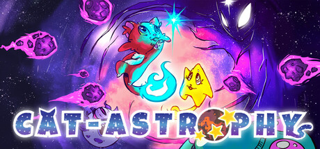
Cat-Astrophy capsule

Cat-Astrophy

Cat-Astrophy is a space action roguelite: mix abilities, adapt your build and playstyle in every run to master frantic combat and precise jumps across procedurally generated planets; death is permanent. Can you survive the cat-astrophe?

RogueliteAction-AdventureAction Roguelike
Heraan StudiosComing soon

Cat-Astrophy scores 73/100 — better than 54% of Roguelite capsules (n=2,398).

Released Coming soon · By Heraan Studios

Quick text summary

Cat-Astrophy scored 73/100 on Steam Analyzer — Good for a Roguelite capsule. Top priority fix: [genre_clarity] Add a subtle visual cue that hints at the roguelite procedural mechanic, such as layered planet fragments, a DNA helix, or deck-building visual motif to differentiate from generic space action.

Capsule scores by dimension

  • Genre Clarity: 7/10 — Space action with cat protagonists clear. The neon glowing eyes, space setting with stars, and dynamic cat characters immediately signal action-adventure gameplay with a comedic tone. At TINY size, the red glowing eyes and yellow cat silhouette read as energetic action, though the roguelite procedural generation aspect is not visually communicated. The genre feels solidly action-adventure indie rather than puzzle or strategy.
  • Title Readability: 8/10 — Bold neon title with excellent contrast. The white text with cyan and magenta neon outline sits cleanly against the dark purple background, creating strong value separation that holds at SMALL and TINY sizes. The all-caps letterforms are consistent and bold, though at TINY size the subtitle or descriptive text becomes unreadable—the main title 'CAT-ASTROPHY' remains clear and punchy. Strategic placement in the lower third keeps the title free from character overlap.
  • Contrast & Color: 8/10 — Strong neon pop against dark space. The bright red cat eyes, cyan-outlined title, and warm yellow secondary character create excellent luminance separation against the deep purple-blue starfield. At TINY size, the glowing eyes and neon text still read with clarity due to the high saturation and value contrast. In grayscale, the title outline and character highlights maintain distinct silhouettes, though the midtone purple blends slightly with the dark background.
  • Uniqueness & Polish: 7/10 — Charming cat aesthetic with playful execution. The stylized cat characters with expressive glowing eyes and the neon cyberpunk treatment feel distinctive for an indie action title, moving beyond generic space-shooter templates. The pun-driven branding ('Cat-Astrophy') and character personality suggest intentional art direction and humor. However, the execution sits at solid competence rather than premium craftsmanship—the effects feel playful but not exceptionally polished compared to top-tier indie peers like Hades II or COCOON.
  • Brand Consistency: 7/10 — Recognizable cat identity with neon style. The red and yellow cat duo with consistent art style and neon glow effects form a memorable visual identity that would be recognizable in store screenshots. The cyan-magenta neon palette is cohesive and ties directly to the brand aesthetic. The style is internally consistent across the two characters, though without access to the 10 store screenshots, the depth of brand recognition signals cannot be fully verified—the capsule alone suggests strong coherence.
  • Composition: 7/10 — Balanced layout with clear focal hierarchy. The red cat commands the left-center focus with glowing eyes as the primary draw, while the yellow cat on the right provides visual balance without competing for attention. The neon title anchors the bottom, creating a stable three-point composition that holds even at TINY size. The deep space background with stars provides breathing room, though some mid-space elements feel slightly scattered—the glowing eyes at the top are striking but could risk cropping at edge margins on certain Steam layouts.

What works

  • Neon title readability. Cyan and white outline text maintains legibility from full header down to tiny thumbnail due to strong contrast and bold letterforms.
  • Character personality. Expressive glowing eyes and distinct cat designs convey charm and energy, immediately signaling indie action-adventure tone.
  • Color separation. Red, cyan, magenta, and yellow create saturation-driven contrast that pops against the dark purple background across all viewing sizes.
  • Balanced composition. Two-character layout with symmetrical spacing and centered title creates visual stability without wasted or cluttered areas.

What hurts the capsule

  • Roguelite gameplay obscured. The procedural generation, permadeath, and build-adaptation mechanics that define the game are not visually communicated; the capsule reads as generic action.
  • Limited visual depth. The starfield background is functional but flat; there is minimal layering or environmental storytelling that hints at the gameplay loop or core mechanic.
  • Glowing eye placement risk. The red eyes at the very top center risk cropping or awkward positioning depending on Steam layout margins and aspect ratio shifts.
  • Tagline or descriptor unreadable. Any secondary text below or near the title becomes illegible at SMALL and TINY sizes, reducing ability to communicate unique selling point quickly.

Priority fixes

  1. [genre_clarity] Add a subtle visual cue that hints at the roguelite procedural mechanic, such as layered planet fragments, a DNA helix, or deck-building visual motif to differentiate from generic space action.
  2. [composition] Reposition or anchor the red glowing eyes lower to ensure they stay safely within cropping margins on all Steam layout variations, preventing cutoff.
  3. [uniqueness_polish] Enhance the starfield or background with subtle procedural or fractured elements that reinforce the 'procedurally generated planets' core mechanic without cluttering the focal area.
  4. [title_readability] Consider adding a single readable subtitle or tagline at readable size (e.g., 'Space Roguelite' or 'Permadeath Action') to reinforce genre identity at SMALL thumbnail view.

Store copy priority fixes

  1. [uniqueness] Add one concrete example of a Star Cursor interaction and synergy (e.g., 'Combine the Cursor's dash ability with a speed module to chain rapid attacks and burst through armor') to show how the system creates meaningful combinations and differentiates from standard action roguelikes.
  2. [feature_communication] Expand the procedural generation claim with specificity: clarify whether boss patterns, enemy types, or full room layouts vary per run, and note any handcrafted anchors that ensure polish and fairness.
  3. [tone_match] Replace the closing 'Add to wishlist' call-to-action with a final challenge or motivational line that reinforces the game's core appeal (e.g., 'Every run teaches you something new. Are you ready to face the cosmic unknown?') to end on the game's voice, not a store template.
  4. [audience_targeting] Explicitly name the skill floor and ceiling (e.g., 'Master attack timing and parkour precision to survive') to help players self-select and set realistic expectations before purchase.

Related guides

Steam app ID: 3059040 · Tags: Roguelite, Action-Adventure, Action Roguelike, 2D Platformer, Hack and Slash