Scoring genre clarity...
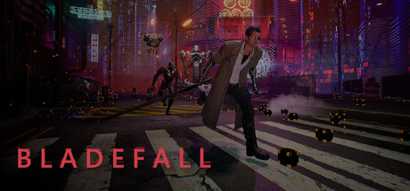
Bladefall capsule

Bladefall

BladeFall is a fast-paced hack-and-slash game featuring fluid melee combat, 2.5D movement, and challenging battles against varied enemies and powerful bosses. Master timing and skill-based attacks as you fight through an evolving system built to test your abilities.

Free to Play5 user reviews
Hack and SlashSide ScrollerCyberpunk
Midnight Ghoul GamesJun 13, 2026

Bladefall scores 70/100 — better than 29% of Hack and Slash capsules (n=995).

5 user reviews · Free to Play · Released Jun 13, 2026 · By Midnight Ghoul Games

Quick text summary

Bladefall scored 70/100 on Steam Analyzer — Good for a Hack and Slash capsule. Top priority fix: [uniqueness_polish] Integrate a visible gameplay element—such as a glowing weapon effect, active stance animation, or skill indicator—that hints at the hack-and-slash timing or 2.5D movement system and differentiates from generic action poses.

Capsule scores by dimension

  • Genre Clarity: 7/10 — Action combat clear, setting ambiguous. The protagonist in a combat-ready stance on a crosswalk with neon cyberpunk cityscape clearly signals action-oriented gameplay, and the melee weapon silhouette supports hack-and-slash expectation. However, at TINY size the setting dominates over character clarity, and the neon aesthetic could suggest action RPG or cyberpunk stealth rather than pure skill-based melee combat. The visual leans heavily on environment mood rather than communicating the 2.5D movement or boss-focused combat loop distinctly.
  • Title Readability: 8/10 — Bold title, excellent contrast hold. BLADEFALL is rendered in large, bright magenta/pink lettering positioned at lower left with strong contrast against the dark street and neon background, maintaining legibility at SMALL size. At TINY size the title remains readable due to its weight and saturation, though some letterform definition softens. Strategic placement avoids key character silhouette and keeps the logo in a relatively clean zone, supporting quick recognition during scroll.
  • Contrast & Color: 8/10 — Strong neon pop, excellent value separation. The magenta title and red/pink neon signs create sharp value contrast against the dark street pavement and cool shadow midtones, reading cleanly even at TINY size. The protagonist's brown coat and pale skin separate well from the darker surroundings, and the white crosswalk provides directional emphasis. In grayscale, the lighting separation remains clear, with the neon glow creating distinct edges around key elements.
  • Uniqueness & Polish: 6/10 — Polished cyberpunk aesthetic, generic composition. The image demonstrates professional lighting, color grading, and atmospheric detail with moody neon reflections and environmental depth, but the crosswalk standoff pose and isolated character against cityscape is a well-worn action game trope. While visually competent, it does not communicate a distinctive mechanical hook—no visible combo indicator, parry UI, or unique art style differentiates it from other action titles on the store. The cyberpunk setting is executed well but is not novel.
  • Brand Consistency: 6/10 — Cohesive neon theme, minimal identity. The warm/cool neon color palette and cyberpunk street setting are internally consistent and support a recognizable mood, but there are no distinctive character traits, iconic symbols, or signature visual motifs that would make Bladefall memorable across multiple marketing materials. The protagonist is a generic suited figure without clear personality or branding cues. Consistency is present but does not elevate to a strong, recognizable brand identity.
  • Composition: 7/10 — Clear focal point, minor edge tension. The protagonist in center-right stance creates a strong primary focal point with clear depth layering: dark foreground street, mid-ground character, and background skyline with neon signs. The composition reads well at SMALL and TINY sizes and guides the eye effectively to the character. However, the title placement at lower left edge sits close to the crop boundary, and the upper background cityscape is dense with detail that could distract from the hero, though this does not significantly harm the overall read.

What works

  • Strong magenta title contrast. BLADEFALL lettering maintains excellent readability at TINY size due to bright saturation and deliberate placement away from busy neon background noise.
  • Clear depth and atmospheric mood. Layered foreground, midground character, and background skyline create visual hierarchy that supports quick recognition even at small sizes.
  • Professional color grading and lighting. Neon reflections, warm/cool temperature contrast, and shadow detail elevate the visual polish and cinematic presentation.

What hurts the capsule

  • Generic action game pose and framing. The crosswalk standoff silhouette is a common trope in action marketing that does not differentiate Bladefall from competitor titles like Black Myth: Wukong or Helldivers 2.
  • No visible gameplay or mechanical hook. Unlike top performers such as Lies of P or Armored Core VI, the capsule does not hint at the skill-based combat, 2.5D movement, or boss-focused loop through UI elements, weapon detail, or pose that implies unique mechanics.
  • Weak brand identity or character memorability. The protagonist lacks distinctive costume, stance, or personality traits that would make this character recognizable in future marketing or social media.

Priority fixes

  1. [uniqueness_polish] Integrate a visible gameplay element—such as a glowing weapon effect, active stance animation, or skill indicator—that hints at the hack-and-slash timing or 2.5D movement system and differentiates from generic action poses.
  2. [genre_clarity] Emphasize the protagonist's melee weapon detail and combat readiness in the pose or lighting to more clearly signal skill-based hack-and-slash combat over cyberpunk exploration or stealth.
  3. [brand_consistency] Add a distinctive character trait, armor detail, or signature weapon design that creates a memorable identity and can anchor future Bladefall marketing assets.

Store copy priority fixes

  1. [feature_communication] Replace 'evolving system built to test your abilities' with a specific example: e.g., 'Unlock new combat abilities and face increasingly complex enemy patterns as you progress.'
  2. [genre_clarity] Restructure the detailed description to lead with the core combat loop and tier structure before diving into the simulation narrative—e.g., open with 'Fight through waves of enemies and bosses using timing-based melee attacks. As you progress, reality breaks down around you...'
  3. [audience_targeting] Add a sentence clarifying difficulty or skill accessibility: e.g., 'Whether you're a fighting game veteran or new to action games, master the basics and face harder challenges as you improve.'
  4. [uniqueness] Explain how the simulation mechanic affects gameplay: e.g., 'Watch the world glitch and collapse in real-time during combat, revealing hidden paths and new enemy encounters.'

Related guides

Steam app ID: 3066110 · Tags: Hack and Slash, Side Scroller, Cyberpunk, Action, 2.5D