Scoring genre clarity...

Piggly Pagly Boom capsule

Piggly Pagly Boom

Can you master this red-hot fireball platform shooting game? Save the world or get turned into roasted ham!

$5.99
Puzzle PlatformerPlatformerArcade
9RatonesOct 3, 2025

Piggly Pagly Boom scores 70/100 — better than 29% of Puzzle Platformer capsules (n=1,022).

$5.99 · Released Oct 3, 2025 · By 9Ratones

Quick text summary

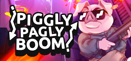
Piggly Pagly Boom scored 70/100 on Steam Analyzer — Good for a Puzzle Platformer capsule. Top priority fix: [genre_clarity] Add a clear fireball or shooting mechanic visual cue, such as a prominent projectile in the character's hand or a trajectory arc, to communicate the platform shooter genre specifically.

Capsule scores by dimension

  • Genre Clarity: 7/10 — Action arcade energy clear. The bright magenta/purple palette, explosive effects, and cartoonish pig character with sunglasses signal arcade action gameplay. At TINY size, the bold character silhouette and flame effects still read as energetic action, though the platform shooter mechanic is not immediately obvious from visuals alone. The genre leans action-casual but lacks specific UI or mechanic cues that would clarify the fireball shooting mechanic.
  • Title Readability: 8/10 — Bold outline text highly legible. The title uses thick white letters with a heavy black outline and curved bubble-style background shape, ensuring strong contrast against the magenta background. At SMALL and TINY sizes, the text remains readable due to the bold weight and outline treatment. The three-line layout is clean and the words stack logically, though at TINY size some letter spacing tightens slightly.
  • Contrast & Color: 8/10 — High saturation pop strong separation. The magenta, orange, and pink palette creates vivid value separation against Steam's dark background. The white title text pops clearly, and the pink/purple character and flame effects maintain strong silhouettes even in grayscale due to distinct mid and light tones. At TINY size, the color intensity and light-dark contrast preserve readability and visual impact.
  • Uniqueness & Polish: 6/10 — Playful but slightly generic execution. The art style is clean and cartoonish with a fun pig character wearing sunglasses, which has charm and personality. However, the overall composition feels like a standard character-with-explosion-effects template common in indie arcade games; the visual hook communicates fun but lacks a distinctive selling point beyond the character design. Polish is solid but the design does not stand out significantly from similar casual action titles.
  • Brand Consistency: 6/10 — Character present but no signature identity. The pig character is the main identity anchor and appears consistently, with a friendly cartoon style that suits the casual-action tone. However, there are no iconic symbols, unique color palette signature, or visual motifs that feel proprietary to this IP; the design could apply to many arcade games. The brand lacks memorable distinguishing markers that would enable recognition across multiple store assets.
  • Composition: 7/10 — Balanced layout clear focal point. The pig character anchors the right side with the title on the left, creating a balanced composition with clear hierarchy. The explosive background effects and gradient support without overwhelming the focal point. At SMALL size the layout reads well, though at TINY size the character's detail softens and the composition compresses, reducing dimensional clarity slightly. Safe margins around critical elements protect the layout during Steam cropping.

What works

  • Bold readable title treatment. White outlined text on bubble-shape background reads clearly from FULL to TINY size with strong contrast and intentional hierarchy.
  • Vibrant color palette pops. Magenta, orange, and pink create high saturation and strong value separation against Steam dark theme, ensuring visual impact at all sizes.
  • Character personality and charm. The sunglasses-wearing pig is approachable and memorable, signaling a fun casual-action tone that matches the game description.

What hurts the capsule

  • Generic template composition. The character-plus-explosion-effects layout is common in indie arcade games and does not communicate a unique selling point or memorable identity.
  • Mechanic clarity is weak. The fireball shooting mechanic is not visually communicated; the capsule reads as generic action-arcade rather than a platform shooter specifically.
  • Limited brand signature. No distinctive icons, symbols, or signature visual motifs exist to make this IP instantly recognizable across future store assets.

Priority fixes

  1. [genre_clarity] Add a clear fireball or shooting mechanic visual cue, such as a prominent projectile in the character's hand or a trajectory arc, to communicate the platform shooter genre specifically.
  2. [uniqueness_polish] Introduce a distinctive visual signature or color motif unique to Piggly Pagly Boom that could anchor brand recognition across future store pages and assets.
  3. [composition] Consider repositioning or emphasizing a secondary gameplay element (e.g., platforms, targets, or level environment) to hint at the platformer mechanic and reduce generic arcade feel.

Store copy priority fixes

  1. [audience_targeting] Add explicit mention of co-op mode early in the detailed description to highlight multiplayer appeal and justify the Split Screen and Family Sharing categories.
  2. [uniqueness] Rewrite the opening detailed description to lead with why the hookshot mechanic is a fresh take: 'Control the battlefield by anchoring your hookshot to ceilings, where the rope becomes your defense against bouncing fireballs.'
  3. [feature_communication] Expand powerup descriptions with one example of strategic impact: 'Powerups like freeze bursts (slow incoming fireballs) and rapid-fire shots (clear clusters faster) change how you tackle each level's chaos.'

Related guides

Steam app ID: 3069300 · Tags: Puzzle Platformer, Platformer, Arcade, 2.5D, Cute