Mythic Merchants scores 72/100 — better than 41% of Time Management capsules (n=936).

Quick text summary

Mythic Merchants scored 72/100 on Steam Analyzer — Good for a Time Management capsule. Top priority fix: [contrast_color] Darken or desaturate the wooden floor and gray workshop interior to increase silhouette separation and improve tiny-size clarity of character shapes.

Capsule scores by dimension

  • Genre Clarity: 7/10 — Casual crafting with quirky charm. The capsule clearly communicates a whimsical crafting/management game through the workshop setting, diverse character roster, and visual style suggesting indie casual gameplay. At tiny size, the colorful character silhouettes and workshop environment still read as a lighthearted strategy/crafting game, though the specific mechanics (time travel, automation) are not immediately apparent from visuals alone.
  • Title Readability: 8/10 — Bold orange text with solid contrast. The title 'MYTHIC MERCHANTS' is rendered in large, bold orange lettering with a dark outline, positioned centrally over the workshop scene. At tiny size, the text remains legible due to strong value contrast and letter weight, though some inner detail may soften slightly.
  • Contrast & Color: 7/10 — Warm palette pops against dark Steam background. The bright yellow sun, warm orange title, and vivid character colors (greens, purples, reds, yellows) create strong separation from the #1b2838 Steam background. The blue sky and white cloud base provide depth, though the mid-tone brown wooden floor and gray workshop details compress slightly in grayscale, reducing silhouette clarity at tiny sizes.
  • Uniqueness & Polish: 7/10 — Charming character design, playful aesthetic. The capsule features a distinctive art style with four expressive, whimsical characters (skeleton, muscular human, frog alchemist, tech wolf) that communicate personality and variety. The hand-drawn quality and character diversity suggest a polished indie production, though the overall composition is relatively balanced composition-wise without a singular standout visual hook that screams 'premium' at first glance.
  • Brand Consistency: 7/10 — Consistent character lineup with unified style. The four named characters (Tony, Mino, Rana, Vulf) are rendered in a consistent cartoon art style with strong individual silhouettes and color coding that should be recognizable across marketing materials. The whimsical character-driven approach and warm color palette establish a coherent brand identity, though without seeing other assets, internal consistency is assumed rather than confirmed.
  • Composition: 7/10 — Balanced ensemble with clear focal area. The characters are arranged around a central workshop with the title anchored in the middle, creating a balanced radial composition that guides the eye across all elements without obvious dead zones. At small and tiny sizes, the arrangement holds together well, though the distributed character placement means no single dominant focal point—the title becomes the anchor, which works effectively for brand recognition.

What works

  • Strong title contrast and legibility. Bold orange 'MYTHIC MERCHANTS' with dark outline maintains readability even at tiny thumbnail sizes.
  • Distinctive character personalities. Four diverse, expressive characters (skeleton mage, minotaur, frog, wolf) communicate charm and variety at both full and small sizes.
  • Cohesive warm color palette. Yellows, oranges, and greens pop effectively against the dark Steam background without feeling muddled or oversaturated.

What hurts the capsule

  • Workshop detail clarity at tiny size. Gray and brown architectural elements (building roof, wooden floor, shelves) lose definition at thumbnail scale and compress silhouette clarity.
  • Distributed focal points. Characters arranged equally around the space mean no single dominant subject emerges at quick glance, potentially reducing memorability versus a hero-centric layout.
  • Limited gameplay visual cues. Mechanics like automation, time travel, and tool upgrades are not visually represented—the capsule relies entirely on charm rather than gameplay hint.

Priority fixes

  1. [contrast_color] Darken or desaturate the wooden floor and gray workshop interior to increase silhouette separation and improve tiny-size clarity of character shapes.
  2. [composition] Consider shifting the strongest character (Mino or skeleton) slightly higher or forward to create a subtle focal hierarchy that still maintains ensemble charm.
  3. [genre_clarity] Add a small iconic workshop element or craft-related symbol (anvil, potion bottle, or gears) that hints at the crafting/management core without cluttering the design.

Store copy priority fixes

  1. [feature_communication] Restructure the detailed description: move the bulk of character backstories to a separate 'Meet the Merchants' section, and expand the 'Upgrade and Automate Your Workshop' section with 2-3 concrete examples of how era-based advancements change workshop layout or order complexity.
  2. [uniqueness] Add a dedicated paragraph explaining the time-travel mechanic: how many eras, what upgrades unlock, and how this mechanic differentiates the game from standard time-management sims.
  3. [audience_targeting] Insert a clear statement early in 'About the Game' section explicitly confirming whether the game is single-player only or whether co-op/online co-op replaces solo play—resolve the category metadata contradiction with copy clarity.
  4. [hook_strength] Replace the opening '
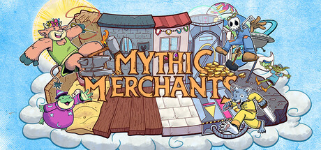
Craft magical gear in a bustling workshop' with a more specific, action-forward hook like 'Rise from a ramshackle forge to a thriving magical factory—craft, automate, and manage four eccentric merchants across time.'

Related guides

Steam app ID: 3074160 · Tags: Time Management, Strategy, Puzzle, Arcade, Character Customization