Scoring genre clarity...
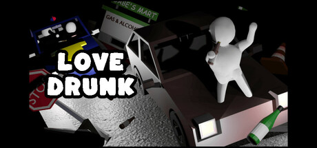
Drive in your car to your ex's place while picking up beverages along the way to keep yourself in the right state of mind. Cops don't like drunk drivers. HAVE FUN ! :)
$2.993 user reviews
CasualIndieArcade
General Goods and Services, Gabethedinosaur, Drww, Probably_Deficient, Aviyarn, Mel.Is.Not.OnlineApr 15, 2025