Scoring genre clarity...

Mortal Kombat X capsule

Mortal Kombat X

Experience the Next Generation of the #1 Fighting Franchise. Mortal Kombat X combines unparalleled, cinematic presentation with all new gameplay.

$19.99Very Positive(179)
FightingGoreAction
NetherRealm Studios, QLOCApr 13, 2015

Mortal Kombat X scores 92/100 — better than 98% of Fighting capsules (n=255).

Very Positive (179 reviews) · $19.99 · Released Apr 13, 2015 · By NetherRealm Studios

Quick text summary

Mortal Kombat X scored 92/100 on Steam Analyzer — Excellent for a Fighting capsule. Top priority fix: [genre_clarity] Consider a subtle background environment or second character silhouette to hint at 1v1 fighting match structure while maintaining dark cinematic tone.

Capsule scores by dimension

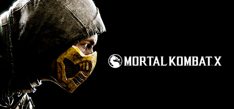
  • Genre Clarity: 9/10 — Brutal fighter identity crystal clear. The iconic Mortal Kombat dragon logo, menacing character with spiked armor and gold mask, bare muscular torso, and dark cinematic lighting immediately signal a hardcore fighting game with mature violence. At tiny size, the silhouette of the character and logo remain unmistakably MK franchise, establishing the fighting genre and brutal tone without ambiguity.
  • Title Readability: 9/10 — Logo and title flawlessly legible. The 'MORTAL KOMBAT X' title uses a clean, bold, all-caps sans-serif font in white with the iconic dragon logo on the left, positioned horizontally across the mid-lower portion of the capsule. At small and tiny sizes, the white text maintains perfect contrast against the dark background and character silhouette, and the logo remains recognizable as the franchise marker.
  • Contrast & Color: 9/10 — Dramatic dark lighting with hot accents. Strong value separation between the dark charcoal background, shadowed character torso, and bright golden mask detail on the right creates visual pop. The warm gold accent on the mask reads distinctly even at tiny thumbnail size, and the overall dark-to-light gradient hierarchy ensures the character and logo cut cleanly against the #1b2838 Steam background.
  • Uniqueness & Polish: 9/10 — Premium cinematic fighting flagship. The capsule exhibits AAA-level craft with professional character lighting, intentional composition that emphasizes intimidation, and the distinctive MK visual language of grounded realism mixed with stylized martial arts brutality. The branded dragon logo and gold accents signal a flagship franchise entry, not a generic action game, delivering clear premium positioning.
  • Brand Consistency: 10/10 — Iconic franchise identity unmistakable. The dragon logo, color palette of gold-on-dark, character armor design language, and cinematic pose are all signature Mortal Kombat visual DNA. These elements would be instantly recognizable to series fans across other marketing materials, establishing strong internal brand coherence and memorable identity cues.
  • Composition: 9/10 — Balanced focal hierarchy with clarity. The character fills the right two-thirds of the frame with clear silhouette and musculature, the dragon logo and title occupy the center-lower region without competing, and the left shoulder/arm provides subtle framing. At tiny size, the eye moves from logo to character to title in clear sequence, with no clutter or dead space, and critical elements sit safely within Steam's crop margins.

What works

  • Iconic franchise branding. Dragon logo and gold-on-dark color scheme are instantly recognizable Mortal Kombat signals that convey premium fighting game pedigree.
  • Silhouette strength at scale. Character anatomy and armor details remain legible and intimidating even when viewed at thumbnail size, maintaining visual impact through compression.
  • Title placement and contrast. White sans-serif text with logo lock-up sits on controlled background with exceptional contrast, readable at all sizes from full header down to tiny.
  • Cinematic production value. Professional lighting, dramatic dark aesthetic, and muscular character pose communicate AAA quality and violent action immediately.

What hurts the capsule

  • Minimal visual storytelling beyond character. The capsule shows a fighter in isolation rather than hinting at gameplay mechanics, stages, or the 'next generation' narrative promise mentioned in the description.
  • Left shoulder edge ambiguity. The bare arm and shoulder on the far left edge create slight uncertainty about character crop intent, though Steam margins appear safe.

Priority fixes

  1. [genre_clarity] Consider a subtle background environment or second character silhouette to hint at 1v1 fighting match structure while maintaining dark cinematic tone.
  2. [uniqueness_polish] Add a secondary visual element such as a stage hint, fatality effect, or fighting stance that differentiates this from a generic fighter character portrait.

Store copy priority fixes

  1. [hook_strength] Replace the opening with a gameplay-first verb like "Master multiple fighting styles" or "Fight your way through cinematic battles" to immediately communicate core player action.
  2. [feature_communication] Add 2-3 sentences detailing single-player campaign, online modes, roster size, or progression systems to answer what players will actually do across 10+ hours of play.
  3. [audience_targeting] Include a brief sentence signaling difficulty curve or accessibility (e.g., "Master advanced combos or dominate with beginner-friendly controls") to clarify whether casual and hardcore players are both welcome.
  4. [uniqueness] Expand the character variation paragraph with concrete examples ("Ice ninja Subzero can freeze opponents or rush with speed variants") to move beyond generic differentiation into specific, memorable mechanics.

Related guides

Steam app ID: 307780 · Tags: Fighting, Gore, Action, Multiplayer, Violent