Scoring genre clarity...
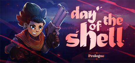
Day of the Shell: Prologue is a “one-click, one-turn” tactical rogue-lite. In a shattered and flooded world, travel from island to island with only hope and a revolver, challenging and appeasing the gods.
Free to PlayVery Positive(115)
Turn-Based TacticsRogueliteTactical
Duper GamesJul 1, 2025