Stratogun scores 70/100 — better than 26% of Bullet Hell capsules (n=1,285).

Quick text summary

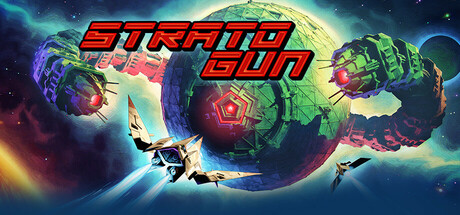
Stratogun scored 70/100 on Steam Analyzer — Good for a Bullet Hell capsule. Top priority fix: [uniqueness_polish] Introduce a distinctive ship silhouette or enemy form in the grid space to hint at core gameplay and create visual memory—consider a iconic player vessel or boss shape that anchors brand identity.

Capsule scores by dimension

  • Genre Clarity: 7/10 — Space shooter intent clear. The red geometric grid wireframe at the bottom reads as a space environment, and the angular, tech-forward design suggests a sci-fi arcade shooter. At TINY size, the grid structure and red color palette communicate action-space gameplay clearly enough, though without a visible ship or enemy silhouette the specific subgenre feels slightly abstract rather than immediately obvious.
  • Title Readability: 8/10 — Bold title with strong legibility. STRATOGUN is rendered in a large, angled, bold red italic font that contrasts sharply against the black background. The letterforms remain readable at SMALL size and mostly intact at TINY, though the secondary words stack in a way that could benefit from more breathing room. The geometric style reinforces the tech-forward brand without sacrificing clarity.
  • Contrast & Color: 8/10 — Strong red-on-black separation. The bright red title and grid wireframe create excellent value separation against the near-black background, reading clearly in quick scroll and at tiny thumbnail size. The red silhouette of the geometric structure maintains edge definition even when squinted, with no muddy midtones that would cause blend-in. High saturation red is inherently distinct and eye-catching on Steam dark background.
  • Uniqueness & Polish: 6/10 — Clean but somewhat generic tech aesthetic. The design is professionally executed with consistent italic typography and a coherent wireframe motif, but the abstract grid and minimal composition lack a distinctive hook or visual storytelling element that hints at core gameplay or a unique selling point. It reads as competent tech-forward branding rather than memorable or distinctive—many sci-fi games use similar wireframe and red-on-black treatments without standing out from peers like HELLDIVERS 2 or Armored Core VI.
  • Brand Consistency: 6/10 — Consistent tech direction, limited identity. The red angular italic typography and geometric wireframe create internal cohesion, and the palette is consistent throughout the visible design. However, without a signature character, icon, or distinctive motif visible in this capsule alone, brand identity feels somewhat generic within the action space-shooter category. A memorable symbol or unique visual trademark would elevate recognition.
  • Composition: 7/10 — Clear hierarchy with safe layout. The title anchors the upper third with strong visual weight, and the geometric grid fills the lower half with a sense of depth and scale. The composition avoids dead center voids and maintains clear safe margins from edges, though the grid texture could be interpreted as slightly busy. At SMALL and TINY sizes, the title remains the focal point with the supporting grid providing context without competing for attention.

What works

  • Excellent contrast and visibility. Bright red against near-black background creates immediate visual pop and reads clearly at all sizes including thumbnail, with strong silhouette definition in grayscale.
  • Readable, cohesive typography. Bold italic STRATOGUN font is legible at small size and reinforces the tech-forward, fast-paced action identity consistently.
  • Appropriate space aesthetic. Wireframe grid conveys sci-fi environment and arcade space shooter context without being overly literal or cluttered.

What hurts the capsule

  • Generic tech-shooter visual language. Red wireframe grid and angled typography are common in sci-fi action games, offering no distinctive hook or memorable visual trademark that separates Stratogun from competitors.
  • Lacks gameplay or ship imagery. No visible player ship, enemy, or core mechanic visual cue—the abstract grid communicates genre but not what makes this game unique or exciting to play.
  • Limited art direction character. The design feels more like a premium tech brand template than a game with personality, missing opportunities to hint at fast-paced arcade intensity or visual storytelling.

Priority fixes

  1. [uniqueness_polish] Introduce a distinctive ship silhouette or enemy form in the grid space to hint at core gameplay and create visual memory—consider a iconic player vessel or boss shape that anchors brand identity.
  2. [genre_clarity] Add a subtle dynamic element like motion lines, energy particle streaks, or aggressive angular shapes within the grid to reinforce fast-paced arcade action and differentiate from static tech branding.
  3. [composition] Introduce a secondary focal point or character silhouette that complements the title and grid, creating narrative depth and clearer gameplay implication at TINY size.

Store copy priority fixes

  1. [uniqueness] Add a specific mechanical or design differentiator—e.g., 'Unlike traditional bullet hells, Stratogun emphasizes [X unique system]' or highlight a signature feature that sets it apart from other roguelite shooters.
  2. [feature_communication] Convert the narrative paragraphs into a hybrid structure: lead with the high-concept hook, then use a bulleted list of core features (e.g., 'Dynamic difficulty scaling,' 'Ship loadout customization,' 'Procedural enemy formations') for scannability.
  3. [audience_targeting] Explicitly mention VR gameplay in the main copy if it is a primary platform, or clarify that VR is a secondary option—current positioning risks confusing VR-curious players.

Related guides

Steam app ID: 3088430 · Tags: Bullet Hell, Top-Down Shooter, Twin Stick Shooter, Roguelite, VR