Scoring genre clarity...
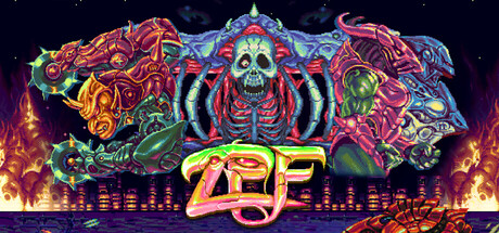
ZPF is a retro-inspired horizontal shooter originally designed for the Sega Genesis/Mega Drive. Blast your way through a cosmic gauntlet of epic boss battles, addictive scoring, and hidden secrets in a thrilling arcade-style adventure through fantasy, sci-fi, and alien-themed worlds.
$9.99Mostly Positive(19)
Side ScrollerBullet HellShoot 'Em Up
ZPF TeamApr 16, 2026