Scoring genre clarity...

Spherebuddie 64 capsule

Spherebuddie 64

This is a love letter to the golden age of 3D platformers. Jump. Dash. Spin attack. Collect everything. Explore colorful worlds packed with quirky enemies and secrets hiding in every corner.

$2.396 user reviews
3D Platformer1990'sAdventure
kargames05May 22, 2026

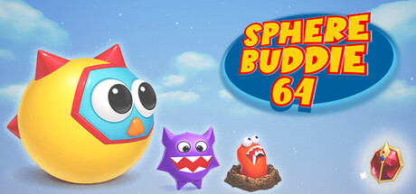
Spherebuddie 64 scores 85/100 — better than 98% of 3D Platformer capsules (n=1,396).

6 user reviews · $2.39 · Released May 22, 2026 · By kargames05

Quick text summary

Spherebuddie 64 scored 85/100 on Steam Analyzer — Excellent for a 3D Platformer capsule. Top priority fix: [genre_clarity] Consider adding a subtle UI element (coin, dash trail, or dynamic pose) that hints at core mechanics to elevate genre specificity beyond generic colorful platformer.

Capsule scores by dimension

  • Genre Clarity: 8/10 — Clear 3D platformer, colorful charm. The capsule immediately signals a vibrant 3D platformer through the round yellow protagonist with large expressive eyes, cartoonish proportions, and the presence of quirky collectible-style enemies (purple spiky creature, orange bird, treasure chest). At tiny size, the bold character silhouette and bright color palette still read as a kid-friendly adventure game, though the specific platformer subgenre is inferred rather than stated by UI elements or iconic platformer poses.
  • Title Readability: 9/10 — Bold, readable at all sizes. The title 'SPHERE BUDDIE 64' uses a thick, all-caps golden font with red outline against a dark blue oval background at top right, creating excellent contrast and legibility across full, small, and tiny sizes. The oval shape acts as a natural frame that isolates the title from the busy background, and the numbering '64' is a recognizable retro reference that reinforces the platformer nostalgia without becoming unreadable. Even at tiny thumbnail size, the text remains distinct and the layout prevents title collapse.
  • Contrast & Color: 9/10 — Strong value separation, vibrant appeal. The capsule uses a bright, light blue sky background that creates excellent contrast against the warm yellow protagonist, purple spiky enemy, orange bird, and golden title text. The character silhouettes remain sharp and readable in grayscale due to strong value separation between the yellow/orange subjects and the mid-tone sky. At small and tiny sizes, the bright primary color palette continues to pop against the dark Steam background (#1b2838), making the capsule immediately eye-catching in a scrolling feed.
  • Uniqueness & Polish: 8/10 — Distinctive retro-inspired style. The capsule demonstrates polished 3D character rendering with a cohesive playful art direction that feels intentional and premium, avoiding generic asset templates. The nostalgic '64' reference, combined with the expressive character design and themed enemy lineup, communicates a clear creative vision tied to golden-age 3D platformers rather than just showing a generic game scene. The spacing and arrangement of elements across the composition shows thoughtful design, though the overall concept (cute character + colorful world) is a familiar genre trope.
  • Brand Consistency: 8/10 — Recognizable character and visual identity. The round yellow Sphere Buddie with its distinctive large eyes and red/orange accent shape is a memorable character that could function as an iconic brand symbol across multiple touchpoints. The warm color palette (yellows, oranges, purples, reds) combined with the bright sky environment creates a consistent visual language that signals this specific game's identity. The style feels cohesive and would likely be recognizable when paired with other game assets, though the palette is not so unique that it stands completely apart from other colorful platformers.
  • Composition: 9/10 — Excellent hierarchy and focal point. The large yellow protagonist anchors the left-center composition as the clear primary focal point, with the title positioned high right to avoid center competition and secondary enemies arranged in descending size order to guide the eye. The depth layering (sky background, mid-ground characters, title as foreground graphic) creates strong hierarchy that remains readable at small and tiny sizes. The composition leaves safe margins, avoids edge clipping of key elements, and the title placement ensures it won't be obscured by Steam UI or responsive design shifts.

What works

  • Nostalgic 64-bit branding. The '64' reference in the title immediately signals retro 3D platformer heritage and creates emotional resonance with the target audience.
  • Expressive character design. The yellow Sphere Buddie's large eyes and cartoonish proportions convey personality and approachability that stand out in the platform genre.
  • Strong color contrast. Vibrant warm tones (yellow, orange, red) against light sky and dark Steam background ensure the capsule pops in scrolling feeds at all sizes.

What hurts the capsule

  • Generic platformer premise. While executed well, the core visual concept (cute round character plus colorful world) follows a well-worn path and does not communicate a unique mechanical hook or story differentiator.
  • Limited gameplay communication. The capsule shows character and enemies but lacks visual cues about core mechanics like dash, spin attack, or specific level design that differentiate this from other 3D platformers.

Priority fixes

  1. [genre_clarity] Consider adding a subtle UI element (coin, dash trail, or dynamic pose) that hints at core mechanics to elevate genre specificity beyond generic colorful platformer.
  2. [uniqueness_polish] Introduce a unique environmental or thematic detail (e.g., sci-fi backdrop, crystal world, or character-specific mechanic visual) to increase memorability and stand-out potential in a crowded genre.

Store copy priority fixes

  1. [feature_communication] Expand the detailed description with concrete gameplay examples: 'Master precise jumps, dash-jumps, and spin attacks to reach hidden areas' and describe 1–2 specific level types or world themes to ground the experience.
  2. [uniqueness] Add a specific differentiator beyond the sphere protagonist, e.g., 'Unique spin attack mechanic lets you break barriers and solve puzzles in ways traditional platformers cannot' or 'Each world introduces a fresh platforming challenge—rolling down slopes, spinning through loops, or bouncing off enemies.'
  3. [feature_communication] Restructure the detailed description as 2–3 short paragraphs instead of bullet points, weaving together protagonist, environment, and mechanics into a cohesive gameplay narrative.

Related guides

Steam app ID: 3096350 · Tags: 3D Platformer, 1990's, Adventure, Collectathon, Colorful