Scoring genre clarity...

Arms of God capsule

Arms of God

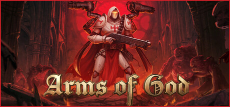
Gear up for a battle through hell in this roguelite Bullet Heaven Arena Autoshooter with Doom-inspired gore vibes, metal music, and a satisfying combat feel. Wield five weapons at once, upgrade and merge them to forge indestructible builds, and bring divine justice to a world on the brink of chaos.

$11.50Very Positive(1,293)
Early AccessBullet HeavenAction Roguelike
Dark Jay StudioJun 8, 2026

Arms of God scores 70/100 — better than 26% of Early Access capsules (n=3,121).

Very Positive (1,293 reviews) · $11.50 · Released Jun 8, 2026 · By Dark Jay Studio

Quick text summary

Arms of God scored 70/100 on Steam Analyzer — Good for a Early Access capsule. Top priority fix: [title_readability] Increase the title stroke weight and add a stronger dark drop shadow or outline so 'Arms of God' remains legible at 120x45 thumbnail size.

Capsule scores by dimension

  • Genre Clarity: 8/10 — Hell-themed shooter roguelite clear. The central armored crusader figure holding a shotgun against a hellish red backdrop with demonic enemies immediately signals a dark action shooter with religious iconography. The Doom-inspired gore aesthetic and enemy silhouettes in the background reinforce the genre at full size. At tiny size the red hell environment and armed paladin figure still suggest dark action or shooter, though roguelite specifics are lost.
  • Title Readability: 7/10 — Readable at full, fades tiny. The ornate serif gold 'Arms of God' title is well-sized and contrasts reasonably against the dark lower portion of the image at full header size. The decorative letterforms are legible at small capsule size but begin to blur at tiny thumbnail size, especially the descender details. The top-left Next Fest banner competes for attention and adds visual noise that complicates the title hierarchy.
  • Contrast & Color: 7/10 — Strong red-dark contrast, some muddle. The saturated crimson background creates strong separation from the Steam dark interface color #1b2838, and the central white and gold armored character pops well against the red environment. At small and tiny sizes the mid-tone orange-red background behind the character becomes murky and the enemy figures blend into the hellscape. Grayscale test shows the main character silhouette holds but secondary elements dissolve.
  • Uniqueness & Polish: 6/10 — Competent but genre-familiar look. The paladin-versus-hell aesthetic is a recognizable and somewhat saturated visual space shared with multiple Doom-adjacent indie games, and this capsule does not introduce a clearly distinctive hook or visual storytelling element beyond genre convention. The craft is competent with solid character rendering and intentional lighting, but the Next Fest overlay badge in the top left feels like an afterthought that reduces perceived polish. Nothing in the composition communicates the unique autoshooter or merge-weapons mechanic.
  • Brand Consistency: 7/10 — Cohesive dark crusader identity. The red hellscape palette, armored religious warrior, and gold title typography form a recognizable internal visual language that could be identified across marketing materials. The ornate serif title font matches the medieval-divine theme of the character design well. However the Next Fest badge breaks the visual identity with a plain flat design element that clashes with the gothic aesthetic.
  • Composition: 7/10 — Clear focal point, badge clutters. The central placement of the armored protagonist creates a strong immediate focal point with good vertical hierarchy flowing from the character down to the title text. Demonic enemies flanking in the background provide depth layering that reinforces the scene without overwhelming the hero. At small and tiny sizes the top-left Next Fest banner occupies prime real estate and competes with the character read, and the title sitting at the very bottom edge risks being clipped or lost in certain Steam UI contexts.

What works

  • Strong protagonist silhouette. The white and gold armored crusader stands out clearly against the red hellscape background and reads as the focal point even at small capsule size.
  • Effective genre color signaling. The saturated crimson environment immediately signals a dark action hell-themed game and separates well from Steam's dark interface background.
  • Coherent thematic identity. The medieval crusader aesthetic, ornate gold serif title, and hellish setting form a unified visual tone that feels intentional and consistent.

What hurts the capsule

  • Next Fest badge disrupts composition. The top-left Next Fest overlay badge occupies premium visual real estate, clashes stylistically with the gothic art direction, and competes with the character at small sizes.
  • No unique mechanic storytelling. Nothing in the capsule communicates the distinctive autoshooter or weapon-merging mechanic, making it visually indistinguishable from other indie hell-shooter titles.
  • Title collapses at tiny size. The ornate decorative serif letterforms in 'Arms of God' lose detail and readability at 120x45 thumbnail size due to low stroke contrast and fine ornamentation.
  • Background enemy figures blend. The demonic enemy silhouettes in the midground merge into the red-orange hellscape at small and tiny sizes, reducing perceived depth and scene richness.

Priority fixes

  1. [title_readability] Increase the title stroke weight and add a stronger dark drop shadow or outline so 'Arms of God' remains legible at 120x45 thumbnail size.
  2. [uniqueness_polish] Incorporate a visual cue that hints at the autoshooter or multi-weapon mechanic, such as multiple floating weapons around the character, to differentiate from generic hell-shooter aesthetics.
  3. [composition] Remove or significantly shrink the Next Fest badge to free up top-left real estate and keep focus on the protagonist and title.
  4. [contrast_color] Increase the value contrast between the background demon figures and the hellscape environment so depth layers read distinctly in grayscale and at small sizes.

Store copy priority fixes

  1. [hook_strength] Replace 'Gear up for a battle through hell' with a verb-forward opening like 'Command five weapons at once in this roguelite autoshooter—upgrade and merge them to forge unstoppable builds' to lead with the unique mechanic and immediate player agency.
  2. [uniqueness] Expand the visual differentiation section with 1-2 specific details about the hand-sculpted 3D art style or how the hellish aesthetic differs from competitors (e.g., 'hand-crafted 3D assets with [specific visual signature]') rather than relying on Doom comparisons.
  3. [audience_targeting] Clarify the difficulty/pacing positioning: add a sentence like 'Master complex weapon synergies for depth, or relax into auto-fire for casual play' to reconcile the 'relaxing' claim with the skill-testing enemy variety and boss challenges mentioned elsewhere.
  4. [feature_communication] Move or expand the weapon upgrade/merge system explanation earlier in the copy (before the Cathedral lore) and explain with a concrete example (e.g., 'Merge a fire rifle with ice upgrades for frozen explosions') to ensure it lands as a primary hook, not a secondary detail.

Related guides

Steam app ID: 3100310 · Tags: Early Access, Bullet Heaven, Action Roguelike, Top-Down Shooter, Bullet Hell