Scoring genre clarity...

Splat Splat capsule

Splat Splat

Splat Splat is a upgrade based top-down shooter game! Battle across arenas, collect coins & become stronger! Splat your friend until they can't splat no more!

Free to Play4 user reviews
Local MultiplayerPvPAction
Ape Brain GamesSep 16, 2025

Splat Splat scores 70/100 — better than 18% of Local Multiplayer capsules (n=835).

4 user reviews · Free to Play · Released Sep 16, 2025 · By Ape Brain Games

Quick text summary

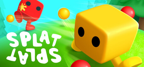
Splat Splat scored 70/100 on Steam Analyzer — Good for a Local Multiplayer capsule. Top priority fix: [uniqueness_polish] Add a distinctive visual hook or signature element to the cube design (e.g., unique markings, weapon visual, or stylized detail) that communicates the game's core identity and stands out in genre thumbnails

Capsule scores by dimension

  • Genre Clarity: 7/10 — Casual arcade shooter vibe clear. The bright, playful aesthetic with colorful cube characters and floating projectiles communicates a lighthearted action game immediately. At tiny size, the red and yellow cube silhouettes and scattered spheres read as a casual arcade shooter, though the exact top-down mechanic is not explicitly obvious without context. The blocky art style effectively signals indie arcade energy rather than hardcore action.
  • Title Readability: 8/10 — Bold white text legible throughout. SPLAT SPLAT is rendered in large, bold white sans-serif lettering positioned in the lower left quadrant against the green grass background, ensuring strong contrast and readability at all sizes. The text maintains clarity even at tiny 120x45 resolution due to generous letter spacing and weight. The placement avoids the busy cube characters, keeping the title isolated and scannable.
  • Contrast & Color: 8/10 — Vibrant palette pops on dark. The cyan sky, bright red and yellow cubes, and emerald green grass create strong value separation against the dark Steam background (#1b2838). The saturated primary colors have excellent luminosity contrast, and the white title text sits cleanly on the green, maintaining silhouette clarity even when squinting. The warm-to-cool color balance guides the eye naturally without muddiness.
  • Uniqueness & Polish: 6/10 — Competent but generic casual style. The 3D cube characters and floating ball mechanics feel like straightforward asset work rather than a distinctive visual hook or signature art direction. While the render quality is clean and the composition is functional, the overall presentation lacks a memorable identity or unique selling point that differentiates it from other casual indie games. The blocky character design is charming but common in the free-to-play indie space.
  • Brand Consistency: 6/10 — Cohesive but not yet iconic. The red and yellow cube protagonists appear consistently rendered with matching matte 3D style, and the bright primary color palette is internally coherent across the visible scene. However, there are no distinctive motifs, symbols, or signature elements that would make the brand instantly recognizable in isolation. The presentation feels like a generic casual arcade aesthetic rather than a proprietary brand identity.
  • Composition: 7/10 — Clear focal point, safe margins. The yellow cube is positioned in the center-right as the primary subject, with the red cube and floating spheres supporting the composition without competing for attention. The title sits securely in the lower left with adequate margin from edges, and the layered depth (sky, grass, foreground cubes) creates readable separation at small sizes. The composition remains intact at tiny size with no critical crop issues, though the rightmost red cube approaches the edge slightly.

What works

  • Strong color contrast on dark background. The saturated cyan, red, yellow, and green palette has excellent value separation and pops immediately against Steam's dark theme without muddy midtones.
  • Readable title placement and weight. White bold sans-serif text in the lower left quadrant maintains legibility at all viewing sizes, with clear spacing and no collision with background elements.
  • Instant casual arcade tone. The bright blocky aesthetic and floating projectiles immediately signal a lighthearted, approachable game rather than hardcore action.

What hurts the capsule

  • Generic blocky character design. The simple cube protagonists lack distinctive style or personality that would make them memorable or iconic beyond the immediate viewing context.
  • No visual unique selling point. The capsule shows competent execution of a standard casual arcade setup but fails to communicate a specific core mechanic or hook that sets it apart from similar titles.
  • Inconsistent focal point clarity at small sizes. At tiny size, the equal visual weight of the red and yellow cubes, combined with scattered floating spheres, creates slight ambiguity about which element is the primary subject.

Priority fixes

  1. [uniqueness_polish] Add a distinctive visual hook or signature element to the cube design (e.g., unique markings, weapon visual, or stylized detail) that communicates the game's core identity and stands out in genre thumbnails
  2. [brand_consistency] Establish an iconic character motif or symbol (logo or mascot variant) that appears consistently across store assets and becomes instantly recognizable to returning players
  3. [composition] Reduce visual competition between the red and yellow cubes by strengthening the yellow cube's prominence through scale, lighting, or foreground placement to clarify the single focal point at tiny sizes

Store copy priority fixes

  1. [hook_strength] Rewrite the opening to lead with the auction upgrade mechanic instead of repeating 'splat'—e.g., 'Splat Splat is a competitive top-down shooter where you bid on upgrades between rounds to outplay your opponents.'
  2. [feature_communication] Add a sentence explaining the core moment-to-moment gameplay: 'Land shots to earn coins, then outbid your opponent in the upgrade auction to gain a temporary advantage before the next round.'
  3. [uniqueness] Explicitly state what makes the bidding system unique—e.g., 'The underdog-scaling auction system ensures every match is winnable, no matter the skill gap.'
  4. [genre_clarity] Remove the vague 'skill-based' claim or replace it with a concrete skill signal: 'Master spray patterns and arena positioning to dominate the leaderboards.'

Related guides

Steam app ID: 3104920 · Tags: Local Multiplayer, PvP, Action, 3D, Top-Down Shooter