Geometry Wars™ 3: Dimensions Evolved scores 85/100 — better than 97% of Action capsules (n=9,722).

Quick text summary

Geometry Wars™ 3: Dimensions Evolved scored 85/100 on Steam Analyzer — Excellent for a Action capsule. Top priority fix: [uniqueness_polish] Consider adding a subtle geometric enemy silhouette or grid-based object in the lower-right safe area to enhance gameplay specificity and visual storytelling without cluttering the title hierarchy.

Capsule scores by dimension

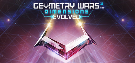
  • Genre Clarity: 8/10 — Strong arcade shooter identity. The geometric grid backdrop, radiating light burst from center, and neon cyan accents immediately signal a fast-paced arcade game with sci-fi aesthetics. At TINY size, the geometric pattern and glowing core remain recognizable as action-arcade. The '3D grids' visual language is communicated through perspective lines and the radial energy effect, though specific shooter gameplay mechanics are not explicitly shown.
  • Title Readability: 9/10 — Excellent legibility across all sizes. The title uses bold white letterforms with clean sans-serif geometry and cyan accent highlights on key words ('DIMENSIONS' and the superscript '3' in cyan). At SMALL and TINY sizes, the text remains crisp and fully readable due to strong contrast against the dark background and strategic spacing. No decorative collapse or muddiness at any viewing size.
  • Contrast & Color: 9/10 — Outstanding contrast and visual pop. White title text contrasts dramatically against the dark blue-to-black gradient background, with cyan neon accents providing secondary contrast and visual direction. The radial light burst at center creates a clear focal point with warm yellow-white core fading to cool blues. Even in grayscale, the light-to-dark separation is strong, and at TINY size the glow and text remain distinct and punchy against #1b2838.
  • Uniqueness & Polish: 8/10 — Polished sci-fi arcade presentation. The design showcases intentional craft with the signature geometric motif, neon styling, and dynamic energy effects that feel premium and cohesive. The radial burst composition with layered glow effects conveys motion and intensity befitting an arcade shooter. While the neon-geometric aesthetic is somewhat familiar in the action genre, the execution is clean and the branded identity is strong without feeling generic.
  • Brand Consistency: 8/10 — Strong recognizable brand identity. The cyan-and-white neon palette, geometric grid patterns, and radiating light-burst composition are signature visual language for Geometry Wars across its franchise iterations. The title treatment with the cyan superscript '3' reinforces brand continuity. The overall aesthetic is distinctly Geometry Wars and would be recognizable to fans of the series, with consistent rendering style and color palette.
  • Composition: 9/10 — Balanced hierarchy with clear focal point. The radial burst creates a natural center focal point with the title positioned in the mid-upper area, allowing the glow and light effects to frame it without competing. Supporting geometric elements and particle-like light dots are distributed evenly without clutter. At SMALL and TINY sizes, the composition remains balanced and readable, with no critical elements touching unsafe edges, and the title sits comfortably within safe margins.

What works

  • Neon color hierarchy. The cyan accents on key words guide the eye and add visual interest while maintaining overall legibility at all viewing sizes.
  • Dynamic focal point. The radial light burst with layered glow effects creates motion and energy that communicates arcade action gameplay without literal gameplay imagery.
  • Strong brand recognition. The geometric aesthetic, cyan-white palette, and lighting effects are instantly identifiable as Geometry Wars franchise visual language.
  • Safe composition across sizes. Title and key elements maintain safe margins and remain legible from full header down to tiny thumbnail without cropping or overlap issues.

What hurts the capsule

  • Limited gameplay specificity. The design does not visually communicate the '3D grids' or multi-wave enemy combat directly; it relies on geometric abstraction rather than concrete action imagery.
  • Slightly generic neon aesthetic. While well-executed, the neon-sci-fi style is common across action games in the genre, so it may not stand out as distinctly premium compared to top benchmarks like Helldivers 2 or Armored Core VI.

Priority fixes

  1. [uniqueness_polish] Consider adding a subtle geometric enemy silhouette or grid-based object in the lower-right safe area to enhance gameplay specificity and visual storytelling without cluttering the title hierarchy.
  2. [composition] Introduce a warmer secondary color accent (orange or red) in the lower composition to create additional depth layering and guide secondary focal points, improving visual richness at SMALL size.

Related guides

Steam app ID: 310790 · Tags: Action, Twin Stick Shooter, Arcade, Shoot 'Em Up, Bullet Hell