Scoring genre clarity...
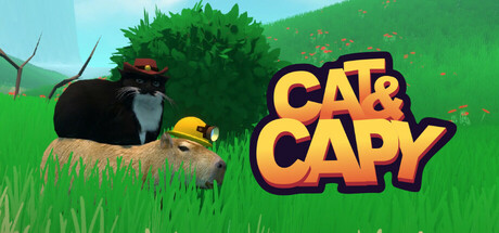
Cat & Capy is a heartwarming 3D platformer where you play as the cat and capybara from the viral Matato Games video series on TikTok and Instagram. Embark on an adventurous journey to rescue dogs, explore diverse worlds, and battle the nefarious bird army!
$3.99Positive(30)
Early AccessActionAdventure
Matato GamesApr 11, 2025