Scoring genre clarity...

Swordia capsule

Swordia

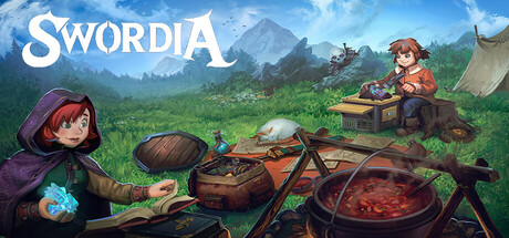
Swordia is more than a game... It’s a fully playable demonstration of a flexible 2D game engine and multiplayer framework designed for creators. Inspired by classic pixel-art RPGs and online worlds and much more!

$4.995 user reviews
Massively MultiplayerRPGMedieval
Affliction Networks LLCJan 23, 2026

Swordia scores 72/100 — better than 49% of Massively Multiplayer capsules (n=265).

5 user reviews · $4.99 · Released Jan 23, 2026 · By Affliction Networks LLC

Quick text summary

Swordia scored 72/100 on Steam Analyzer — Good for a Massively Multiplayer capsule. Top priority fix: [genre_clarity] Add a subtle UI element or mechanical cue (e.g., a spell effect, inventory icon, or multiplayer indicator) in the background or mid-frame to hint at the engine-framework and online multiplayer aspects, differentiating it from standard pixel-art RPGs.

Capsule scores by dimension

  • Genre Clarity: 7/10 — Fantasy RPG with cozy adventure vibes. The pixel-art aesthetic, fantasy setting with mountains, and two characters engaged in cooking/campfire activities clearly signal a classic RPG with slice-of-life elements. At tiny size, the warm earthen tones and character silhouettes remain readable, though the specific genre blend becomes slightly ambiguous—it reads as adventure/RPG rather than specifically multiplayer-focused. The cozy campfire scene is thematically coherent but doesn't aggressively communicate the multiplayer or engine-demo aspects mentioned in the description.
  • Title Readability: 8/10 — Bold white serif logo, high visibility. The 'SWORDIA' title uses clean, bold white serif lettering positioned in the upper left with excellent contrast against the blue sky background. At full size and small capsule sizes, the text remains highly legible with clear letterforms and appropriate spacing. At tiny size, the logo holds up well due to its weight and simplicity, though some serif detail softens slightly under compression.
  • Contrast & Color: 8/10 — Strong sky-to-earth value separation. The composition uses a clear light-to-dark gradient with bright blue sky occupying the upper half and a darker earth-toned foreground with cooking pots and characters. The white title pops clearly against both backgrounds, and character silhouettes are well-defined with warm reds and purples contrasting the cool sky. At tiny size, the value separation holds firm in grayscale, maintaining silhouette clarity and preventing muddy blending.
  • Uniqueness & Polish: 7/10 — Polished pixel art with familiar charm. The capsule demonstrates solid craft with clean pixel-art rendering, cohesive color harmony, and thoughtful scene composition that hints at both adventure and community gathering. However, the cozy campfire gathering is a familiar trope in indie RPGs, and while executed well, it doesn't communicate a distinctive mechanical hook or unique selling point beyond visual appeal. The scene feels premium and intentional but reads as a refined take on common genre themes rather than a bold differentiator.
  • Brand Consistency: 6/10 — Competent pixel-art identity, limited distinctiveness. The capsule uses a consistent warm color palette, clean pixel-art style, and fantasy-camp aesthetic that would be recognizable across promotional materials. However, no iconic character, symbol, or signature motif jumps out as a memorable brand anchor—the composition feels more like a skillful genre scene than an unmistakable identity mark. The style is coherent but not particularly distinctive compared to other pixel-art RPG capsules.
  • Composition: 7/10 — Clear focal point with balanced depth layers. The composition uses effective layering with sky background, mountainous midground, and foreground campfire/cooking elements that guide the eye naturally to the two characters and pots. The left-placed title doesn't interfere with the visual hierarchy, and the scene maintains visual interest across the frame without becoming cluttered. At small and tiny sizes, the focal point remains clear, though some supporting detail (distant character, smaller pots) becomes soft and risks losing impact in extreme compression.

What works

  • Title legibility and placement. The white 'SWORDIA' serif logo is bold, well-positioned in the upper left, and maintains excellent contrast against the sky background at all viewing sizes.
  • Value contrast and silhouette clarity. The light blue sky cleanly separates from darker earth tones, and character and pot silhouettes remain well-defined even at tiny size, preventing muddy blending against the Steam dark background.
  • Cohesive visual storytelling. The campfire cooking scene with two characters creates a warm, inviting atmosphere that successfully communicates community and adventure without feeling forced or generic.
  • Balanced depth layering. The composition uses distinct background, midground, and foreground elements that create natural visual hierarchy and guide attention effectively across the canvas.

What hurts the capsule

  • Limited brand distinctiveness. The cozy campfire RPG aesthetic is well-executed but familiar in the indie space, lacking an iconic character, symbol, or signature motif that would make Swordia immediately recognizable.
  • Unclear multiplayer/engine emphasis. The capsule's visual focus on a charming scene does not communicate the game's core selling point as a playable engine demonstration or multiplayer framework—a key differentiator buried by generic genre aesthetics.
  • Detail loss at tiny compression. The distant character in the background and smaller cooking details soften significantly when viewed at thumbnail size, reducing the sense of activity and depth.

Priority fixes

  1. [genre_clarity] Add a subtle UI element or mechanical cue (e.g., a spell effect, inventory icon, or multiplayer indicator) in the background or mid-frame to hint at the engine-framework and online multiplayer aspects, differentiating it from standard pixel-art RPGs.
  2. [uniqueness_polish] Introduce a distinctive visual motif or iconic element unique to Swordia (a signature creature, artifact, or character design choice) that would be immediately recognizable in other promotional materials and set it apart from competitor capsules.
  3. [composition] Increase contrast and clarity of the distant character and key foreground details by adding a subtle halo or silhouette highlight to ensure visual interest is preserved at small and tiny sizes without sacrificing the scenic composition.

Store copy priority fixes

  1. [hook_strength] Rewrite the short description to lead with the core player experience: 'A pixel-art MMORPG with spell casting, cooperative dungeons, and open-world exploration—built on a transparent, community-driven framework.' Reserve the framework positioning for the second paragraph.
  2. [audience_targeting] Create two distinct messaging tiers: open with a 2–3 sentence hook for adventure players (what they do, not how the engine works), then follow with a separate section explicitly labeled 'For Creators & Developers' that highlights the framework, plugin system, and SDK.
  3. [tone_match] Unify the voice: choose either 'this is a player-first adventure game that happens to showcase a framework' or 'this is an educational framework demonstrating a playable MMO.' Adopt one perspective consistently and drop the contradictory 'is a game / is a demo / is a toolkit' framing.
  4. [feature_communication] Add a concrete time-investment and progression example: 'Expect 10+ hours of solo exploration and skill-based progression (mining, crafting, spell unlocks), plus cooperative dungeons and PvP zones for social play,' to ground the scope.

Related guides

Steam app ID: 3115850 · Tags: Massively Multiplayer, RPG, Medieval, Pixel Graphics, Adventure