Scoring genre clarity...

NOOK FALL: West Town capsule

NOOK FALL: West Town

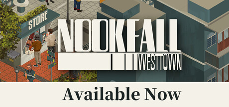
A charming yet fantastical town, where vitality and decay constantly collide. We hope that through interactions with characters and objects, and the sensory experience created by visuals and sound, you can connect with the emotions and charm of this little world of West Town.

$13.99Positive(36)
RetroRelaxingShop Keeper
NarraTruth GamesMay 11, 2026

NOOK FALL: West Town scores 75/100 — better than 66% of Retro capsules (n=2,723).

Positive (36 reviews) · $13.99 · Released May 11, 2026 · By NarraTruth Games

Quick text summary

NOOK FALL: West Town scored 75/100 on Steam Analyzer — Good for a Retro capsule. Top priority fix: [uniqueness_polish] Introduce a distinctive character, motif, or visual signature (e.g., a recurring NPC or iconic object from the game world) that anchors the brand identity beyond the generic cozy-town aesthetic.

Capsule scores by dimension

  • Genre Clarity: 7/10 — Isometric casual exploration game clear. The isometric perspective, cozy town setting with storefronts, and pedestrian characters immediately signal a casual exploration or life sim game. At tiny size, the overhead architectural view and character silhouettes remain readable enough to convey the genre. However, the visual style alone could also suggest a management or puzzle game, creating minor ambiguity about the specific subgenre focus.
  • Title Readability: 8/10 — Bold sans-serif title reads well. NOOKFALL in large, clean white sans-serif with strong contrast against the dark teal building backdrop reads clearly at all sizes, including tiny. The secondary text 'WEST TOWN' below maintains hierarchy and remains legible. At small and tiny sizes, the title holds its weight without deteriorating, though the 'Available Now' tagline becomes harder to parse at thumbnail size but does not interfere with core branding.
  • Contrast & Color: 8/10 — Strong light-dark separation effective. White title text pops sharply against the dark teal and slate building, creating excellent value separation. The warm tan-orange isometric ground and storefronts provide color lift and visual interest without muddying the hierarchy. Even in grayscale, the bright title and mid-tone architecture separate cleanly from the dark background, maintaining silhouette clarity at small sizes.
  • Uniqueness & Polish: 7/10 — Charming isometric aesthetic, slight familiarity. The isometric pixel-art style and cozy town aesthetic feel polished and intentional, with consistent rendering and warm color palette that evokes games like Stardew Valley or Spiritfarer. The design communicates charm and character interaction as core mechanics through the visible storefront and NPC placement. However, the visual style is not entirely distinctive within the crowded cozy-game space—it executes the formula well but does not stand out as instantly iconic compared to peers like DAVE THE DIVER or Tiny Glade.
  • Brand Consistency: 7/10 — Coherent palette, recognizable town identity. The warm isometric town aesthetic with tan and teal color blocking creates a cohesive and recognizable look that should carry across store screenshots. The 'NOOKFALL' wordmark uses bold sans-serif styling that feels like a stable brand anchor. The internal art direction is consistent—color harmony, rendering detail level, and architectural style all align—though the identity lacks a truly iconic character, symbol, or signature motif that would make it immediately memorable on repeated viewing.
  • Composition: 8/10 — Clean hierarchy, focused focal point. The title occupies the center-top with strong visual weight, while the isometric town scene grounds the lower composition and provides supporting visual context. The focal point remains clear at small and tiny sizes, with no competing elements drawing equal attention. Safe margins are respected, and the composition is resilient to Steam cropping; the key title and town silhouette remain legible even if edges shift slightly.

What works

  • Title contrast and readability. White sans-serif 'NOOKFALL' maintains crisp legibility at tiny thumbnail size against the dark teal backdrop with no degradation.
  • Isometric perspective clarity. The overhead town view instantly communicates a casual exploration game and creates visual depth that remains readable at all scales.
  • Warm color palette appeal. The tan, orange, and warm brown isometric ground tones create an inviting, cozy atmosphere that aligns with the genre and stands out pleasantly against the dark Steam background.
  • Balanced composition and safe margins. Focal elements are centered or well-positioned; title and town scene have breathing room and are not at risk of Steam edge cropping.

What hurts the capsule

  • Limited visual distinctiveness. The isometric cozy-game aesthetic, while well-executed, follows familiar conventions seen in many successful indie titles and lacks a signature visual hook or iconic element.
  • Tagline legibility at small size. The 'Available Now' text becomes difficult to read at tiny thumbnail size and adds secondary noise without reinforcing core branding.
  • Moderate genre ambiguity. While the isometric style signals casual gameplay, the exact subgenre (town builder, life sim, exploration focus) is not entirely clear from visuals alone at small size.

Priority fixes

  1. [uniqueness_polish] Introduce a distinctive character, motif, or visual signature (e.g., a recurring NPC or iconic object from the game world) that anchors the brand identity beyond the generic cozy-town aesthetic.
  2. [title_readability] Remove or simplify the 'Available Now' tagline so the primary 'NOOKFALL WEST TOWN' branding dominates without secondary text that degrades at thumbnail scale.
  3. [genre_clarity] Add a subtle gameplay cue—such as a highlighted interaction prompt, inventory icon, or character in a pose that hints at the core mechanic—to reinforce the specific subgenre (exploration, life sim, or collection focus) at small sizes.

Store copy priority fixes

  1. [hook_strength] Replace the short description with a verb-forward hook that leads with the core experience: 'Run a cozy shop in a charming town and uncover a thirty-year-old mystery through ten days of gentle exploration and character encounters.' This immediately communicates genre, gameplay, and emotional appeal.
  2. [feature_communication] Add a structured feature list or paragraph explaining the shopkeeping mechanic—what does the player buy, sell, or curate? How do shop interactions drive the story? What does the ten-day timeframe unlock?
  3. [uniqueness] Articulate what makes West Town distinct from other cozy visual novels by adding a specific comparison or unique selling point, such as 'the only visual novel where your shop's inventory and daily choices directly shape which characters and stories you encounter.'
  4. [genre_clarity] Mention 'visual novel' in or immediately after the short description so players browsing quickly understand the genre without reading the full body copy.

Related guides

Steam app ID: 3119700 · Tags: Retro, Relaxing, Shop Keeper, Visual Novel, Atmospheric