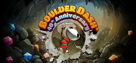
BOULDER DASH 40th Anniversary scores 77/100 — better than 75% of Casual capsules (n=10,153).

Quick text summary

BOULDER DASH 40th Anniversary scored 77/100 on Steam Analyzer — Good for a Casual capsule. Top priority fix: [uniqueness_polish] Add a subtle visual element that highlights what makes this anniversary edition special—such as a modern visual effect or silhouette enhancement that distinguishes it from classic Boulder Dash ports.

Capsule scores by dimension

  • Genre Clarity: 8/10 — Classic puzzle-action immediately recognizable. The central character pushing a boulder down a circular tunnel with falling gems and rocks clearly signals a puzzle-action platformer mechanic. At TINY size, the boulder, character pose, and cascading colored gems still communicate the core gameplay loop of collecting and avoiding hazards. The cave setting and colorful falling objects are genre-specific cues that distinguish this from action or strategy games.
  • Title Readability: 8/10 — Bold title with strong contrast and hierarchy. The large yellow 'BOULDER DASH' text with blue outline and red '40 Anniversary' ribbon sits cleanly above the central action, maintaining excellent legibility at all sizes. The outline treatment prevents letter collapse at TINY scale, and the warm yellow pops clearly against the dark cave background. At SMALL size, all text remains readable without strain, though the anniversary subtitle is smaller it does not interfere with core title recognition.
  • Contrast & Color: 8/10 — Strong value separation with warm accent palette. Bright yellow title and colored gems (blue, orange, pink) create sharp silhouettes against the dark gray-brown cave interior and black borders. The character's red outfit and the gem shards provide warm focal points that separate clearly from cool cave tones. In grayscale, the value ladder from dark background to bright title and gems remains distinct, ensuring readability even when squinting or scrolling quickly.
  • Uniqueness & Polish: 7/10 — Polished anniversary edition with nostalgic appeal. The capsule demonstrates clean craft with intentional typography, coherent lighting (cave interior with warm glow highlighting the boulder mechanism), and a clear visual hook around the '40th Anniversary' celebration. The circular boulder tunnel is a distinctive mechanical focal point that signals a classic game reborn. However, the overall composition relies on familiar puzzle game tropes; without the anniversary ribbon, this would feel more generic despite solid execution.
  • Brand Consistency: 7/10 — Recognizable identity with retro-modern treatment. The art style maintains visual consistency with classic Boulder Dash assets (round character, gem shapes, cave aesthetic) while adding modern shading and lighting. The color palette (warm oranges, cool blues, earth tones) and the iconic round boulder silhouette create recognizable brand markers. The anniversary branding is prominent but does not override the core identity; however, without reference to other capsules, internal cohesion is solid but not exceptionally distinctive.
  • Composition: 8/10 — Clear hierarchy with centered focal point and depth. The circular tunnel mechanic forms a strong primary focal point in the center, with layered depth created by foreground gems, mid-ground character and boulder, and background cave walls and rocks. The title anchors the top third without crowding the action, and supporting elements (floating gems, cave detail) frame the center without competing for attention. At TINY size, the composition remains coherent; the central circular tunnel and gem scatter are instantly identifiable even at minimal scale.

What works

  • Strong title contrast and readability. Yellow text with blue outline maintains excellent legibility across all sizes and stands out sharply against the dark cave background.
  • Clear mechanical focal point. The circular boulder tunnel is an instantly recognizable iconic element that communicates the core gameplay at a glance.
  • Effective depth layering. Foreground gems, mid-ground character and boulder, and background cave environment create visual separation that reads clearly even at TINY scale.
  • Anniversary branding integration. The '40 Anniversary' ribbon is positioned and colored strategically to enhance rather than obscure the classic game identity.

What hurts the capsule

  • Generic puzzle-game tropes. Beyond the anniversary hook, the visual presentation relies on familiar cave and gem imagery without a distinctive signature element unique to this franchise.
  • Limited visual storytelling of updates. The capsule does not visually communicate what makes this 40th Anniversary edition special beyond the ribbon; modern enhancements or feature highlights are absent.
  • Busy background detail. The scattered floating gems and cave rocks on the left and right edges add clutter that, while not collapsing the composition, dilutes focus slightly at SMALL size.

Priority fixes

  1. [uniqueness_polish] Add a subtle visual element that highlights what makes this anniversary edition special—such as a modern visual effect or silhouette enhancement that distinguishes it from classic Boulder Dash ports.
  2. [composition] Refine gem placement on edges to reduce visual scatter and strengthen the clear path from title to central focal point, ensuring all secondary elements guide rather than distract the eye.

Store copy priority fixes

  1. [hook_strength] Rewrite the short description to open with a verb and core gameplay mechanic: 'Collect diamonds in deadly caves while dodging enemies and falling rocks. BOULDER DASH returns 40 years later with 320 levels, modern visuals, and a thriving community editor.'
  2. [feature_communication] Expand the level editor section with a sentence on its scope and new building blocks available: 'Create custom caves using new elements like growing walls, slime, and enemy generators—or play thousands of community levels for free.'
  3. [uniqueness] Add a direct comparison line early in the detailed description: 'The most comprehensive BOULDER DASH ever released: combines all 80 original levels from I–IV with 240 brand-new challenges and 6 fan-designed worlds, officially curated from the community.'

Related guides

Steam app ID: 3124310 · Tags: Casual, Strategy, Adventure, Puzzle, 2D Platformer