Scoring genre clarity...

STORROR Parkour Pro capsule

STORROR Parkour Pro

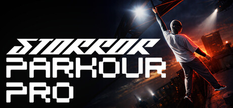
The city is your playground. The risk is real. The path is yours. A physics-driven experience that will immerse you in an authentic urban environment. Master your movement, challenge your instincts, and traverse a city designed for limitless creative potential.

$17.49Mostly Positive(44)
Early AccessParkourAction
Hole in the Sleeve Game StudiosMar 31, 2025

STORROR Parkour Pro scores 77/100 — better than 77% of Early Access capsules (n=3,067).

Mostly Positive (44 reviews) · $17.49 · Released Mar 31, 2025 · By Hole in the Sleeve Game Studios

Quick text summary

STORROR Parkour Pro scored 77/100 on Steam Analyzer — Good for a Early Access capsule. Top priority fix: [uniqueness_polish] Integrate a signature STORROR visual motif or character element (distinct from generic athlete pose) to increase brand memorability and stand out among action game capsules.

Capsule scores by dimension

  • Genre Clarity: 8/10 — Clear parkour action sport implied. The central figure in mid-leap against an urban backdrop with dynamic lighting immediately communicates parkour/movement-based action. The dynamic pose, city environment, and athletic silhouette read clearly as a parkour or free-running game even at tiny size. At TINY, the jumping figure and fiery urban setting remain the dominant read, though fine detail of the environment compresses.
  • Title Readability: 8/10 — Bold sans-serif reads at all sizes. STORROR PARKOUR PRO uses a strong geometric sans-serif with high contrast white letters on dark background, positioned in the left-center area with clear separation from the action figure. The title remains legible at SMALL and TINY sizes due to thick letterforms and simple stroke structure. The diagonal stripe design in the logo adds visual interest without compromising letterform clarity.
  • Contrast & Color: 8/10 — Strong orange-white separation from dark background. Warm orange and gold tones in the parkour figure and environmental effects create clear value separation against the deep blue-black background (#1b2838). White title text and bright highlights on the athlete produce excellent silhouette clarity in grayscale. The lighting design with spotlights and fire accents maintain strong edge definition even at TINY size, though the mid-ground city details compress into shadow.
  • Uniqueness & Polish: 7/10 — Professional action photography aesthetic. The capsule uses cinematic lighting and dynamic pose treatment that feels premium and intentional rather than generic. The STORROR branding (a real parkour collective) provides authentic credibility and distinguishes this from typical indie action game treatments. However, the core composition—athletic figure in dramatic lighting—follows familiar action game templates, keeping it solidly competent rather than visually innovative.
  • Brand Consistency: 7/10 — Cohesive urban action identity. The warm orange-gold palette, dramatic spotlighting, and urban environment establish a consistent visual identity aligned with parkour/street sports. The geometric stripe logo and sans-serif typography feel intentional and recognizable. Without cross-referencing the 13 store screenshots, internal cohesion appears strong—all elements support an athletic, high-energy action narrative with no tonal inconsistency.
  • Composition: 8/10 — Balanced focal point with clear hierarchy. The leaping athlete occupies the right-center focus area while the title anchors the left side, creating natural visual balance and avoiding central voids. The layered depth—dark background, mid-ground city structure, foreground figure with rim lighting—guides the eye effectively across scales. At SMALL and TINY sizes, the composition maintains clarity with the athlete as primary subject and title as secondary anchor; no critical elements sit dangerously close to edges.

What works

  • High-contrast title legibility. White geometric sans-serif on dark background with thick strokes ensures STORROR PARKOUR PRO reads clearly at all viewing sizes including TINY.
  • Dynamic athletic pose. The mid-leap figure with extended limbs creates an instant read of movement and action that communicates the parkour genre effectively even at compressed sizes.
  • Strong cinematic lighting. Orange-gold rim lighting and spotlights create premium visual separation and silhouette clarity against the dark Steam background without feeling overwrought.
  • Balanced composition hierarchy. Title and athlete figure are spatially separated with clear primary (athlete) and secondary (text) focal points, avoiding clutter or competing attention.

What hurts the capsule

  • Generic action game template. The core visual formula—solo athlete in dramatic lighting against urban backdrop—is familiar across many action games and lacks a truly distinctive hook.
  • Limited environmental readability at TINY. The mid-ground city structure and background details compress into shadow at TINY size, reducing the urban context that supports genre clarity.
  • Minimal brand iconography. While STORROR is an authentic parkour collective, the capsule does not feature distinctive character, mascot, or signature visual motif that would enable instant brand recognition on repeat exposure.

Priority fixes

  1. [uniqueness_polish] Integrate a signature STORROR visual motif or character element (distinct from generic athlete pose) to increase brand memorability and stand out among action game capsules.
  2. [brand_consistency] Ensure the warm orange-gold palette and geometric stripe logo appear consistently across all store assets to strengthen brand identity across the storefront.
  3. [composition] Add a subtle foreground parkour element (rail grind, wall run, or obstacle) that reinforces the core mechanic and creates visual depth separation at TINY size.

Store copy priority fixes

  1. [hook_strength] Replace generic "physics-driven experience" and "immerse you" with a specific, action-forward hook such as: "Master real-world parkour moves from STORROR athletes, then chain them together in freestyle combos across London's rooftops and streets." This moves from abstract promise to concrete gameplay.
  2. [feature_communication] Restructure the "JOIN THE MOVEMENT" section into a bulleted feature list with headers (e.g., "Motion-Captured Animations," "300+ Unique Moves," "Intuitive Control System") to improve scannability and prevent dense paragraphs from obscuring key selling points.
  3. [feature_communication] Add a clear "Early Access Roadmap" or "What's Included Now" section that explicitly lists available content (Isle of Dogs map, challenge types, co-op modes) versus planned features (new cities, team missions, expanded progression), setting realistic expectations.
  4. [uniqueness] Emphasize the blend of realism and arcade gameplay more prominently in the short description, as this balance is a core differentiator that is currently buried in technical explanation.

Related guides

Steam app ID: 3125250 · Tags: Early Access, Parkour, Action, Adventure, Sports