Scoring genre clarity...
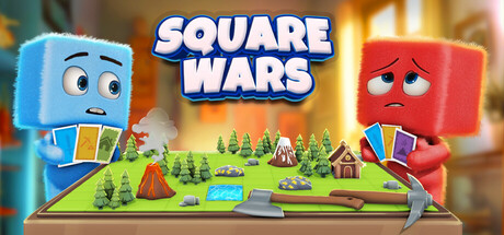
⁤Square Wars capsule

⁤Square Wars

Square Wars is a rogue-lite square-conquering game featuring real-time strategy, resource gathering, survival, and card-based gameplay mechanics. 🌍 Randomly generated maps make each game unique. Join the adventure solo, in local co-op with a friend, or online! 🎮🔥

$3.74Mostly Positive(43)
Early AccessCard BattlerWargame
Gökhan BirçekJan 10, 2025

⁤Square Wars scores 73/100 — better than 54% of Early Access capsules (n=3,147).

Mostly Positive (43 reviews) · $3.74 · Released Jan 10, 2025 · By Gökhan Birçek

Quick text summary

⁤Square Wars scored 73/100 on Steam Analyzer — Good for a Early Access capsule. Top priority fix: [uniqueness_polish] Integrate a signature visual motif—such as a distinctive card icon, resource symbol, or terrain feature—that hints at the rogue-lite card mechanics and becomes a recognizable brand mark.

Capsule scores by dimension

  • Genre Clarity: 7/10 — Clear strategy with cute aesthetic. The diorama-style 3D board with miniature trees, buildings, and terrain immediately signals a strategy or tactics game. The two anthropomorphic cube characters with opposing expressions (happy blue vs. angry red) suggest competition or conflict. At tiny size, the board layout and character silhouettes still read as strategy gameplay, though the rogue-lite and card mechanics are not visually evident.
  • Title Readability: 8/10 — Bold, legible title with strong outline. The title 'SQUARE WARS' uses a thick white-outlined sans-serif font in the top center, providing excellent contrast against the warm background. The outline ensures the text remains crisp and readable even at tiny size. At small size, letterforms are clear and spacing is clean; no taglines compete for attention.
  • Contrast & Color: 8/10 — Warm glow separates subjects clearly. The bright warm orange-yellow backdrop creates strong value separation from the cool blue and red cube characters, making them pop distinctly against the dark Steam background. The glossy 3D render of the board sits in the midground with sufficient luminosity to avoid muddy blending. At tiny size, the warm-to-cool contrast holds, and character silhouettes remain visually distinct.
  • Uniqueness & Polish: 7/10 — Charming diorama with polished 3D craft. The miniature diorama presentation with detailed terrain, trees, and buildings shows intentional art direction and high 3D render quality that feels premium rather than template-based. The anthropomorphic cube characters with expressive faces add personality and whimsy. However, the concept of two opposing forces on a board is familiar in strategy games, and the visual execution, while polished, does not introduce a immediately distinctive mechanical hook beyond the cute aesthetic.
  • Brand Consistency: 6/10 — Consistent cute style, limited identity cues. The blue and red cube characters, diorama presentation, and bright cheerful palette are internally cohesive and match the casual indie strategy aesthetic. However, there are no strong iconic symbols, signature motifs, or distinctive palette elements that would create immediate brand recognition if seen again without the title. The style is charming but not yet uniquely memorable as a standalone visual identity.
  • Composition: 8/10 — Strong focal hierarchy with balanced staging. The title anchors the top center with clear visual weight, the two opposing characters frame left and right in the foreground to draw attention, and the detailed board occupies the center middle ground naturally. The depth layering—blurred warm bokeh background, sharp diorama board, expressive character foreground—creates excellent visual hierarchy. At small and tiny sizes, the character pair and board still read as the primary subject, and the composition remains balanced without edge-hugging or wasted space.

What works

  • Excellent title contrast and legibility. White-outlined bold sans-serif sits on warm backdrop and reads perfectly at all sizes, from full to tiny without collapse.
  • Strong 3D render quality and craft. The diorama miniature aesthetic feels polished and premium, with detailed terrain, buildings, and expressive characters that elevate the presentation above template work.
  • Clear warm-cool color separation. Warm orange-yellow bokeh background creates strong value contrast that makes the cool blue and red cube characters pop distinctly against dark Steam background.
  • Effective depth and visual hierarchy. Focal point is clear at all sizes: characters frame the board naturally, and layered composition guides the eye without confusion or scattered emphasis.

What hurts the capsule

  • Generic strategic concept visually. Two-player board conflict is a familiar trope; the visual does not immediately communicate unique rogue-lite, card, or resource-gathering mechanics that differentiate it.
  • Limited brand identity memorability. No iconic symbol, signature motif, or distinctive palette element exists that would make this capsule recognizable without the title text; the style is charming but generic to cute strategy games.
  • Gameplay mechanics unclear from visuals alone. Card-based gameplay, resource gathering, and survival elements are not visually communicated; a player would only understand 'strategy game' and 'two-player conflict' without deeper knowledge.

Priority fixes

  1. [uniqueness_polish] Integrate a signature visual motif—such as a distinctive card icon, resource symbol, or terrain feature—that hints at the rogue-lite card mechanics and becomes a recognizable brand mark.
  2. [genre_clarity] Add subtle UI elements or visual cues (e.g., resource icons, card silhouettes, or a progress indicator) that communicate the card-based and rogue-lite mechanics without overcrowding.
  3. [brand_consistency] Establish a unique palette or character design signature (e.g., a consistent geometric material style, specific color triad, or facial expression language) that strengthens memorability across future marketing assets.

Store copy priority fixes

  1. [hook_strength] Replace the opening short description with a single punchy sentence that answers 'what will I do?' and 'why should I care?' e.g., 'Start with one square. Conquer the map. Race your friends.' Remove the feature dump from the opening.
  2. [tone_match] Reduce emoji density by 70% (aim for zero to one per section max) and replace celebratory language with tone that matches strategy and tactics. Use words like 'outwit,' 'outmaneuver,' and 'dominate' instead of 'exciting' and 'fantastic.'
  3. [uniqueness] Add a 1-2 sentence statement of what makes Square Wars different from other roguelite territory-conquest or card battler games. For example, specify how card mechanics interact with territory control uniquely, or what roguelite progression looks like.
  4. [audience_targeting] Explicitly state who should buy this game: 'For tactical players who love roguelites' or 'For friends looking for competitive local co-op strategy' to replace the generic 'seasoned and newcomers' appeal.

Related guides

Steam app ID: 3125270 · Tags: Early Access, Card Battler, Wargame, Real Time Tactics, Roguelite