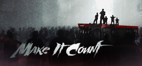
Make It Count scores 72/100 — better than 39% of Roguelite capsules (n=2,290).

Quick text summary

Make It Count scored 72/100 on Steam Analyzer — Good for a Roguelite capsule. Top priority fix: [uniqueness_polish] Introduce a distinctive visual element—either a unique character silhouette, signature enemy design, or iconic trinket/artifact—that can become a branded motif across marketing materials and strengthen instant recognition.

Capsule scores by dimension

  • Genre Clarity: 7/10 — Post-apocalyptic action shooter clear. The silhouetted figures atop a red platform with a crowd below immediately reads as a dystopian action scenario with group themes. At tiny size, the red accent and mass of dark figures still communicate action and conflict, though the specific 'top-down shooter' mechanic is not visually apparent—the composition suggests more third-person action than overhead perspective. The post-apocalyptic mood is strong but roguelite elements are not visually telegraphed.
  • Title Readability: 8/10 — Bold title legible at small sizes. The white 'Make It Count' text with dynamic slashed styling sits prominently at the bottom over a semi-transparent dark overlay, maintaining readability at small and tiny sizes. The letterforms are bold and high-contrast against the background, with intentional spacing that survives scaling. At tiny size, the title remains recognizable though some of the stylistic slash details lose sharpness, but the core message is never illegible.
  • Contrast & Color: 8/10 — Strong value separation with accent pop. The image leverages a clear light-to-dark gradient from bright foggy sky to deep shadow foreground, with the red platform providing a saturated mid-tone accent that pops against both the dark crowd and bright sky. In grayscale, the silhouette of the crowd reads distinctly from the lighter sky, and the red platform maintains strong value separation even without color. The composition survives the squint test with clear layered depth.
  • Uniqueness & Polish: 7/10 — Cinematic mood with strong execution. The image has a polished, filmic quality with intentional fog effects, layered silhouettes, and a dramatic composition that feels premium and deliberately art-directed rather than generic. However, the visual concept—figures on a raised platform overlooking a crowd in a post-apocalyptic setting—is familiar territory in indie action game marketing and doesn't introduce a unique hook or distinctive art signature that sets it apart from similar genre capsules. The craft is solid but the idea is well-trodden.
  • Brand Consistency: 6/10 — Mood consistent but no distinctive brand mark. The image establishes a cohesive dark, industrial, post-apocalyptic mood with consistent rendering and atmospheric treatment that aligns with the game's narrative context. However, there are no visible iconic character, motif, symbol, or signature visual element that would be immediately recognizable as 'Make It Count' specifically—a player seeing only this capsule would struggle to recall it later without the title. The red platform provides color consistency but is not a branded signature.
  • Composition: 7/10 — Clear hierarchy with safe layout. The focal point is the elevated figures silhouetted against the bright sky, creating natural depth with foreground crowd, midground platform, and background architecture. The title placement at the bottom is well-anchored in the safe margin zone with a semi-transparent overlay ensuring legibility. At small and tiny sizes, the composition holds with the elevated figures remaining the primary subject, though some architectural detail on the sides becomes noise and the crowd mass loses individual definition.

What works

  • Strong atmospheric contrast. The light-to-dark gradient and value separation between sky, platform, and crowd creates excellent visual hierarchy that reads at all sizes including tiny thumbnails.
  • Readable bold title design. The white 'Make It Count' text with high contrast and dynamic styling remains legible from full size down to tiny, benefiting from intentional overlay placement.
  • Cinematic production value. Intentional fog effects, layered silhouettes, and dramatic composition convey a premium, polished aesthetic that elevates the indie positioning.

What hurts the capsule

  • No distinctive brand signature. The capsule lacks an iconic character, symbol, or unique visual motif that would make it memorable and recognizable without the title text.
  • Familiar composition trope. The figures-on-platform-over-crowd concept is well-used in post-apocalyptic action marketing and doesn't communicate a unique gameplay hook or design selling point.
  • Roguelite and co-op mechanics invisible. The capsule communicates dark action atmosphere but provides no visual cues about the randomized routes, trinket progression, or cooperative multiplayer that differentiate the game mechanically.

Priority fixes

  1. [uniqueness_polish] Introduce a distinctive visual element—either a unique character silhouette, signature enemy design, or iconic trinket/artifact—that can become a branded motif across marketing materials and strengthen instant recognition.
  2. [genre_clarity] Add a subtle top-down perspective indicator or HUD-style element to the platform or figures to visually telegraph the top-down shooter view and roguelite progression system more clearly.
  3. [brand_consistency] Develop a consistent red accent treatment or signature visual symbol (trinket shape, UI element, character mark) that appears in future promotional materials to build recognizable brand identity.

Store copy priority fixes

  1. [uniqueness] Replace the generic 'ammo is limited' mechanic description with a concrete explanation of what makes the ammo system or progression loop unique to this game—e.g., 'strategic ammo scarcity forces constant loadout adaptation' or 'trinket combinations create synergies unavailable in other roguelites'.
  2. [hook_strength] Rewrite the short description opening to lead with a specific gameplay tension or reward rather than tag stacking—e.g., 'Survive randomized zombie missions with your squad, but ammo runs dry fast—every shot and every trinket choice could be your last' instead of listing four genre tags.
  3. [feature_communication] Replace vague terms ('various trinkets,' 'useful things') with concrete examples of actual trinkets, resources, or progression unlocks that appear in-game.
  4. [tone_match] Standardize voice across the copy by choosing between formal survival narrative or action-driven intensity, then apply consistently—currently it wavers and dilutes the personality.

Related guides

Steam app ID: 3126220 · Tags: Roguelite, Shooter, Zombies, Co-op, Dark