Scoring genre clarity...
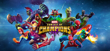
The ultimate Super Hero fighting game is now on Steam! Collect and upgrade iconic Super Heroes and Villains from the Marvel Universe, engage in fast-paced 1v1 battles, and unleash powerful abilities in Marvel Contest of Champions!
Free to PlayMostly Positive(57)
Free to PlaySuperheroFighting
Kabam Games, Inc.Jun 18, 2025