Scoring genre clarity...
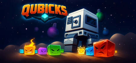
Qubicks is where tower defense meets roguelike as you venture across procedurally generated levels where you strategically position towers, balancing immediate survival with long-term growth. Upgrade your towers and heroes to adapt to difficult waves and ensure victory against alien inhabitants.
$4.992 user reviews
StrategyTower DefenseRoguelite
ITTT ProductionOct 10, 2025