Scoring genre clarity...
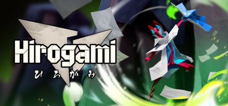
Explore a beautiful origami world as Hiro, a fan-wielding master of the art of ‘folding’. Embark on a mystical journey to save your fragile home from deadly digital invaders. Take on animal forms to traverse the landscape, solve puzzles, overcome enemies, and save the realm.
$12.99Mixed(25)
Action-Adventure3D PlatformerPuzzle Platformer
Bandai Namco Studios Singapore Pte. Ltd., Bandai Namco Studios Malaysia Sdn. Bhd.Sep 3, 2025