Scoring genre clarity...

Lap of the Gods: A Visual Novel capsule

Lap of the Gods: A Visual Novel

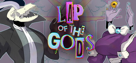
When the sun shines on the Lap of the Gods, it is blood red. And when it rains, the sky sobs. Explore a strange world populated by even stranger beings in this story-driven adventure as Marion attempts to undo a mistake on a universal level, before everything she has ever known becomes Undone.

$7.996 user reviews
Interactive FictionVisual NovelPoint & Click
Muda GamesApr 20, 2026

Lap of the Gods: A Visual Novel scores 63/100 — better than 12% of Interactive Fiction capsules (n=1,043).

6 user reviews · $7.99 · Released Apr 20, 2026 · By Muda Games

Quick text summary

Lap of the Gods: A Visual Novel scored 63/100 on Steam Analyzer — Solid for a Interactive Fiction capsule. Top priority fix: [title_readability] Increase title stroke weight and add a dark outline or shadow to the rainbow letters to maintain legibility at small (231x87) and tiny (120x45) sizes.

Capsule scores by dimension

  • Genre Clarity: 7/10 — Visual novel with surreal adventure tone. The capsule communicates a narrative-driven experience through character-focused composition and stylized character designs on the left and right. At tiny size, the distinct character silhouettes and colorful title suggest a story game, though the exact genre (visual novel vs. adventure game) is not immediately obvious from visuals alone. The surreal aesthetic and character poses hint at narrative weight rather than action-based gameplay.
  • Title Readability: 6/10 — Colorful but visibility challenges small. The title 'LAP OF THE GODS' uses large rainbow-gradient lettering positioned center-top with clear letter forms at full size. However, at small size (231x87), the multi-color gradient and thin letterforms lose contrast against the gray background, making individual letter distinction softer. At tiny size (120x45), the title collapses into a colorful blur without readable separation—legibility drops significantly due to narrow strokes and competing color channels reducing effective contrast.
  • Contrast & Color: 5/10 — Muddy mid-tone palette reduces pop. The capsule relies heavily on cool purples, grays, and pastels with bright neon accents in the title that create local contrast but don't punch strongly against Steam's dark background. The character silhouettes (left shark-creature, right purple figure) blend into the gray-purple background, losing edge clarity even in grayscale simulation. The bright rainbow title provides some separation but the overall composition lacks strong value separation—dark characters on dark-to-mid background muddy the primary read.
  • Uniqueness & Polish: 7/10 — Quirky character design with polished execution. The capsule features distinctive, hand-drawn-style character designs that feel premium and intentional rather than generic—the left creature's skeletal jaw and the right figure's exaggerated form suggest a unique visual identity. The neon rainbow title treatment and surreal background grid communicate a thoughtful art direction aligned with the game's strange-world premise. The craft feels deliberate and cohesive, though the overall composition doesn't reveal a standout unique selling point beyond 'quirky visual novel.'
  • Brand Consistency: 7/10 — Recognizable character iconography and palette. The two characters appear to be signature visual elements with distinct silhouettes and design language that suggest they could be core NPCs or antagonists in the narrative. The color palette (cool purples, grays, neon accents) and the surreal grid background create an identifiable look. Without reference to store screenshots, the internal cohesion is strong—consistent rendering style and a memorable weird-world aesthetic that could anchor brand recognition.
  • Composition: 6/10 — Balanced but lacks clear focal hierarchy. The layout places characters symmetrically on left and right edges with the title centered, creating visual balance but no dominant focal point—both figures compete for attention equally at all sizes. At small and tiny sizes, this symmetry reads flatter and the composition feels static rather than dynamic. The background grid and faint UI elements fill mid-space but don't guide the eye or create layered depth; the design prioritizes balance over directional composition.

What works

  • Distinctive character visuals. The two figures have memorable, quirky silhouettes and hand-drawn styling that feel premium and communicate a unique narrative world rather than generic fantasy.
  • Clear centered title placement. The 'LAP OF THE GODS' text is positioned in prime real estate with sufficient padding and does not risk edge cropping across Steam sizes.
  • Coherent surreal aesthetic. The combination of character design, grid background, and neon accents creates a unified art direction that aligns with the game's strange-world theme.

What hurts the capsule

  • Title contrast collapse at small sizes. The rainbow gradient and thin letterforms of the title lose readable distinction at small (231x87) and especially tiny (120x45) sizes, reducing discoverability during quick scroll.
  • Muddy background color separation. Dark character silhouettes blend into the gray-purple background, particularly in grayscale simulation, weakening overall contrast and visual pop against Steam's dark theme.
  • Symmetrical composition lacks focal hierarchy. Equal emphasis on left and right characters with centered title creates a static, non-directional read that doesn't guide the eye or establish a clear primary subject at tiny size.
  • Mid-tone palette dominates the read. The overall value range is limited to cool pastels and grays with only title neon providing bright pop, reducing silhouette clarity and visual energy.

Priority fixes

  1. [title_readability] Increase title stroke weight and add a dark outline or shadow to the rainbow letters to maintain legibility at small (231x87) and tiny (120x45) sizes.
  2. [contrast_color] Lighten the background gradient or add a semi-transparent light vignette around character silhouettes to increase value separation and edge clarity against the dark Steam background.
  3. [composition] Shift one character or the title slightly off-center to establish a clear focal hierarchy and directional flow that reads better at tiny size than symmetrical balance.

Store copy priority fixes

  1. [feature_communication] Move all technical Ren'Py settings to a collapsible 'Troubleshooting' section or FAQ, and replace the first paragraph of the detailed description with: 'In Lap of the Gods, you guide Marion through a surreal world by clicking on environments and characters to uncover dialogue, solve puzzles, and unravel why reality is breaking. Your choices shape how Marion understands her mistake and its consequences.'
  2. [audience_targeting] Add a sentence specifying playstyle: 'This is a [X]-hour linear story-driven experience with [branching/single] endings and minimal inventory puzzles' to help players gauge time commitment.
  3. [hook_strength] Keep the poetic opening but move it higher in the detailed description, placing it immediately after 'About the Game' to maintain the emotional hook before any technical information.
  4. [uniqueness] Add a sentence differentiating the game from standard VNs: 'Unlike traditional visual novels, Lap of the Gods emphasizes surreal world exploration and environmental storytelling through its hand-drawn backgrounds, making discovery as important as dialogue.'

Related guides

Steam app ID: 3138230 · Tags: Interactive Fiction, Visual Novel, Point & Click, Female Protagonist, 2D