Scoring genre clarity...

+ PC Maker capsule

+ PC Maker

The game from people who love computers to people who love computers :3

$9.99Mostly Negative(21)
Early AccessCasualSimulation
SpeedWaGoonFeb 15, 2026

+ PC Maker scores 70/100 — better than 26% of Early Access capsules (n=3,067).

Mostly Negative (21 reviews) · $9.99 · Released Feb 15, 2026 · By SpeedWaGoon

Quick text summary

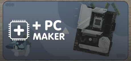
+ PC Maker scored 70/100 on Steam Analyzer — Good for a Early Access capsule. Top priority fix: [uniqueness_polish] Add character, stylized art, or a memorable visual hook (e.g., a cute mascot, signature color accent, or playful illustration style) to differentiate from generic tech product photography.

Capsule scores by dimension

  • Genre Clarity: 7/10 — Simulation core clear, niche appeal readable. The PC hardware imagery (motherboard, CPU socket, cooling fan) immediately signals a computer-building or tech simulation game. The plus icon and 'PC MAKER' text reinforce the crafting/assembly mechanic. At tiny size, the hardware silhouettes remain recognizable enough to suggest the simulation genre, though the exact gameplay loop (assembly vs. management) is not explicit from visuals alone.
  • Title Readability: 8/10 — Clean white typography, excellent contrast. The title '+PC MAKER' uses bold, sans-serif white letterforms positioned in the upper-left quadrant against a blue-gray background with clear separation. The plus icon serves as a memorable symbol. At small and tiny sizes, the text remains legible with strong value contrast, though the tagline is not visible at thumbnail scale, which is appropriate for this layout.
  • Contrast & Color: 8/10 — Strong value separation, white pops clearly. White text and icon stand out sharply against the muted blue-gray background (#4a5f7f range), creating excellent silhouette clarity even in grayscale. The hardware components on the right side have sufficient tonal separation from the background. The overall palette is restrained and functional, supporting readability at all sizes without clutter or muddy midtones.
  • Uniqueness & Polish: 6/10 — Competent but generic tech presentation. The capsule presents a straightforward, professional product-shot approach with real hardware photography rather than stylized art. While clean and functional, it lacks a distinctive visual hook or memorable artistic signature that would elevate it above typical simulation capsule treatments. The composition feels more like a tech spec sheet than a game narrative, missing opportunities for character, mood, or personality.
  • Brand Consistency: 6/10 — Minimal identity signals, functional iconography. The plus icon is a simple, recurring motif but lacks distinctiveness or memorability beyond basic symbol association with 'addition' or 'crafting.' The white-on-blue color scheme is clean but generic across tech/simulation titles. Without additional visual elements like character designs, signature textures, or palette uniqueness, the capsule does not establish a strong internal brand identity that would be recognizable in isolation from the title.
  • Composition: 7/10 — Clear left-right balance, safe focal point. The title and plus icon anchor the left side, while the hardware assembly (motherboard, CPU, cooler) fills the right side, creating stable visual balance without clutter. The focal point is clear at all sizes. At tiny scale, the elements compress but maintain separation; however, the right-side hardware details risk becoming an indistinct gray mass at 120×45px, reducing the secondary visual interest.

What works

  • Legible title and icon at all sizes. White '+PC MAKER' text and plus symbol maintain clarity and readability from full header down to tiny thumbnail, with strong contrast against the blue-gray background.
  • Genre immediately recognizable. PC hardware imagery (motherboard, CPU socket, fan) clearly telegraphs a computer-building or PC assembly simulation without ambiguity.
  • Balanced composition and safe margins. Title placement on the left with hardware on the right creates stable hierarchy and avoids edge clipping or centered voids that would confuse the visual read.

What hurts the capsule

  • Generic tech aesthetic lacks personality. The straightforward product-shot approach with real hardware feels sterile and functional rather than playful or emotionally engaging, missing the charm implied by the tagline 'for people who love computers.'
  • Hardware details collapse at tiny size. The right-side motherboard and components become muddy, indistinct gray shapes at 120×45px, losing visual impact and adding no value at thumbnail scale.
  • Weak brand differentiation. The plus icon and color scheme are generic; there are no signature visual motifs, character designs, or distinctive art direction that would make this capsule instantly recognizable as '+ PC Maker' versus other tech simulators.

Priority fixes

  1. [uniqueness_polish] Add character, stylized art, or a memorable visual hook (e.g., a cute mascot, signature color accent, or playful illustration style) to differentiate from generic tech product photography.
  2. [composition] Simplify or remove the right-side hardware detail and replace with a stronger secondary focal element (e.g., a glowing component, circuit pattern, or visual metaphor) that reads cleanly at tiny size.
  3. [brand_consistency] Develop a distinctive palette, icon system, or recurring visual motif that reinforces the game's identity and would be recognizable in store listings and promotional materials.

Store copy priority fixes

  1. [hook_strength] Rewrite the short description to lead with the core gameplay verb: "Build custom PCs and design your dream workspace in this immersive simulation" or similar—replace the in-joke with a clear value proposition.
  2. [feature_communication] Add a bulleted list of concrete features (e.g., "Choose from authentic hardware components," "Customize every detail of your office," "Test your builds") to replace vague language and clarify what actually exists vs. what is planned.
  3. [audience_targeting] Clarify who this game is for in the first paragraph (e.g., "Perfect for PC enthusiasts and design fans" or "Ideal for players who love sandbox building and optimization") to signal inclusion rather than exclusion.
  4. [uniqueness] Include a 1–2 sentence statement of what makes this version distinct (e.g., unique hardware database, physics simulation, creative freedom compared to competitors) to differentiate from existing genre entries.

Related guides

Steam app ID: 3138760 · Tags: Early Access, Casual, Simulation, Puzzle, Sandbox