Scoring genre clarity...
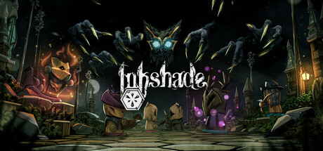
Inkshade is a turn-based tactics game carved out of strange wooden miniatures, wrapped in a web of locked rooms, and orchestrated by an otherworldly game master. Victory is not guaranteed, and the only constant is the cruel black ink that flows within the pieces.
$19.99Very Positive(10)
Turn-Based TacticsRogueliteAtmospheric
Studio VezelleAug 14, 2025