Scoring genre clarity...
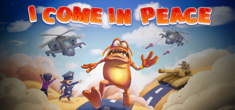
Don't panic! survive this bullet hell action! As a goofy pacifist alien that crashed on Earth, use your defense abilities to evade paranoid humans whose deadly attacks on you cause destruction and mayhem. Navigate the chaos, collect your spaceship parts, and run the hell out of this planet!
$4.99Positive(14)
ActionBullet HellArcade
Fooya GamesApr 16, 2025