Scoring genre clarity...
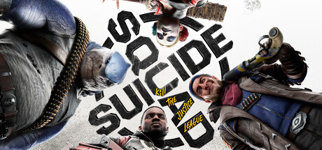
Suicide Squad: Kill the Justice League capsule

Suicide Squad: Kill the Justice League

From the creators of Batman: Arkham, Suicide Squad: Kill the Justice League is a genre-defying third-person action shooter where the ultimate band of misfits must do the impossible: Kill the Justice League.

$3.49Mixed(92)
CapitalismOnline Co-OpSuperhero
Rocksteady StudiosFeb 2, 2024

Suicide Squad: Kill the Justice League scores 62/100 — better than 2% of Capitalism capsules (n=575).

Mixed (92 reviews) · $3.49 · Released Feb 2, 2024 · By Rocksteady Studios

Quick text summary

Suicide Squad: Kill the Justice League scored 62/100 on Steam Analyzer — Solid for a Capitalism capsule. Top priority fix: [composition] Reduce visual clutter by establishing one clear focal character in the foreground center, repositioning supporting cast to background or sides to create depth hierarchy and improve TINY size readability.

Capsule scores by dimension

  • Genre Clarity: 7/10 — Action shooter with character focus. The capsule clearly communicates an action game through visible weapons, tactical gear, and dynamic character poses arranged in a radial composition. Multiple armed characters and heavy weaponry establish third-person shooter credentials, though the 'Kill the Justice League' text and ensemble cast don't immediately signal the superhero/comic property angle at tiny size. At TINY size, the chaotic arrangement and overlapping figures read as 'action team' but lose specific genre nuance.
  • Title Readability: 6/10 — Bold text, moderate clarity issues. The title 'SUICIDE SQUAD KILL THE JUSTICE LEAGUE' is rendered in large black sans-serif on a white background, which provides good contrast against the dark Steam background. However, at SMALL size the stacked layout feels cramped, and at TINY size the full text becomes difficult to parse—only 'SUICIDE SQUAD' remains clearly legible due to character size. The layout prioritizes impact over optimized readability at small sizes.
  • Contrast & Color: 7/10 — Strong value separation, white anchor. The white background and black title create high contrast against #1b2838, and the bright clothing colors (blue, red, yellow accents) on the characters provide secondary pop. The grayscale silhouettes of the characters remain distinct from the background, and the overall light-to-dark value range supports quick recognition. At TINY size the composition maintains reasonable clarity, though fine detail in gear and faces collapses.
  • Uniqueness & Polish: 5/10 — Competent but generic ensemble layout. The radial arrangement of armed characters is a familiar action game template, seen across many shooter and team-based titles. While the execution is clean and the character variety is visible, there is no distinctive visual hook, signature art style, or unique compositional insight that sets this apart from benchmark competitors like Warhammer 40K: Space Marine 2 or Helldivers 2. The presentation feels professional but follows convention without a standout creative signature.
  • Brand Consistency: 6/10 — Arkham studio heritage, minimal ID cues. The gritty, grounded character rendering and tactical costume design reflect the Arkham franchise's visual DNA, establishing internal studio consistency. However, the capsule lacks iconic character silhouettes, recognizable motifs (like the Joker's laugh or a signature symbol), or a distinctive color palette that would make this IP immediately memorable on repeat exposure. The title text is the only strong identity anchor; the visual treatment is competent but not distinctly branded.
  • Composition: 6/10 — Radial balance, focal point diffusion. The radial arrangement of five characters around the centered title creates visual balance but scatters attention across the frame—no single primary subject dominates, making the read at TINY size feel cluttered and hard to parse quickly. The white background zones provide breathing room, but the symmetrical character placement feels static and lacks dynamic layering (foreground, midground, background depth). Safe margins are respected, but the composition prioritizes symmetry over clear hierarchy.

What works

  • Title contrast on light background. Black text on white provides excellent separation against the Steam dark background, ensuring the main brand message reads clearly at full size.
  • Character silhouette variety and clarity. The five distinct character poses and outfits are visually different and readable even at small size, communicating a diverse ensemble cast.
  • Weapon visibility and gear detail. Guns, armor, and tactical equipment are prominent and clearly visible, immediately establishing the action shooter genre.

What hurts the capsule

  • Cluttered focal point at small sizes. Five characters of near-equal visual weight arranged symmetrically creates competing focal points, and at TINY size the composition collapses into visual noise rather than a clear read.
  • Generic ensemble template. The radial character arrangement is a common action game layout seen across many AAA titles, with no distinctive compositional or stylistic hook.
  • Weak brand identity cues. No iconic character silhouettes, signature symbols, or memorable color palette distinguish this capsule as Suicide Squad on repeat exposure—only the title anchors the brand.

Priority fixes

  1. [composition] Reduce visual clutter by establishing one clear focal character in the foreground center, repositioning supporting cast to background or sides to create depth hierarchy and improve TINY size readability.
  2. [uniqueness_polish] Introduce a distinctive color grade, lighting motif, or compositional element (e.g., dramatic spotlight, signature palette) that signals Suicide Squad identity beyond the title text.
  3. [title_readability] Test stacking 'SUICIDE SQUAD' on one line and 'KILL THE JUSTICE LEAGUE' as smaller secondary text to improve legibility at SMALL and TINY sizes without sacrificing impact.

Related guides

Steam app ID: 315210 · Tags: Capitalism, Online Co-Op, Superhero, Looter Shooter, LGBTQ+