Scoring genre clarity...
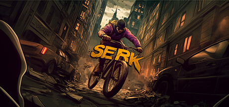
Are you from a city with no traffic? Do you feel that pain? Yes? I built this game for you — it simulates how a chaotic city with no traffic rules makes people suffer. No? Then it’s your time to find out what the other side of the world feels like!
$3.991 user reviews
ActionSimulationArcade
GOBLAGAMESJul 22, 2025