Sapling Wars scores 75/100 — better than 70% of Action capsules (n=8,534).

Quick text summary

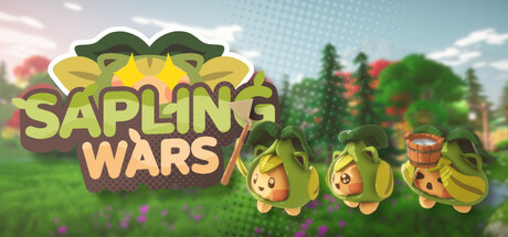
Sapling Wars scored 75/100 on Steam Analyzer — Good for a Action capsule. Top priority fix: [genre_clarity] Introduce subtle visual elements such as a shield icon, resource markers, or a faint competitive overlay to signal battle royale and team-based strategy elements without compromising the whimsical aesthetic.

Capsule scores by dimension

  • Genre Clarity: 7/10 — Casual strategy with cute characters. The three playful, anthropomorphic sapling characters with expressive faces and farming/combat poses clearly signal a casual strategy game with multiplayer appeal. At TINY size, the character silhouettes remain recognizable and the pastoral mountain landscape reinforces the farming-meets-battle theme, though the specific 'battle royale' mechanic is not immediately obvious from visuals alone.
  • Title Readability: 8/10 — Bold, readable title with strong hierarchy. SAPLING WARS uses a large, bold yellow-gold serif font with a thick dark outline that maintains excellent contrast against the light sky and green background. The title remains fully legible at SMALL and TINY sizes due to the substantial letterform weight and strategic placement above the character trio, with no tagline clutter to degrade readability.
  • Contrast & Color: 8/10 — Bright, separated palette with strong silhouettes. The warm yellow-gold title and vibrant green saplings pop distinctly against the soft blue-green sky and landscape background. At TINY size, the value separation between the characters and midground foliage remains clear, and the dark outline on the title ensures it does not blur into the pale background when squinting or scrolling quickly.
  • Uniqueness & Polish: 7/10 — Charming aesthetic with some generic elements. The cute anthropomorphic sapling characters and whimsical art style give the capsule a memorable, family-friendly identity that stands apart from typical action shooters. However, the pastoral landscape and soft lighting approach are familiar in casual strategy and farming game capsules, and the visual does not clearly communicate the competitive multiplayer or battle royale hook that would distinguish it from single-player farming sims.
  • Brand Consistency: 7/10 — Cohesive art direction with iconic characters. The three distinct sapling designs with consistent warm color palette, simple proportions, and expressive faces create a recognizable brand identity. The overall soft, pastoral art direction with halftone-style foliage and gentle lighting is cohesive, though the capsule does not reveal whether these character designs and this pastoral motif carry distinctly throughout the game's UI and promotional materials.
  • Composition: 8/10 — Clear focal point with balanced depth layering. The three saplings anchored in the center-right create a strong focal point that guides the eye downward, while the mountain landscape and sky provide layered background depth without clutter. At SMALL and TINY sizes, the character trio remains the primary subject and does not compete with the title; safe margins around all edges prevent crop loss, and the overall balance feels intentional and premium.

What works

  • Exceptional title legibility. Large, bold serif font with thick dark outline ensures SAPLING WARS remains crystal clear at all sizes, including TINY, without loss of identity.
  • Charming visual identity. The three expressive saplings with warm color palette and whimsical proportions create a memorable, distinctive brand that would be recognizable in future promotional materials.
  • Strong contrast and silhouette separation. Characters and title pop clearly against the soft blue-green sky and landscape, maintaining readability even under quick scroll and with grayscale conversion.
  • Layered composition with clear hierarchy. Background mountain landscape, midground foliage, and foreground character trio create natural depth without visual clutter or competing focal points.

What hurts the capsule

  • Unclear competitive/multiplayer messaging. The pastoral farming aesthetic and peaceful landscape do not visually communicate the battle royale or team-based competitive core mechanic that differentiates it from casual farming sims.
  • Generic pastoral landscape backdrop. The soft green mountains and sky, while pleasant, are a familiar convention in casual strategy and farming game capsules, reducing visual distinctiveness in genre crowding.
  • Limited action or strategy visual cues. The saplings do not display weapons, defensive structures, or combat poses; the capsule emphasizes charm over gameplay stakes, which may not convey urgency or competitive intensity.

Priority fixes

  1. [genre_clarity] Introduce subtle visual elements such as a shield icon, resource markers, or a faint competitive overlay to signal battle royale and team-based strategy elements without compromising the whimsical aesthetic.
  2. [uniqueness_polish] Add a distinctive environmental or gameplay hook—such as a team base outline, farming plot, or subtle HUD element—that differentiates this from generic farming or life-sim capsules and clarifies the multiplayer battle premise.
  3. [composition] Consider repositioning one sapling into a defensive or strategic pose (e.g., guarding a miniature structure) to reinforce the competitive gameplay loop while maintaining the charming art style.

Store copy priority fixes

  1. [hook_strength] Lead the short description with the farming-combat hybrid explicitly: 'Sapling Wars is a battle royale where you farm resources and destroy enemy bases in fast-paced 4-team combat.' This frontloads uniqueness before standard BR language.
  2. [uniqueness] Add a sentence explaining why the farming-combat blend is mechanically distinct: e.g., 'Unlike traditional BRs, your farming decisions directly impact combat power and base defenses,' to articulate competitive depth.
  3. [audience_targeting] Clarify team-size flexibility early in detailed description: specify if solo players can queue, if team coordination is mandatory for winning, or if casual/hardcore modes exist.
  4. [tone_match] Unify voice by either expanding the conversational 'Think again' tone throughout or removing it in favor of consistent, energetic language matching the game's cute + action identity.

Related guides

Steam app ID: 3159040 · Tags: Action, Strategy, Casual, Battle Royale, 3D