Scoring genre clarity...

Shade Silver 2 A Walk In The Darkness capsule

Shade Silver 2 A Walk In The Darkness

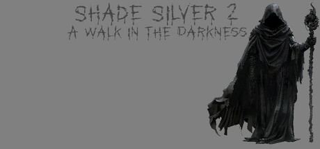
Shoot, Fight, Outwit Enemies, Avoid Spikes, Dark Faces, Evil Bunnies, Solve Puzzles, Fight Bosses, Collect Eyes, Blow Up Bombs, And More, Across Multiple Nightmares, In This Dark Sequel Dungeon Crawler.

$5.991 user reviews
Shoot 'Em UpTop-Down ShooterDungeon Crawler
Chris AllenAug 18, 2025

Shade Silver 2 A Walk In The Darkness scores 60/100 — better than 0% of Shoot 'Em Up capsules (n=814).

1 user reviews · $5.99 · Released Aug 18, 2025 · By Chris Allen

Quick text summary

Shade Silver 2 A Walk In The Darkness scored 60/100 on Steam Analyzer — Solid for a Shoot 'Em Up capsule. Top priority fix: [title_readability] Increase font weight and add a subtle dark outline or drop shadow to the title to maintain legibility at TINY size and improve contrast against the gray background.

Capsule scores by dimension

  • Genre Clarity: 7/10 — Dark action adventure clearly signaled. The hooded skeletal figure with staff and the grayscale palette immediately suggest a dark fantasy action game with supernatural or horror elements. At TINY size, the silhouette of the robed character and staff remain readable, though the specific dungeon crawler nature is less obvious without the tagline. Genre messaging is strong but could be more specific about puzzle or exploration focus.
  • Title Readability: 6/10 — Title readable at full size, degrades at tiny. SHADE SILVER 2 reads clearly in the upper left at full size with reasonable spacing, but the thin sans-serif font loses definition at TINY size and begins to blur into the background. The tagline 'A WALK IN THE DARKNESS' is positioned below but becomes unreadable at thumbnail scale due to small point size and light gray value on gray background.
  • Contrast & Color: 6/10 — Adequate but limited value separation overall. The robed figure achieves good silhouette contrast against the mid-gray background, with strong black rendering on the character. However, the title text and background occupy a narrow mid-gray range that lacks punchy separation at small sizes, and at TINY scale the figure compresses into the background despite initial clarity at full size.
  • Uniqueness & Polish: 5/10 — Competent but generic dark fantasy aesthetic. The execution is clean and the hooded figure is well-rendered, but the visual language—robed skeleton, staff, gray palette—feels familiar within the dark dungeon crawler space and does not communicate a unique mechanical hook or distinctive identity. Comparison to top genre capsules (Hellblade, DREDGE, Slay the Princess) shows this lacks a memorable or standout visual concept.
  • Brand Consistency: 5/10 — No distinctive identity cues established. The capsule presents a single dark character without recurring motifs, iconography, or color palette signals that would be recognizable across multiple brand touchpoints. Without access to in-game screenshots for comparison, the robed figure appears generic to the dungeon crawler genre and does not establish a unique visual signature that would distinguish Shade Silver 2 from competitor titles.
  • Composition: 7/10 — Strong focal point, minor margin concerns. The robed figure is clearly positioned as the primary subject and commands attention across all sizes, with title text placed safely in the upper left avoiding direct overlap. However, the figure sits slightly toward the right edge, and at TINY crop simulation there is noticeable dead space on the left that could be better utilized, reducing overall compositional efficiency.

What works

  • Character silhouette reads at all sizes. The hooded figure maintains clear definition and recognizable form from full size down to TINY scale, serving as a reliable focal point.
  • Title placement avoids overlap. Text is anchored in the upper left with sufficient spacing from the character, ensuring readability separation at full and small sizes.
  • Dark aesthetic matches genre expectations. The grayscale palette and supernatural figure correctly signal a dark action adventure without confusing the intended tone or category.

What hurts the capsule

  • Title degrades at tiny size. The light gray sans-serif font loses crispness and blends into the background at thumbnail scale, reducing discoverability in quick scroll.
  • Generic visual identity. The robed skeleton with staff lacks distinctive art style, memorable motifs, or unique visual hooks that would differentiate it from other dark fantasy titles in the genre.
  • Underutilized left compositional space. Significant negative space on the left side of the frame is wasted when the figure could be repositioned or supporting elements added for better balance.
  • Tagline unreadable at small size. The subtitle text is too small and lacks sufficient contrast to function at SMALL or TINY viewing scales, becoming visual noise rather than reinforcement.

Priority fixes

  1. [title_readability] Increase font weight and add a subtle dark outline or drop shadow to the title to maintain legibility at TINY size and improve contrast against the gray background.
  2. [contrast_color] Boost the title color to a lighter gray or white value, or darken the background region behind text to create a 7+ value separation in grayscale mode.
  3. [uniqueness_polish] Introduce a distinctive visual element—such as a unique color accent, iconic symbol, or stylized effect—that signals Shade Silver 2's mechanical identity beyond generic dark fantasy.
  4. [composition] Reposition the character slightly left and add supporting visual elements (e.g., environmental detail, collectible icon, puzzle motif) to fill dead space and reinforce the dungeon crawler concept.

Store copy priority fixes

  1. [hook_strength] Rewrite the short description as a single, punchy sentence that leads with the core premise (e.g., 'Guide a wizard through nightmare dungeons filled with dark creatures and deadly traps—shoot, solve, and survive to escape reality itself') instead of a feature list.
  2. [uniqueness] Add 1–2 sentences explaining what makes Shade Silver 2 distinct (e.g., a unique visual style, an unusual twist on the dungeon crawler formula, or specific standout boss designs) beyond 'more of the first game.'
  3. [tone_match] Revise the closing paragraph to commit to either horror or action-adventure tone consistently; remove forced phrases like 'satisfy your cravings for Nightmares' and replace with language that authentically matches the game's mood.
  4. [audience_targeting] Add 1–2 clarity statements about who will enjoy this game (e.g., 'for fans of fast-paced action-puzzle games' or 'ideal for solo players seeking challenging horror dungeons') to help the right players identify immediately.

Related guides

Steam app ID: 3162750 · Tags: Shoot 'Em Up, Top-Down Shooter, Dungeon Crawler, Puzzle, Tutorial