Scoring genre clarity...
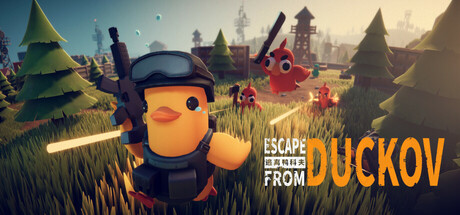
Escape From Duckov capsule

Escape From Duckov

Escape from Duckov is a PVE indie survival RPG — in a duck's world!. Scavenge for resources, build your hideout, and upgrade your gear in the world of Duckov. Start from nothing and rise to the top. Outwit hostile ducks, survive, or make it out alive.

$13.49Very Positive(731)
AdventureActionExtraction Shooter
Team SodaOct 16, 2025

Escape From Duckov scores 72/100 — better than 47% of Adventure capsules (n=8,231).

Very Positive (731 reviews) · $13.49 · Released Oct 16, 2025 · By Team Soda

Quick text summary

Escape From Duckov scored 72/100 on Steam Analyzer — Good for a Adventure capsule. Top priority fix: [contrast_color] Increase sky-to-midground value separation by adding a slight cyan or purple rim-light to village silhouettes to push them forward in grayscale

Capsule scores by dimension

  • Genre Clarity: 7/10 — Whimsical survival RPG identity clear. The oversized orange duck protagonist in tactical gear with weapons clearly signals an action-survival game with a quirky art style. At SMALL and TINY sizes, the duck silhouette and gear remain readable, though the survival/scavenging mechanics are inferred from context rather than explicit UI cues. The colorful fantasy village backdrop supports an adventure genre read without strong RPG or survival iconography.
  • Title Readability: 8/10 — Title legible with strong contrast. ESCAPE FROM DUCKOV uses bright orange and white text positioned over a darker background area on the right side, ensuring clarity across sizes. At TINY size, the title remains readable though tagline details blur; the main game title maintains strong letter separation. Placement on the right half avoids the busy village scene, aiding legibility.
  • Contrast & Color: 7/10 — Good separation despite warm palette. The bright orange duck protagonist pops distinctly against the muted teal-green forest and sky tones, creating a clear focal point even at small sizes. The warm orange and cooler background establish solid value separation in grayscale. However, the overall palette is warm-dominated, and the sky-to-background gradient creates some mid-tone softness that slightly reduces edge crispness at TINY size.
  • Uniqueness & Polish: 7/10 — Charming character design, generic setting. The anthropomorphic duck in combat gear is a memorable and distinctive visual hook that differentiates this from generic survival games. The art style is polished with clean shapes and intentional proportions, though the background village scene uses common fantasy tropes without a strong signature visual identity. At SMALL size the duck remains the standout element, but the generic pastoral setting feels supplementary rather than part of the core hook.
  • Brand Consistency: 6/10 — Consistent but generic visual identity. The duck protagonist establishes a clear character motif, and the art direction is internally cohesive with consistent rendering and soft-edged stylization throughout. However, the visual language lacks iconic symbols, distinctive color palette hierarchy, or signature design cues that would make the brand instantly recognizable without the title. The whimsical tone is consistent but not uniquely branded.
  • Composition: 8/10 — Clear hierarchy, well-balanced layout. The orange duck occupies the left-center focal point while title text anchors the right side, creating a balanced compositional structure that guides the eye naturally. The three-tier depth—foreground character, midground village, background sky—establishes clear spatial layering. At TINY size the duck remains the dominant focal point and the title stays readable; composition does not collapse under squeeze.

What works

  • Distinctive protagonist silhouette. The orange duck in tactical gear is immediately recognizable and unique compared to human-centric survival game covers, providing clear brand differentiation.
  • Readable title placement strategy. Right-side positioning of ESCAPE FROM DUCKOV over darker background zones ensures legibility at all viewing sizes without fighting the focal character.
  • Balanced composition across scales. The left-anchored character and right-anchored title create stable visual weight that does not collapse or become confusing when reduced to TINY size.

What hurts the capsule

  • Generic background environment. The fantasy village and forest scene use common pastoral tropes that do not reinforce the game's unique survival-RPG identity or core mechanics.
  • Warm palette muddles background depth. The sky-to-midground color transition lacks sufficient contrast separation, causing the village and distant towers to blend into soft mid-tones rather than read as distinct layers.
  • Limited brand iconography. Beyond the duck character, there are no signature symbols, UI elements, or visual cues that would make the game recognizable in future marketing materials or menus.

Priority fixes

  1. [contrast_color] Increase sky-to-midground value separation by adding a slight cyan or purple rim-light to village silhouettes to push them forward in grayscale
  2. [uniqueness_polish] Replace or stylize the background to incorporate survival elements like resource piles, fortifications, or hostile duck enemies to reinforce core mechanics
  3. [brand_consistency] Introduce a distinctive color accent or icon motif (e.g., red flags, resource symbols) that appears consistently to establish recognizable brand identity

Store copy priority fixes

  1. [hook_strength] Rewrite the short description opening to lead with a specific, high-stakes action verb: 'Raid procedural duck wastelands, extract with loot, or lose everything—an extraction shooter where every run rewrites the story.' This front-loads the core tension and gameplay loop.
  2. [uniqueness] Add one sentence explicitly differentiating Duckov from other extraction shooters—e.g., 'With 50+ hours of story missions woven into extraction runs, Duckov blends narrative progression with roguelike risk-reward,' or highlight a specific mechanical or world-building innovation.
  3. [tone_match] Reduce frequency of forced duck puns and cutesy language in core gameplay sections (keep 1–2 for charm, remove from weapon/gear/survival text). Let the whimsical world speak for itself while maintaining tactical credibility.
  4. [feature_communication] Expand the base building section with 2–3 concrete mechanics: 'Upgrade your hideout with defenses, craft stations, and storage. Defend against raids or fortify for faster recovery between expeditions.'

Related guides

Steam app ID: 3167020 · Tags: Adventure, Action, Extraction Shooter, Top-Down Shooter, Looter Shooter