Scoring genre clarity...
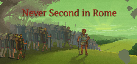
Never Second in Rome is a turn-based historical game with RPG and management elements. You are a Roman centurion in the army of Julius Caesar. You will control both your character and the unit under his command.
$12.99Very Positive(44)
RomeHistoricalTurn-Based
Alessandro RobertiMay 5, 2026