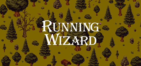
Running Wizard scores 75/100 — better than 68% of Shoot 'Em Up capsules (n=829).

Quick text summary

Running Wizard scored 75/100 on Steam Analyzer — Good for a Shoot 'Em Up capsule. Top priority fix: [title_readability] Simplify the title font or add a stronger outlined background panel to maintain legibility at thumbnail sizes without losing the magical aesthetic.

Capsule scores by dimension

  • Genre Clarity: 8/10 — Clear roguelike action fantasy. The pixel art wizard character in purple robes, surrounded by enemies and magical elements, immediately communicates a spell-based action game. The running pose and obstacle-filled scene with projectiles suggest fast-paced gameplay. At tiny size, the silhouette of the wizard and enemy variety remain readable enough to convey the roguelike action genre, though fine details blur.
  • Title Readability: 7/10 — Readable but decorative font. The title 'Running Wizard' uses a stylized metallic serif font with ice/magical effects that reads clearly at full size and remains legible at small size, though the ornamental styling costs some crispness at tiny dimensions. The white text with blue accents and shadow outline provides adequate contrast against the scene, but the decorative nature means it loses some impact when scaled down significantly.
  • Contrast & Color: 8/10 — Strong value separation overall. The bright purple wizard character and cyan magical effects create excellent pop against the dark green foliage and deep sky background. The title's white and light blue coloring stands out well against the mid-tone environment. At tiny size, the primary character and enemies maintain distinct silhouettes, though some mid-ground details blend into the background clutter.
  • Uniqueness & Polish: 7/10 — Polished pixel art with character. The clean pixel art style is well-executed with cohesive enemy design, environmental detail, and magical effects that feel intentional rather than random. The wizard character has personality through pose and outfit, and the scene composition tells a story of action and danger. However, the overall aesthetic, while quality, sits within expected indie pixel art conventions rather than feeling distinctly fresh.
  • Brand Consistency: 7/10 — Consistent art style, recognizable setup. The purple wizard figure and pixel art rendering style would be recognizable across marketing materials based on the distinctive character color and fantasy theme. The cohesive enemy design and magical effects suggest a unified art direction. However, without exposure to other Running Wizard assets, it's difficult to identify truly iconic brand motifs beyond the wizard silhouette itself.
  • Composition: 8/10 — Strong focal point, balanced hierarchy. The wizard is clearly the primary focal point in the center-left area, with enemies and obstacles creating supporting visual interest without overwhelming the composition. The layered depth from foreground characters through mid-ground obstacles to background sky creates good visual hierarchy. The title placement at bottom-center is safe and doesn't interfere with the art; the composition reads well even at tiny size, though edge elements (right-side trees) approach crop danger zones.

What works

  • Clear focal point hierarchy. The purple wizard draws the eye immediately and remains the primary subject across all viewing sizes, with supporting enemies and obstacles creating depth without competing for attention.
  • Strong color contrast. Bright purple, cyan, and white elements pop distinctly against the dark green and blue background, maintaining readability even at tiny thumbnail size.
  • Coherent pixel art execution. Character design, enemies, and effects are rendered in a consistent, polished style that suggests quality and intentional art direction.

What hurts the capsule

  • Title font loses crispness at tiny size. The decorative metallic serif styling becomes muddy and difficult to parse when scaled to thumbnail dimensions, reducing text legibility despite reasonable contrast.
  • Background clutter in mid-tones. The green foliage and mid-ground enemies create visual noise that slightly competes with the main wizard figure, and some details blend together in grayscale test.
  • Limited distinctive brand identity. While the wizard is recognizable, the overall composition uses generic fantasy roguelike visual language without a signature motif or memorable icon beyond the character itself.

Priority fixes

  1. [title_readability] Simplify the title font or add a stronger outlined background panel to maintain legibility at thumbnail sizes without losing the magical aesthetic.
  2. [composition] Reduce mid-ground foliage density or darken it slightly to increase separation between the wizard figure and background clutter.
  3. [brand_consistency] Introduce a distinctive visual signature such as a unique magical effect, color accent pattern, or iconic symbol that could serve as a recognizable Running Wizard brand marker.

Store copy priority fixes

  1. [hook_strength] Cut or condense the mage/potion narrative opening; replace with a direct hook like 'Unleash spells, survive waves of darkness, and race toward the horizon in this auto-runner bullet hell' to match the short description's energy.
  2. [uniqueness] Add a specific differentiator, such as 'Combine spell combos unique to each wizard' or 'the only auto-runner shoot em up where spell discovery changes your playstyle' to justify choosing this game.
  3. [tone_match] Rewrite the detailed description opening to match the punchy, action-first tone of the short description rather than starting with fantasy flavor.
  4. [audience_targeting] Clarify difficulty and playstyle expectations: add a line indicating whether this is casual-friendly or targets speed-runners and bullet-hell fans.

Related guides

Steam app ID: 3170250 · Tags: Shoot 'Em Up, 2D, Action Roguelike, Runner, Pixel Graphics