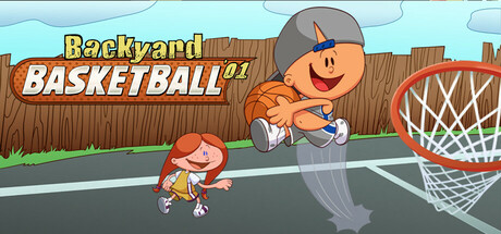
Backyard Basketball '01 scores 80/100 — better than 79% of Sports capsules (n=905).

Quick text summary

Backyard Basketball '01 scored 80/100 on Steam Analyzer — Good for a Sports capsule. Top priority fix: [title_readability] Increase the visual weight and outline of the '01' year text to maintain legibility at tiny sizes, or consider repositioning it to a more prominent location.

Capsule scores by dimension

  • Genre Clarity: 9/10 — Clear casual sports gameplay. The basketball hoop, dribbling player, and backyard court setting instantly communicate casual arcade sports at any size. Cartoon art style and character poses reinforce the lighthearted, accessible tone. Even at tiny size, the hoop silhouette and athletic posture are unmistakably basketball.
  • Title Readability: 8/10 — Strong readable title treatment. The bold yellow 'Backyard BASKETBALL '01' text with white outline stands out clearly against the blue sky and wooden fence background at all sizes. The orange shadow effect adds depth without compromising legibility. At tiny size, both the word 'Backyard' and 'BASKETBALL' remain distinguishable, though the year becomes harder to parse.
  • Contrast & Color: 8/10 — Vibrant colors pop well. Bright cyan sky, orange basketball, red hoop, and warm wood tones create strong value separation against the dark Steam background. The yellow title text has excellent contrast with surrounding elements. Colors remain saturated and distinct even when squinting or viewing at small scale.
  • Uniqueness & Polish: 7/10 — Nostalgic charm with solid craft. The cartoon character design and retro 2001 aesthetic give this a distinctive identity that appeals to nostalgia. Clean linework and intentional color choices show professional execution. However, casual cartoon sports is a crowded visual category, and while this is well-done, it lacks a truly surprising or unique hook beyond the remake angle.
  • Brand Consistency: 8/10 — Consistent nostalgic identity. The cartoon character designs, warm wooden court aesthetic, and playful tone establish a cohesive Backyard brand identity. The visual style feels consistent with the Backyard Sports legacy and would be recognizable across marketing materials. The limited palette and friendly character expressions reinforce a memorable, unified brand voice.
  • Composition: 8/10 — Well-balanced focal hierarchy. The central character shooting creates a clear focal point, with the hoop positioned naturally to lead the eye. Title placement in the upper left avoids blocking key action. The composition uses foreground (characters), midground (court), and background (fence and sky) effectively. Safe margins protect elements at small sizes, and the basket remains visible and uncut.

What works

  • Instant genre recognition. Basketball hoop, court setting, and athletic pose communicate casual sports immediately at any viewing size.
  • High-contrast title design. Yellow text with white outline on controlled background ensures the game name stays readable from full to tiny size.
  • Cohesive visual identity. Cartoon art style, warm color palette, and character design create a recognizable and nostalgic brand presence.
  • Strong color saturation. Vibrant sky, orange ball, and red hoop maintain visual pop and distinctness against the dark Steam background.

What hurts the capsule

  • Generic casual sports look. While well-executed, cartoon basketball court scenes are visually common in the casual sports genre and lack a surprising unique hook.
  • Year text loses clarity at tiny size. The '01' in the title becomes hard to read at thumbnail scale due to smaller font weight relative to the main title.
  • Limited visual storytelling depth. The capsule shows the action but doesn't hint at unique mechanics, progression systems, or what makes this remake special beyond nostalgia.

Priority fixes

  1. [title_readability] Increase the visual weight and outline of the '01' year text to maintain legibility at tiny sizes, or consider repositioning it to a more prominent location.
  2. [uniqueness_polish] Add a subtle visual element that hints at a unique selling point—such as a character upgrade indicator, multiplayer hint, or enhanced feature badge—to differentiate from generic basketball games.
  3. [composition] Ensure the small character on the left remains clearly visible at 120x45 pixel thumbnail size by testing safe margins and considering a slight upscale or bold outline.

Store copy priority fixes

  1. [audience_targeting] Add a sentence to the short description that speaks directly to new players: e.g., 'Whether you're a longtime fan or discovering the classic for the first time, experience arcade basketball with charming kid athletes and hilarious power-ups.' This broadens appeal beyond nostalgic players.
  2. [hook_strength] Lead the short description with a stronger gameplay hook: Replace the opening with action-first language like 'Step onto the court with 30 iconic kid athletes and pull off wild dunks, hilarious power-ups, and season-long championship runs.' This immediately explains why the game is fun, not just who it's for.
  3. [tone_match] Relocate or rewrite the 'ADDITIONAL INFORMATION' section to use casual, fan-friendly language: e.g., 'We couldn't get the original code to work perfectly, but we've rebuilt it to look great and run smooth on Steam—plus new achievements!' This maintains voice consistency and frames limitations positively.
  4. [uniqueness] Add a specific mechanical or visual differentiator: e.g., 'The only basketball game where you can recruit iconic 90s kid athletes, unlock comical power-ups like rocket shoes, and manage a full season from the backyard court.' This clarifies what sets it apart from modern sports games.

Related guides

Steam app ID: 3170580 · Tags: Sports, Casual, Basketball, Arcade, Cute