Scoring genre clarity...
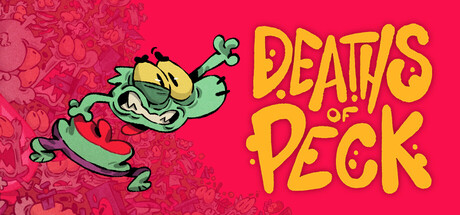
Deaths Of Peck capsule

Deaths Of Peck

Deaths of Peck is a fast-paced 2D platformer where the only way to WIN is to DIE! Play as Peck, a tiny goblin cursed with immortality. Orcs took your friends. No matter how many deaths it takes to save them, you always bounce back stronger - in this charmingly gory, hand-drawn adventure.

ActionPrecision PlatformerDifficult
THE LINE StudioComing soon

Deaths Of Peck scores 77/100 — better than 81% of Metroidvania capsules (n=378).

Released Coming soon · By THE LINE Studio

Quick text summary

Deaths Of Peck scored 77/100 on Steam Analyzer — Good for a Metroidvania capsule. Top priority fix: [genre_clarity] Add subtle visual cue suggesting death mechanic (e.g., ghostly aura, respawn indicator, or stacked skeleton motif) to elevate conceptual clarity

Capsule scores by dimension

  • Genre Clarity: 7/10 — Quirky platformer with dark humor. The cartoonish goblin character with exaggerated expression and vibrant colors signals a stylized indie platformer with comedic tone. At tiny size, the character silhouette remains readable and the dynamic pose suggests action-gameplay, though the specific 'death-as-mechanic' hook is not visually obvious without context. The art style and character design clearly communicate indie adventure rather than horror or puzzle genres.
  • Title Readability: 8/10 — Bold yellow type, clear at all sizes. The title 'DEATHS PECK' uses thick yellow sans-serif lettering with strong contrast against the hot pink background, maintaining excellent legibility even at tiny thumbnail size. The all-caps treatment and tight kerning create a punchy, memorable impression during quick scroll. Letter forms remain distinct and sharp across all viewing scales without collapse or blur.
  • Contrast & Color: 8/10 — Vibrant hot pink with strong value separation. The saturated magenta background (#FF1461 approx) creates excellent contrast against the dark Steam background #1b2838, with bright yellow type providing strong value separation. The teal-green goblin character has clear silhouette distinction in grayscale, and the layered composition (character foreground, pattern background) maintains depth even at tiny size. Saturation is intentional and controlled, avoiding muddy mid-tones.
  • Uniqueness & Polish: 8/10 — Hand-drawn charm with distinctive character. The goblin design shows clear hand-drawn quality with exaggerated features, toothy grin, and loose linework that feels intentional rather than generic asset-based. The visual hook of a cursed immortal protagonist is reinforced by the dynamic, slightly chaotic pose that suggests the game's 'keep dying to win' mechanic through movement alone. This rises above typical platformer templates with a cohesive, memorable art direction.
  • Brand Consistency: 7/10 — Consistent hand-drawn indie aesthetic. The capsule establishes internal cohesion through unified color palette (hot pink, yellow, teal-green), consistent hand-drawn character rendering, and decorative background pattern that supports the main illustration without competing. The bold typography matches the playful tone of the character design, creating a recognizable visual identity. However, without reference to additional branding materials, there are no iconic symbols or motifs that would guarantee recognition as 'Peck' specifically across other marketing touchpoints.
  • Composition: 8/10 — Clear focal point, balanced layout, safe margins. The goblin character occupies prime center-left real estate with strong visual weight and clear hierarchy, while the title anchors the upper right without competing for attention. The repeating curved pattern background provides texture depth without creating visual noise that interferes with the character read at any size. Safe margins are respected, and the composition remains cohesive at tiny size where the character and title remain spatially distinct and legible.

What works

  • Exceptional title contrast and legibility. Thick yellow sans-serif on hot pink background maintains sharp readability from full size down to tiny thumbnail, with no letterform collapse or blur during quick scroll.
  • Distinctive hand-drawn character design. The goblin's exaggerated features, dynamic pose, and expressive rendering create memorable visual identity that stands out from generic platformer templates.
  • Strong background separation. Hot pink saturation and teal-green character silhouette create excellent value contrast in grayscale while maintaining visual depth and layering.
  • Balanced focal point hierarchy. Character and title occupy distinct spatial zones without competing, and the supporting pattern background enhances rather than distracts from primary elements.

What hurts the capsule

  • Mechanic clarity not visually obvious. The 'deaths as progression' core hook is not communicable from visuals alone; a viewer sees a platformer but not specifically why dying is winning.
  • Limited narrative context in capsule. While the tone and genre are clear, the story hook (immortal cursed goblin rescuing friends from orcs) is not visually telegraphed, reducing emotional connection at glance.
  • Background pattern lacks specific purpose. The repeating curved motif adds visual interest but does not reinforce game theme, character backstory, or unique selling point beyond generic texture fill.

Priority fixes

  1. [genre_clarity] Add subtle visual cue suggesting death mechanic (e.g., ghostly aura, respawn indicator, or stacked skeleton motif) to elevate conceptual clarity
  2. [composition] Consider incorporating a small orc silhouette or secondary character hint to reinforce the rescue-mission narrative and raise emotional stakes
  3. [uniqueness_polish] Replace generic background pattern with thematic elements (cursed runes, respawn portals, or goblin-specific iconography) that build world cohesion

Store copy priority fixes

  1. [feature_communication] Replace or follow the playtest callout with a concrete gameplay sentence: 'When Peck dies, [specific progression mechanic] — your health increases / new ability unlocks / tower changes. Repeat deaths layer new challenges and rewards.' This explains the core loop in action terms.
  2. [feature_communication] Add 1-2 sentences after 'master powerful abilities' describing 1-3 example abilities or progression types (e.g., 'Unlock flight, wall-climb, and phase powers as you ascend').
  3. [uniqueness] Insert a sentence differentiating this from other death-loop games: 'Unlike roguelikes, each death makes Peck permanently stronger, not the player—story progression rewards dying strategically, not punishment.'
  4. [audience_targeting] Add one line signaling difficulty/skill: 'Challenging platforming for players who love Celeste and Dead Cells' or 'Accessible to newcomers, rewarding for completionists.'

Related guides

Steam app ID: 3174780 · Tags: Metroidvania, Adventure, 2D Platformer, Platformer, 2D