Scoring genre clarity...

Tesserarii: The Dice Rolling Roguelike capsule

Tesserarii: The Dice Rolling Roguelike

The dice rolling rogue-like. Tesserarii is an enchanting indie strategy game where you increase the power of your dice rolls and combos to deliver satisfyingly powerful blows to the enemy.

$7.994 user reviews
CasualStrategyBoard Game
Dylan Van BeekMar 27, 2025

Tesserarii: The Dice Rolling Roguelike scores 73/100 — better than 54% of Casual capsules (n=10,153).

4 user reviews · $7.99 · Released Mar 27, 2025 · By Dylan Van Beek

Quick text summary

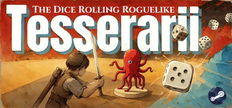
Tesserarii: The Dice Rolling Roguelike scored 73/100 on Steam Analyzer — Good for a Casual capsule. Top priority fix: [title_readability] Integrate or remove the top banner tagline; move 'Dice Rolling Roguelike' as a secondary subtitle positioned below 'Tesserarii' in a smaller but still readable weight that survives 231×87 compression

Capsule scores by dimension

  • Genre Clarity: 8/10 — Dice roguelike mechanics clear. The central red octopus character, multiple dice elements (large d20 and smaller dice scattered), and the adventurer with sword all clearly signal a dice-rolling strategy game with fantasy combat. At tiny size, the dice and character silhouettes remain readable enough to convey roguelike strategy gameplay, though the exact genre mechanics require the title to fully land.
  • Title Readability: 7/10 — Title readable but subtitle weak. The main 'Tesserarii' title in large white sans-serif is bold and reads clearly at full and small sizes against the warm background. The tagline 'The Dice Rolling Roguelike' in the top banner is readable at full size but collapses into illegibility at tiny size, creating a minor hierarchy issue. The primary title survives the 120×45 compression adequately.
  • Contrast & Color: 8/10 — Strong warm-cool separation. The composition uses warm orange-tan tones for the desert background with cool blue sky and bright white title text that pops cleanly against #1b2838. The red octopus and cream-colored dice create strong focal contrast; in grayscale, value separation is clear and silhouettes remain distinct even at compressed sizes. The adventurer figure in brown tones reads clearly without muddiness.
  • Uniqueness & Polish: 7/10 — Charming character, solid execution. The red octopus mascot with its whimsical design and friendly expression is memorable and distinct from typical roguelike fare, adding character to what could be a generic dice game aesthetic. The composition feels intentional and polished with layered depth and balanced element placement, though the overall execution sits in the good-to-solid range without revolutionary art direction. The visual storytelling effectively communicates a fun, approachable strategy game rather than dark or hardcore positioning.
  • Brand Consistency: 6/10 — Functional identity, limited signature. The red octopus appears consistent as a potential mascot character, and the warm earth-tone palette is cohesive throughout the composition. However, there are no strong iconic visual motifs, signature symbols, or distinctive rendering style that would create immediate recognition in a series—the design feels competent but lacks a memorable brand hook that would distinguish it from other indie strategy games at a glance.
  • Composition: 8/10 — Clear hierarchy, balanced focal points. The adventurer on the left, red octopus in the center, and floating dice create a natural left-to-right reading flow with the title anchoring the top. The composition maintains strong focal clarity at small and tiny sizes with the octopus as the primary subject and the large d20 as a supporting element that reinforces genre. Safe margins are generally respected, though the dice in the upper right edge approach crop risk; the overall layout remains resilient across Steam's display sizes.

What works

  • Strong value contrast and readability. White title text and bright dice elements pop cleanly against the warm-cool background separation, maintaining legibility and visual pop even at tiny thumbnail sizes.
  • Memorable mascot character. The red octopus is charming, distinctive, and serves as a clear focal point that communicates personality and approachability for the strategy indie space.
  • Clear genre signaling through iconography. The combination of adventurer, dice, fantasy setting, and octopus creature immediately communicates roguelike strategy gameplay without confusion.
  • Balanced multi-element composition. Three character and object elements are arranged with clear hierarchy and visual breathing room, avoiding clutter while maintaining visual interest.

What hurts the capsule

  • Subtitle tagline illegible at small size. The 'The Dice Rolling Roguelike' text in the top banner becomes unreadable at 231×87 and smaller, creating a secondary hierarchy problem for brand clarity.
  • Limited distinctive visual signature. While competent, the art direction lacks a strong iconic style or memorable motif that would help the game stand out from other indie strategy competitors.
  • Edge-proximate dice placement. Dice elements in the upper right corner approach Steam's crop boundaries and could be cut off in certain display contexts or platform variations.
  • Generic palette without unique distinction. The warm earth tones and blue sky, while functional and pleasant, don't carry a signature personality that differentiates the brand from other indie roguelikes.

Priority fixes

  1. [title_readability] Integrate or remove the top banner tagline; move 'Dice Rolling Roguelike' as a secondary subtitle positioned below 'Tesserarii' in a smaller but still readable weight that survives 231×87 compression
  2. [composition] Reposition floating dice elements away from the right edge to ensure they remain visible in all Steam display and mobile contexts without crop risk
  3. [uniqueness_polish] Develop a signature visual motif or distinctive rendering style (e.g., a unique border treatment, glow effect, or color accent) that becomes recognizable across store screenshots and promotional assets
  4. [brand_consistency] Create a consistent iconographic or color identity cue that reinforces the octopus mascot's brand presence, such as a distinctive silhouette or palette accent used across all game marketing

Store copy priority fixes

  1. [uniqueness] Add a sentence that articulates Tesserarii's specific design philosophy or core twist (e.g., 'the only dice roguelike where rolling happens in real-time' or 'combines 1980s arcade dice games with modern roguelike progression'). This is the highest-impact gap.
  2. [feature_communication] Replace 'combining different powerups and elements at the right time' with a concrete example of a synergy or combo (e.g., 'pair Fire dice with Wind elements to trigger cascading explosions'). This moves from vague to understandable.
  3. [hook_strength] Rewrite the short description to lead with the emotional payoff first: 'Watch your dice combos cascade into devastating attacks as you build an unstoppable run' rather than 'increase the power.' Lead with action and spectacle.
  4. [uniqueness] Explicitly mention the 1980s visual style in the copy (not just tags) to differentiate from modern roguelikes and appeal to retro-game fans: 'Throw yourself into this stylized 1980s arcade-inspired roguelike.'

Related guides

Steam app ID: 3176790 · Tags: Casual, Strategy, Board Game, Roguelike, Turn-Based Strategy