Scoring genre clarity...

Long Drive North: Co-Op RV Simulator capsule

Long Drive North: Co-Op RV Simulator

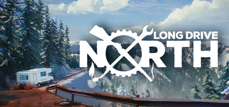
Join the Early Access journey with this immersive driving-survival game. Explore the harsh American wilderness in the Long Drive North. Drive & repair your trusty RV, scavenge for parts, upgrade your vehicle, hunt & cook to survive; alone or with up to 4 players. SHARED RV MULTIPLAYER NOW AVAILABLE.

$14.99Mostly Negative(33)
Early AccessSurvivalMultiplayer
Mindflair Games LTDNov 18, 2025

Long Drive North: Co-Op RV Simulator scores 72/100 — better than 42% of Early Access capsules (n=3,067).

Mostly Negative (33 reviews) · $14.99 · Released Nov 18, 2025 · By Mindflair Games LTD

Quick text summary

Long Drive North: Co-Op RV Simulator scored 72/100 on Steam Analyzer — Good for a Early Access capsule. Top priority fix: [title_readability] Replace or remove the yellow tagline banner with a minimal, integrated update indicator or relocate messaging to a clearer, larger format that remains legible at small size.

Capsule scores by dimension

  • Genre Clarity: 8/10 — Clear survival driving sim genre. The RV centered in a snowy wilderness with mountains and pine trees immediately communicates outdoor adventure and vehicle-based gameplay. At tiny size, the RV silhouette remains recognizable against the landscape, and the survival/exploration theme reads clearly from the setting alone. The gear/wrench icon integrated into the logo reinforces the repair and maintenance mechanics.
  • Title Readability: 7/10 — Strong logo, readable at all sizes. The 'LONG DRIVE NORTH' logo features bold, clean sans-serif typography with excellent contrast against the sky background, and the integrated wrench/gear motif adds visual interest without compromising legibility. At small and tiny sizes, the logo remains distinctly readable. However, the yellow banner with 'SHARED RV UPDATE + NEW DEMO' tagline becomes nearly illegible at tiny size due to compressed letterforms and competing visual weight.
  • Contrast & Color: 8/10 — Strong value separation throughout. The white logo stands out sharply against the blue-grey sky and darker forest elements, creating excellent silhouette clarity even at tiny sizes. The bright yellow banner provides strong chromatic contrast and guides attention to the update messaging. Against the dark Steam background, the entire composition pops with warm landscape tones (orange/rust RV) contrasting cooler sky and forest, maintaining clear hierarchy across all viewing sizes.
  • Uniqueness & Polish: 7/10 — Cohesive wilderness aesthetic, solid execution. The photorealistic RV in a genuine landscape setting feels premium and grounded compared to generic indie sim aesthetics, with a clear visual hook around vehicle-based survival exploration. The branded logo with integrated mechanical iconography shows intentional design thinking. However, the scene reads as a competent travel/tourism image rather than highlighting unique gameplay mechanics like multiplayer cooperation or scavenging systems that differentiate it from standard driving sims.
  • Brand Consistency: 6/10 — Functional identity, limited distinctiveness. The wrench/compass-style logo is a memorable motif that could serve as a recognizable brand symbol, and the wilderness setting with RV establishes consistent visual identity. The white-on-dark logo treatment appears cohesive with the broader brand direction. However, the capsule lacks iconic character, signature color palette beyond generic landscape tones, or visual storytelling elements that would make the brand immediately recognizable in a crowded storefront or compared to the reference titles.
  • Composition: 7/10 — Balanced landscape, clear focal hierarchy. The RV sits in natural mid-ground with strong layering—snowy foreground, vehicle midground, forest and mountains in background creating depth. The logo placement in upper right avoids competing with the primary subject, and the yellow banner anchors the bottom third with clear separation. At small size the composition holds well, though at tiny size the dense forest detail competes slightly with the RV silhouette, and the banner text becomes a visual weight that doesn't resolve into legible messaging.

What works

  • Photorealistic landscape setting. The authentic snowy wilderness with RV grounds the game in a tangible, premium aesthetic that immediately communicates immersion and adventure survival gameplay.
  • Logo contrast and integration. The white 'LONG DRIVE NORTH' logo with wrench motif maintains excellent readability at all sizes and serves as a potential brand anchor with its mechanical iconography.
  • Strong chromatic and value contrast. The composition pops against the dark Steam background with warm RV and landscape tones against cool sky and forest, ensuring visibility at tiny scroll speeds.
  • Clear depth layering. The foreground snow, midground RV, and background mountains create natural compositional hierarchy that prevents a flat, compressed appearance at smaller sizes.

What hurts the capsule

  • Tagline illegibility at tiny size. The 'SHARED RV UPDATE + NEW DEMO' banner text compresses into an unreadable yellow bar at thumbnail size, wasting prime messaging real estate.
  • Generic gameplay communication. The landscape and RV alone do not visually differentiate the co-op or scavenging mechanics from other driving/survival sims, relying on assumed genre familiarity rather than unique hook visibility.
  • Limited brand personality. Beyond the logo, the capsule lacks memorable iconography, character presence, or signature visual elements that would create instant recognition compared to peers like Lethal Company or DAVE THE DIVER.
  • Dense background detail at scale reduction. The busy forest and mountain texture, while beautiful full-size, competes with RV silhouette clarity when squinted or viewed at tiny size, reducing focal point isolation.

Priority fixes

  1. [title_readability] Replace or remove the yellow tagline banner with a minimal, integrated update indicator or relocate messaging to a clearer, larger format that remains legible at small size.
  2. [uniqueness_polish] Add a visual reference to co-op or survival mechanics—such as a second character figure, hunting/scavenging props, or an icon overlay—to differentiate the core gameplay hook from generic driving sims.
  3. [composition] Slightly increase RV size or adjust camera framing to ensure the vehicle remains the dominant focal point even at tiny size, reducing background visual competition.
  4. [brand_consistency] Develop a signature color or motif (beyond the logo wrench) that appears consistently across store assets to build immediate visual recognition in storefront browsing.

Store copy priority fixes

  1. [hook_strength] Rewrite the short description opening to lead with the core gameplay: 'Drive an aging RV across post-disaster America, repair it with your own hands, hunt and cook to survive—alone or with up to 4 players in shared multiplayer.' This moves the exciting hook ahead of 'Early Access' framing.
  2. [uniqueness] Add a sentence after the comp titles that articulates the specific differentiation: 'Unlike its inspirations, Long Drive North lets you share a single RV with friends, creating unique co-op survival challenges and collaborative vehicle maintenance.' This converts passive comparisons into active differentiation.
  3. [audience_targeting] Include an explicit statement about solo vs. multiplayer appeal: 'Perfect for survival-sim enthusiasts and co-op players—whether you prefer solo challenge or collaborative wilderness exploration.' This removes ambiguity about who benefits from which play mode.
  4. [feature_communication] Expand the 'shared RV multiplayer' explanation to clarify the choice: 'In multiplayer, travel together in one vehicle, sharing supplies and maintenance duties, or each pilot your own RV across the frontier.' This explains the mechanical difference and appeals to different playstyles.

Related guides

Steam app ID: 3179350 · Tags: Early Access, Survival, Multiplayer, Voxel, Co-op