Radirgy Swag scores 67/100 — better than 13% of Bullet Hell capsules (n=1,285).

Quick text summary

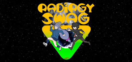
Radirgy Swag scored 67/100 on Steam Analyzer — Solid for a Bullet Hell capsule. Top priority fix: [title_readability] Replace distressed font with a cleaner, bolder sans-serif that maintains neon-arcade energy without sacrificing legibility at 120x45px.

Capsule scores by dimension

  • Genre Clarity: 7/10 — Shoot-em-up action clearly signaled. The two characters in dynamic poses with visible weapons (gun and sword) against a starfield immediately communicate action gameplay. The neon green checkmark and energetic composition reinforce arcade-style shooter energy. At tiny size, the character silhouettes and weapon outlines remain distinguishable, though specific game mechanics blur slightly.
  • Title Readability: 6/10 — Bold title with legibility limits. The all-caps yellow 'RADIRGY SWAG' uses thick, distressed letterforms with good contrast against the dark background. However, at tiny size the distressed texture and quirky spacing make individual letters harder to parse quickly; the title reads as 'action game' rather than legible text. The tagline below is unreadable at small and tiny sizes.
  • Contrast & Color: 8/10 — Strong yellow-green pop. Bright yellow title and neon lime-green checkmark create excellent value separation against the black starfield and dark Steam background. The character silhouettes benefit from rim lighting that pushes them forward. Grayscale test confirms strong light-dark separation; the green checkmark and yellow text remain clearly defined even when color is removed.
  • Uniqueness & Polish: 6/10 — Quirky but generic execution. The retro-arcade aesthetic with distressed fonts and neon colors feels intentional and matches the 'Swag' branding, but the character designs and composition are relatively standard for indie action games. The checkmark shape is a memorable motif, but overall execution reads as competent indie craft rather than premium or standout polish. No distinctive visual hook that separates it from mid-tier action titles.
  • Brand Consistency: 6/10 — Arcade aesthetic cohesive but generic. The distressed yellow type, neon green accent, starfield, and character roster create internal consistency around a retro-arcade theme. The look is recognizable as a cohesive brand direction. However, without access to store screenshots, the identity lacks memorable icons or signature palette cues that would make it instantly recognizable beyond the obvious arcade vibe shared by many indie shooters.
  • Composition: 7/10 — Clear hierarchy with balanced layout. The title anchors the top, the checkmark shapes the center focal point, and the two character poses create a strong visual anchor below. The starfield background provides clear separation between subject and environment. At small size, the composition remains readable with no element fighting for attention, though the center void around the checkmark creates slight imbalance at tiny size.

What works

  • Excellent color contrast. Bright yellow and neon green pop dramatically against the black starfield and dark Steam background, ensuring visibility at all sizes.
  • Action genre immediately clear. Character poses, weapons, and energetic composition communicate shoot-em-up action without ambiguity at small and tiny sizes.
  • Cohesive retro-arcade theme. Distressed typography, neon palette, and starfield create a unified visual direction that feels intentional and branded.

What hurts the capsule

  • Distressed font loses legibility. The quirky, textured letterforms reduce readability at tiny size; the title reads as atmosphere rather than clear text.
  • Generic character design. The two posed characters lack distinctive silhouettes or memorable features that would elevate brand recognition beyond standard indie action.
  • Tagline unreadable at scale. Secondary text below the title disappears entirely at small and tiny sizes, wasting space that could reinforce core identity.

Priority fixes

  1. [title_readability] Replace distressed font with a cleaner, bolder sans-serif that maintains neon-arcade energy without sacrificing legibility at 120x45px.
  2. [uniqueness_polish] Add a distinctive visual hook—iconic character trait, signature symbol, or unique color accent—that differentiates it from generic arcade shooters.
  3. [composition] Remove or heavily reduce the tagline; shift title slightly higher to eliminate center void and improve focal point hierarchy.

Store copy priority fixes

  1. [hook_strength] Replace or clarify "Radio-allergic Shoot 'Em Up" in the short description with a direct statement of what the mechanic is (e.g., 'Rocket through endless enemy waves with laser fire and melee slash combos') to remove the wordplay barrier.
  2. [feature_communication] Add a one-sentence explanation of how the slash mechanic works—is it a close-range melee counter, a combo system, or a screen-clear utility?—to eliminate ambiguity in core gameplay.
  3. [uniqueness] Add a specific differentiator in the detailed description such as 'the only shmup where you can slash and shoot in tandem' or detail what makes the Order mission system or story integration mechanically distinct from standard progression.
  4. [audience_targeting] Clarify in the short description or opening bullet whether this is a short arcade run or a longer campaign experience ("Endless ways to play" is vague) so players immediately know if this fits their time commitment.

Related guides

Steam app ID: 3179820 · Tags: Bullet Hell, Action, Shoot 'Em Up, Singleplayer, 2D