Scoring genre clarity...

Adrenalinkick capsule

Adrenalinkick

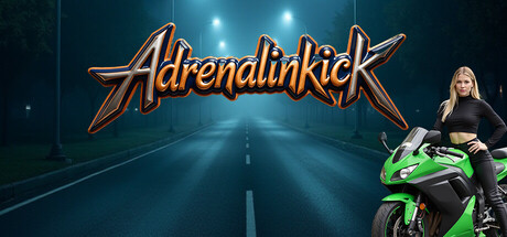
Feel like Ghost Rider and race across the highways and streets of any regions. A race in the grey area of the law, because there is no speed limit for you. But always remember, every decision could be your last. You don't have unlimited guardian angels.

$4.993 user reviews
RacingDrivingMotorbike
DraconumFeb 10, 2026

Adrenalinkick scores 70/100 — better than 28% of Racing capsules (n=762).

3 user reviews · $4.99 · Released Feb 10, 2026 · By Draconum

Quick text summary

Adrenalinkick scored 70/100 on Steam Analyzer — Good for a Racing capsule. Top priority fix: [uniqueness_polish] Introduce a distinctive visual signature—either a unique character design element, a signature UI frame, or a thematic symbol (e.g., 'no limits' motif or angel/guardian visual)—to differentiate from generic street racing imagery and communicate core theme.

Capsule scores by dimension

  • Genre Clarity: 8/10 — Racing action clearly communicated. The capsule immediately signals street racing through the highway setting with center line markings, bright motorcycle headlights, and a rider on a high-performance green bike positioned center-right. At tiny size, the road perspective and vehicle silhouette remain readable enough to identify motorcycle racing as the core genre. The illegal street racing theme reads clearly from the dark, isolated highway setting and nighttime atmosphere.
  • Title Readability: 7/10 — Logo readable but stylized. The 'Adrenalinkick' title uses a metallic orange/bronze script font with clear letterforms positioned in the upper third against a dark sky. At full size the text reads cleanly, and at small size it remains mostly legible though the decorative serifs lose some sharpness. At tiny size the overall word shape is still recognizable but fine details blur, which is acceptable given the bold styling and central placement on a low-contrast background region.
  • Contrast & Color: 8/10 — Strong value separation and highlights. Bright white and blue light elements (headlights, sky spots, road markings) create excellent value contrast against the deep teal-dark background, while the green motorcycle and orange title pop distinctly in the mid-tones. The silhouettes read clearly in grayscale with good edge separation between the rider, bike, road, and sky. The warm orange typography and cool blue-teal environment create compelling color harmony that maintains readability even at small sizes.
  • Uniqueness & Polish: 6/10 — Competent execution, familiar theme. The image quality is clean with professional lighting and rendering, but the core concept—lone rider on a glowing motorcycle against a dramatic highway—follows common racing game visual tropes seen in titles like Forza and HOT WHEELS UNLEASHED. While well-crafted, it lacks a distinctive visual hook or storytelling element that communicates what makes Adrenalinkick unique beyond standard street racing aesthetic. The metallic logo treatment adds some polish but doesn't elevate beyond genre baseline.
  • Brand Consistency: 6/10 — Consistent visual style, no icons. The capsule presents a cohesive dark-neon aesthetic with warm-cool color harmony that would likely carry through other marketing materials, and the metallic script logo could serve as a recognizable identity marker. However, without access to the 12 store screenshots, the internal consistency cannot be fully validated—the capsule lacks a distinctive character, symbol, or visual motif specific to Adrenalinkick that would enable immediate brand recognition. The neon-road theme is more of a genre convention than a brand signature.
  • Composition: 7/10 — Clear focal point, good depth layering. The composition uses effective foreground (rider and bike center-right), midground (road with headlight beams), and background (sky with atmospheric lights) to create visual depth and guide attention naturally. The title sits safely in the upper region without crowding edges, and the rider position creates a strong diagonal that activates the frame. At small and tiny sizes the motorcycle silhouette remains the primary focal point, though the character's face detail on the right edge loses clarity at thumbnail scale.

What works

  • Excellent contrast and light design. Bright headlights, road markings, and sky lights create vivid value separation against the dark background, making the image pop in quick scrolls and read well even at tiny size.
  • Clear racing genre signaling. The perspective road, glowing motorcycle, helmeted rider, and nighttime highway setting immediately communicate street racing action without ambiguity.
  • Professional rendering and lighting. The image shows polished execution with realistic motorcycle modeling, atmospheric depth, and intentional color grading that feels premium.
  • Effective focal point hierarchy. The green motorcycle and rider occupy the center-right with strong silhouette separation, naturally drawing the eye first at all viewing sizes.

What hurts the capsule

  • Generic racing theme lacking differentiation. The lone rider on glowing bike against dramatic highway is a well-worn visual formula in racing games, with no unique visual story or mechanic hint that distinguishes Adrenalinkick.
  • Character detail lost at tiny scale. The rider's face and pose detail on the right edge becomes indistinct at thumbnail size, reducing the human element that could add personality.
  • No brand identity motif or symbol. Beyond the metallic script logo, there are no distinctive visual icons, color patterns, or design elements that create lasting brand recognition specific to Adrenalinkick.
  • Decorative font risks clarity at extreme scale. While readable at small size, the serif-heavy script title loses fine detail at the tiniest thumbnails where simpler bold letterforms would maintain legibility.

Priority fixes

  1. [uniqueness_polish] Introduce a distinctive visual signature—either a unique character design element, a signature UI frame, or a thematic symbol (e.g., 'no limits' motif or angel/guardian visual)—to differentiate from generic street racing imagery and communicate core theme.
  2. [title_readability] Simplify the logo letterforms or add a subtle outline/glow to maintain character definition at tiny size while preserving the metallic aesthetic.
  3. [brand_consistency] Create or emphasize a recurring visual motif (color accent, shape, or symbol) that appears across the title, motorcycle design, and UI to build instant brand recognition in future marketing.
  4. [composition] Consider repositioning or enlarging the character element or adding a secondary branded accent (patch, emblem) in the foreground to strengthen personality and brand recall at small scales.

Store copy priority fixes

  1. [feature_communication] Replace the feature bullets with 2–3 sentences explaining what the player *does* with these tools—e.g., 'Customize your bike's look and license plate to build your racer identity. Use Streamer Editor to brand your runs for content creation.' This turns inventory into motivation.
  2. [uniqueness] Add one sentence immediately after the Ghost Rider reference that articulates the core differentiation—e.g., 'Unlike endless arcade racers, every run is a calculated high-wire act: millisecond steering decisions in real traffic determine survival and score.' This clarifies what Adrenalinkick does differently.
  3. [audience_targeting] Explicitly state the skill floor and play style early in the detailed description: 'Built for arcade racing enthusiasts who want challenge without simulation complexity' or 'Designed for casual players seeking stylish, accessible high-speed thrills.' Currently 'Casual' and 'eSports' tags send conflicting signals.
  4. [tone_match] Move or soften the legal disclaimer to the bottom of the page or footer. Lead with the edgy fantasy and tone throughout, placing safety messaging where it does not interrupt narrative momentum.

Related guides

Steam app ID: 3179880 · Tags: Racing, Driving, Motorbike, Parkour, Physics